Pagination
Contrast Angular Bootstrap Pagination
Contrast Angular Bootstrap Pagination is a component used to indicate existence of a series of related content across multiple pages and enables navigation across them.
We use a large block of connected links for our pagination, making links hard to miss and easily scalable - all while providing large hit areas. Pagination is built with list HTML elements so screen readers can announce the number of available links. We use a wrapping <nav> element to identify it as a navigation section to screen readers and other assistive technologies.
Importing the Contrast Angular Bootstrap Pagination Module
To use the Contrast Angular Bootstrap Pagination component in your project you need to import PaginationModule.
import {PaginationModule } from 'cdbangular';Default Pagination
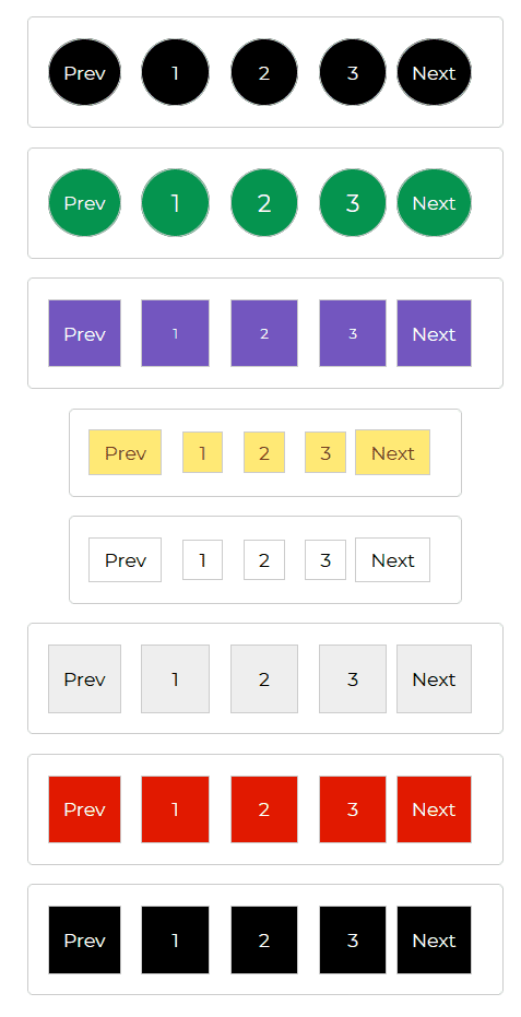
Alongside the CDBPagination component, we also use the CDBPageItem, this represents an item in the CDBPagination component. Next, we imported the CDBPageLink component, this component acts as a link.
Setting the circle prop makes our pagination more rounded. Use the size prop to describe how little or large you want your pagination to be, and the color prop.
HTML
<CDBPagination [circle]=true> <CDBPagelink>Prev</CDBPagelink> <CDBPageitem>1</CDBPageitem> <CDBPageitem>2</CDBPageitem> <CDBPageitem>3</CDBPageitem> <CDBPagelink>Next</CDBPagelink> </CDBPagination> <CDBPagination [circle]=true size="big" color="success"> <CDBPagelink>Prev</CDBPagelink> <CDBPageitem>1</CDBPageitem> <CDBPageitem>2</CDBPageitem> <CDBPageitem>3</CDBPageitem> <CDBPagelink>Next</CDBPagelink> </CDBPagination> <CDBPagination size="small" color="secondary"> <CDBPagelink>Prev</CDBPagelink> <CDBPageitem>1</CDBPageitem> <CDBPageitem>2</CDBPageitem> <CDBPageitem>3</CDBPageitem> <CDBPagelink>Next</CDBPagelink> </CDBPagination> <CDBPagination color="warning" [sm]=true> <CDBPagelink>Prev</CDBPagelink> <CDBPageitem>1</CDBPageitem> <CDBPageitem>2</CDBPageitem> <CDBPageitem>3</CDBPageitem> <CDBPagelink>Next</CDBPagelink> </CDBPagination> <CDBPagination color="white" [sm]=true> <CDBPagelink>Prev</CDBPagelink> <CDBPageitem>1</CDBPageitem> <CDBPageitem>2</CDBPageitem> <CDBPageitem>3</CDBPageitem> <CDBPagelink>Next</CDBPagelink> </CDBPagination> <CDBPagination color="white"> <CDBPagelink>Prev</CDBPagelink> <CDBPageitem>1</CDBPageitem> <CDBPageitem>2</CDBPageitem> <CDBPageitem>3</CDBPageitem> <CDBPagelink>Next</CDBPagelink> </CDBPagination> <CDBPagination color="danger"> <CDBPagelink>Prev</CDBPagelink> <CDBPageitem>1</CDBPageitem> <CDBPageitem>2</CDBPageitem> <CDBPageitem>3</CDBPageitem> <CDBPagelink>Next</CDBPagelink> </CDBPagination> <CDBPagination> <CDBPagelink>Prev</CDBPagelink> <CDBPageitem>1</CDBPageitem> <CDBPageitem>2</CDBPageitem> <CDBPageitem>3</CDBPageitem> <CDBPagelink>Next</CDBPagelink> </CDBPagination>API Reference: Contrast Angular Bootstrap Pagination Props
This section will build on your information about the props you get to use with the Contrast Angular Bootstrap Pagination component. You will find out what these props do, their default values, and how you would use them in your code.
The table below lists other prop options of the CDBPagination component.
| Name | Type | Default | Description | Example |
|---|---|---|---|---|
| class | String | Adds custom classes | Adds custom classes | class="myClass" |
| size | String | Changes size of pagination component. Choose from lg and sm | size="sm" | |
| sm | Boolean | false | Changes the size of pagination component to sm | sm=true |
| circle | Boolean | false | Changes the shape of pagination component to circular | circle=true |
| color | String | dark | Changes default pagination buttons color; available values: [white, dark, primary, secondary, success, danger, warning, info] | color="white" |
API Reference: Contrast Angular Bootstrap Pagination Item Props
The table below lists other prop options of the CDBPageItem component.
| Name | Type | Default | Description | Example |
|---|---|---|---|---|
| class | String | Adds custom classes | class="myClass" | |
| disable | Boolean | false | Disables item from being clicked | disabled=true |
| active | Boolean | false | Sets active state of the button | active=true |
API Reference: Contrast Bootstrap Pagination Link Props
The table below lists other prop options of the CDBPageLink component.
| Name | Type | Default | Description | Example |
|---|---|---|---|---|
| class | String | Adds custom classes | class="myClass" | |
| disable | Boolean | false | Disables item from being clicked | disabled=true |
| active | Boolean | false | Sets active state of the button | active=true |
Build modern projects using Bootstrap 5 and Contrast
Trying to create components and pages for a web app or website from
scratch while maintaining a modern User interface can be very tedious.
This is why we created Contrast, to help drastically reduce the amount of time we spend doing that.
so we can focus on building some other aspects of the project.
Contrast Bootstrap PRO consists of a Premium UI Kit Library featuring over 10000+ component variants.
Which even comes bundled together with its own admin template comprising of 5 admin dashboards and 23+ additional admin and multipurpose pages for
building almost any type of website or web app.
See a demo and learn more about Contrast Bootstrap Pro by clicking here.
