Slider
Contrast Angular Bootstrap Slider
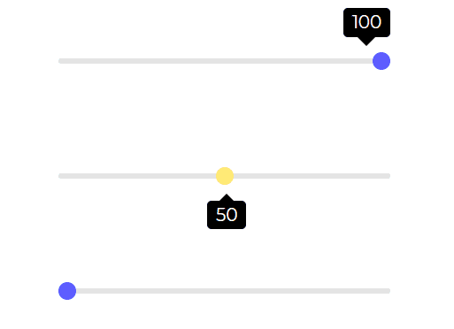
Contrast Angular Bootstrap Slider is an interactive component that allows users to choose a value from a range of values using a sliding bar.
Applications of a Angular Bootstrap slider:
- Brightness
- Volume increase/decrease
- Video Progression.
Importing the Contrast Angular Bootstrap Slider Module
To use the Contrast Angular Bootstrap Slider component in your project you need to import SliderModule.
import {SliderModule } from 'cdbangular';Slider
HTML
<CDBSlider style="max-width: 300px;margin: auto;"></CDBSlider> <CDBSlider variant='slider-warning' tooltipPlacement="bottom" style="max-width: 300px;margin: auto; margin-top: 50px;"> </CDBSlider> <CDBSlider tooltip="auto" style="max-width: 300px;margin: auto; margin-top: 50px;"></CDBSlider>API Reference: Contrast Angular Bootstrap Slider Props
This section will build on your information about the props you get to use with the Contrast Angular Bootstrap Slider component. You will find out what these props do, their default values, and how you would use them in your code.
The table below lists other prop options of the CDBSlider.
| Name | Type | Default | Description | Example |
|---|---|---|---|---|
| class | String | Adds custom classes | class="myClass" | |
| value | Number or String | Slider's value - useful for additional data binding and edge use-cases | value=49 | |
| disable | Boolean | false | Disables Slider component | [disabled] = false |
| min | Number | 0 | Sets the lowest Slider's value | min=10 |
| max | Number | 100 | Sets the highest Slider's value | max=70 |
| step | Number | 1 | Specifies the interval between valid values in a number-based input. | step=0.1 |
| size | String | Changes size of slider component. Choose from lg and sm | size="sm" | |
| variant | String | dark | Changes default slider color; available values: [blue, red, teal, dark-grey, dark, blue-grey, amber, purple] | variant="red" |
| onChange | function | Returns slider value, on onChange event | onChange=handleChange | |
| onAfterChange | function | executes a function after Change event | onAfterChange=handleAfterChange | |
| tooltip | String | Displays the current value of the slider. Can choose from auto, on or off | tooltip="on" | |
| tooltipPlacement | String | Selects where to place tooltip. Can choose from top or bottom | tooltipPlacement="top" | |
| tooltipLabel | function | Sets the label of the tooltip | tooltipLabel=yourFunction | |
| tooltipStyle | Object | Customize the style of the tooltip | tooltipStyle= color: "red" |
Build modern projects using Bootstrap 5 and Contrast
Trying to create components and pages for a web app or website from
scratch while maintaining a modern User interface can be very tedious.
This is why we created Contrast, to help drastically reduce the amount of time we spend doing that.
so we can focus on building some other aspects of the project.
Contrast Bootstrap PRO consists of a Premium UI Kit Library featuring over 10000+ component variants.
Which even comes bundled together with its own admin template comprising of 5 admin dashboards and 23+ additional admin and multipurpose pages for
building almost any type of website or web app.
See a demo and learn more about Contrast Bootstrap Pro by clicking here.
