Alert
Angular Bootstrap Alert
Contrast Angular Bootstrap Alert are used to send feedback messages to users after specific actions are carried out.
Examples
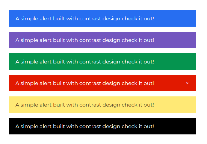
Contrast Angular Bootstrap Alerts have an optional dismiss button. It is used with text of varying lengths to pass information to users. Contextual props (e.g., color="success") are used to give Bootstrap Alerts a suitable style. The dismiss prop is used for inline dismissal of the angular Alert component.
Importing the Contrast Angular Bootstrap Alert
import { AlertModule } from 'cdbangular';Typescript
import { Component, OnInit } from `@angular/core`;
@Component({  selector: `app-alert`,  templateUrl: `./alert.component.html`,  styleUrls: [`./alert.component.scss`],})export class AlertComponent implements OnInit {  constructor() {}
  ngOnInit(): void {}}
HTML
<CDBAlert color="primary"> A simple alert built with contrast design check it out!</CDBAlert><CDBAlert color="secondary"> A simple alert built with contrast design check it out!</CDBAlert><CDBAlert color="success"> A simple alert built with contrast design check it out!</CDBAlert><CDBAlert color="danger" [dismiss]="true"> A simple alert built with contrast design check it out!</CDBAlert><CDBAlert color="warning"> A simple alert built with contrast design check it out!</CDBAlert><CDBAlert color="dark"> A simple alert built with contrast design check it out!</CDBAlert>Contrast Angular Bootstrap Alert Props
This section will build on your information about the props you get to use with the Contrast Angular Bootstrap Alert component. You will find out what these props do, their default values, and how you would use them in your code.
The table below lists other prop options of the CDBAlert component.
| Name | Type | Default | Description | Example |
|---|---|---|---|---|
| class | String | Adds custom classes | [class]="myClass" | |
| color | String | primary | Sets color of the alert. Choose one of these: primary, secondary, success, danger, warning, info, light, dark | [color]="primary" |
| dismiss | Boolean | false | Shows a dismiss button | [dismiss]=true |
Build modern projects using Bootstrap 5 and Contrast
Trying to create components and pages for a web app or website from
scratch while maintaining a modern User interface can be very tedious.
This is why we created Contrast, to help drastically reduce the amount of time we spend doing that.
so we can focus on building some other aspects of the project.
Contrast Bootstrap PRO consists of a Premium UI Kit Library featuring over 10000+ component variants.
Which even comes bundled together with its own admin template comprising of 5 admin dashboards and 23+ additional admin and multipurpose pages for
building almost any type of website or web app.
See a demo and learn more about Contrast Bootstrap Pro by clicking here.
