Radio
Contrast Angular Bootstrap Radio
Contrast Angular Bootstrap Radio button is a component that allow users to select an option from a list of options, while Checkboxes are for selecting multiple options.
Importing the Contrast Angular Bootstrap Radio Module
To use the Contrast Angular Bootstrap Radio component in your project you need to import RadioModule.
import {RadioModule } from 'cdbangular';Single Radio
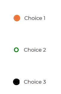
Use the Contrast Angular Bootstrap CDBRadio component to create radio buttons.
HTML
<CDBRadio value="Choice 1" fill="#eb7434" colorfill="#eb7434"></CDBRadio><CDBRadio value="Choice 2" fill="green" colorfill="red"></CDBRadio><CDBRadio value="Choice 3" fill="#000000" colorfill="#000000"></CDBRadio>Radio Group
Creating multiple radio buttons may be hectic, and with the Contrast Angular Bootstrap RadioGroup component, frankly unnecessary.
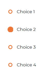
With CDBRadioGroup component, you have an [answers] prop. This [answers] prop takes in an array of choices and creates multiple radio buttons.
HTML
<CDBRadioGroup fill="#eb7434" colorfill="#eb7434" [answers]="['Choice 1', 'Choice 2' , 'Choice 3' , 'Choice 4' ]"></CDBRadioGroup>API
This section will build on your information about the props you get to use with the Contrast Angular Bootstrap Radio component. You will find out what these props do, their default values, and how you would use them in your code.
API Reference: Contrast Radio Props
The table below lists other prop options of the CDBRadio.
| Name | Type | Default | Description | Example |
|---|---|---|---|---|
| class | String | Adds custom classes | class="myClass" | |
| fill | String | #455ff5 | Sets the color of the unselected radio button | fill="#000000" |
| colorfill | String | Sets the color of the selected radio button | colorFill="#000000" | |
| value | String | The value of the input element | value="Choice1" |
API Reference: Contrast Radio Group Props
The table below lists other prop options of the CDBRadioGroup.
| Name | Type | Default | Description | Example |
|---|---|---|---|---|
| className | String | Adds custom classes | class="myClass" | |
| fill | String | #455ff5 | Sets the color of the unselected radio button | fill="#000000" |
| colorfill | String | Sets the color of the selected radio button | colorFill="#000000" | |
| answers | Array | [] | The list of values of the input element | answers=[choice1, choice2, choice3] |
Build modern projects using Bootstrap 5 and Contrast
Trying to create components and pages for a web app or website from
scratch while maintaining a modern User interface can be very tedious.
This is why we created Contrast, to help drastically reduce the amount of time we spend doing that.
so we can focus on building some other aspects of the project.
Contrast Bootstrap PRO consists of a Premium UI Kit Library featuring over 10000+ component variants.
Which even comes bundled together with its own admin template comprising of 5 admin dashboards and 23+ additional admin and multipurpose pages for
building almost any type of website or web app.
See a demo and learn more about Contrast Bootstrap Pro by clicking here.

