Visually build tailwind css projects 10x faster using AI
Build Tailwind websites visually and ship projects to production in minutes instead of days. Generates code from your designs to export to your favourite frameworks like React, Vue, Angular.

Constrast Angular Bootstrap Accordion organizes content within collapsable items. They can toggle through a number content with a single click. This property allows for an excellent user experience.
Applications of Angular Bootstrap Accordion are:
FAQ page
Multiple items presentation
Data tables
import {AccordionModule } from 'cdbangular';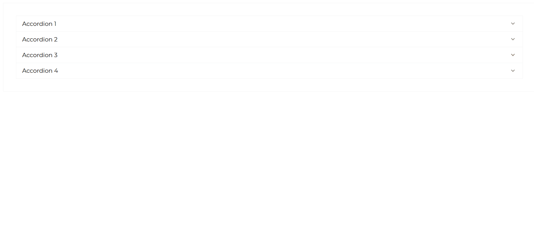
import { Component, OnInit } from '@angular/core';
@Component({  selector: 'app-accordion',  templateUrl: './accordion.component.html',  styleUrls: ['./accordion.component.scss'],})export class AccordionComponent implements OnInit {  paragraph = `Anim pariatur cliche reprehenderit, enim eiusmod high life accusamus terry  richardson ad squid. 3 wolf moon officia aute, non cupidatat skateboard  dolor brunch. Food truck quinoa nesciunt laborum eiusmod. Brunch 3 wolf  moon tempor, sunt aliqua put a bird on it squid single-origin coffee nulla  assumenda shoreditch et. Nihil anim keffiyeh helvetica, craft beer labore  wes anderson cred nesciunt sapiente ea proident. Ad vegan excepteur  butcher vice lomo. Leggings occaecat craft beer farm-to-table, raw denim  aesthetic synth nesciunt you probably haven't heard of them accusamus  labore sustainable VHS.`;
  data = [    {      title: 'Accordion 1',      content: this.paragraph,    },    {      title: 'Accordion 2',      content: this.paragraph,    },    {      title: 'Accordion 3',      content: this.paragraph,    },    {      title: 'Accordion 4',      content: this.paragraph,    },  ];
  constructor() {}
ngOnInit(): void {}}<CDBAccordion [data]='data' ></CDBAccordion>

import { Component, OnInit } from '@angular/core';
@Component({  selector: 'app-accordion',  templateUrl: './accordion.component.html',  styleUrls: ['./accordion.component.scss'],})export class AccordionComponent implements OnInit {  paragraph = `Anim pariatur cliche reprehenderit, enim eiusmod high life accusamus terry  richardson ad squid. 3 wolf moon officia aute, non cupidatat skateboard  dolor brunch. Food truck quinoa nesciunt laborum eiusmod. Brunch 3 wolf  moon tempor, sunt aliqua put a bird on it squid single-origin coffee nulla  assumenda shoreditch et. Nihil anim keffiyeh helvetica, craft beer labore  wes anderson cred nesciunt sapiente ea proident. Ad vegan excepteur  butcher vice lomo. Leggings occaecat craft beer farm-to-table, raw denim  aesthetic synth nesciunt you probably haven't heard of them accusamus  labore sustainable VHS.`;
  data = [    {      title: 'Accordion 1',      content: this.paragraph,    },    {      title: 'Accordion 2',      content: this.paragraph,    },    {      title: 'Accordion 3',      content: this.paragraph,    },    {      title: 'Accordion 4',      content: this.paragraph,    },  ];
  constructor() {}
ngOnInit(): void {}}<CDBAccordion [data]='data' [hideIcon]=true ></CDBAccordion>This section will build on your information about the props you get to use with the Contrast Angular Bootstrap Accordion component. You will find out what these props do, their default values, and how you would use them in your code.
The table below lists the prop options of the CDBAccordion component to personalize your Accordion.
| Name | Type | Default | Description | Example |
|---|---|---|---|---|
| accordionClass | String | Adds custom classes | [accordionClass]="myClass" | |
| accordionHeaderClass | String | Adds custom classes for the accordion header | [accordionHeaderClass]="myHeaderClass" | |
| accordionBodyClass | String | Adds custom classes for the accordion body | [accordionBodyClass]="myBodyClass" | |
| data | List | Supplies data to the accordion | [data]="data1" | |
| hideIcon | Boolean | false | Hides Accordion icon | [hideIcon]=true |
Build Tailwind websites visually and ship projects to production in minutes instead of days. Generates code from your designs to export to your favourite frameworks like React, Vue, Angular.
Trying to create components and pages for a web app or website from
scratch while maintaining a modern User interface can be very tedious.
This is why we created Contrast, to help drastically reduce the amount of time we spend doing that.
so we can focus on building some other aspects of the project.
Contrast Bootstrap PRO consists of a Premium UI Kit Library featuring over 10000+ component variants.
Which even comes bundled together with its own admin template comprising of 5 admin dashboards and 23+ additional admin and multipurpose pages for
building almost any type of website or web app.
See a demo and learn more about Contrast Bootstrap Pro by clicking here.
