Notification
Angular Bootstrap Notification
Contrast Angular Bootstrap Notifications send information to your websites or web apps visitors with a toast, a lightweight and easily customizable alert message.
Toasts are lightweight notifications designed to mimic the push notifications that have been popularized by mobile and desktop operating systems. They’re built with flexbox, so they’re easy to align and position.
Importing the Contrast Angular Bootstrap Notification Module
To use the Contrast Angular Bootstrap Notification component in your project you need to import NotificationModule.
import {NotificationModule } from 'cdbangular';Custom Notification Types
The Contrast Angular Bootstrap Notification takes a couple of parameters. The [show] parameter allows your notification component to be visible, the [fade] parameter gives the notification component a fade animation when it leaves your screen.
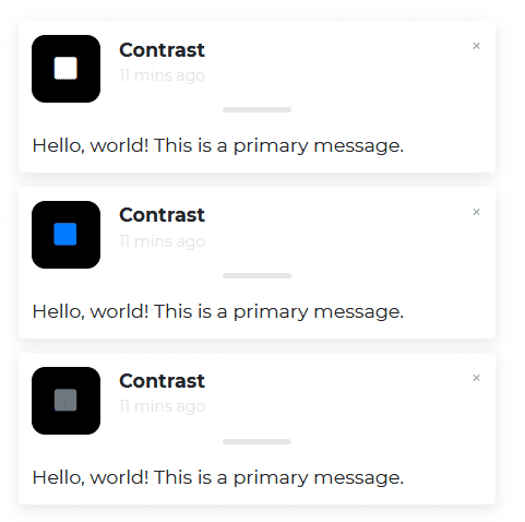
To change the icon's color in your notification, we give our CDBNotification component an iconClassName prop with a text value, then append the color we want it to have (e.g., primary, secondary, etc.). For example iconClassName= "text-primary.
Use the title prop for your notification title, message and texts prop for writing information.
HTML
<CDBNotification [show]=true [fade]=true [autohide]='2' title="Contrast" message="Hello, world! This is a primary message." text="11 mins ago" ></CDBNotification><CDBNotification [show]=true [fade]=true iconClassName="text-primary" title="Contrast" message="Hello, world! This is a primary message." text="11 mins ago" ></CDBNotification><CDBNotification [show]=true [fade]=true iconClassName="text-secondary" title="Contrast" message="Hello, world! This is a primary message." text="11 mins ago" ></CDBNotification>Notification with Hidden Message
HTML
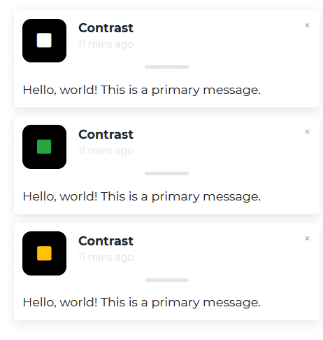
<CDBNotification [show]=true [fade]=true [hideMessages]=true [autohide]='5' title="Contrast" message="Hello, world! This is a primary message." text="11 mins ago" ></CDBNotification><CDBNotification [show]=true [fade]=true [hideMessages]=true iconClassName="text-success" title="Contrast" message="Hello, world! This is a primary message." text="11 mins ago" ></CDBNotification><CDBNotification [show]=true [fade]=true [hideMessages]=true iconClassName="text-warning" title="Contrast" message="Hello, world! This is a primary message." text="11 mins ago" ></CDBNotification>Icon Box
HTML
<CDBNotification [show]=true [fade]=true color="success" title="Contrast" message="Hello, world! This is a primary message."    text="11 mins ago" ></CDBNotification><CDBNotification [show]=true [fade]=true color="danger" title="Contrast" message="Hello, world! This is a primary message."    text="11 mins ago" ></CDBNotification>
<CDBNotification [show]=true [fade]=true color="secondary" title="Contrast" message="Hello, world! This is a primary message."    text="11 mins ago" ></CDBNotification><CDBNotification [show]=true [fade]=true color="primary" title="Contrast" message="Hello, world! This is a primary message."    text="11 mins ago" ></CDBNotification>
Notification with Icons
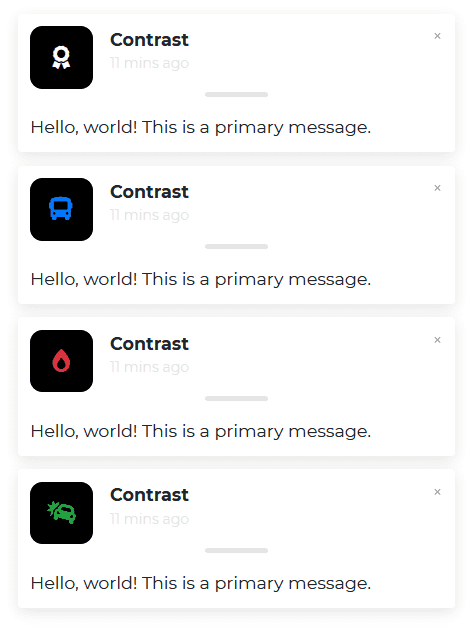
The Contrast Angular Bootstrap Notification component allows you to change the icon on your notification. To do that, use the icon prop.
HTML
<CDBNotification [show]=true [fade]=true title="Contrast" icon="award" message="Hello, world! This is a primary message."    text="11 mins ago" ></CDBNotification><CDBNotification [show]=true [fade]=true iconClassName="text-primary" title="Contrast" icon="bus"    message="Hello, world! This is a primary message." text="11 mins ago" ></CDBNotification>
<CDBNotification [show]=true [fade]=true iconClassName="text-danger" title="Contrast" icon="burn"    message="Hello, world! This is a primary message." text="11 mins ago" ></CDBNotification><CDBNotification [show]=true [fade]=true iconClassName="text-success" icon="car-crash" title="Contrast"    message="Hello, world! This is a primary message." text="11 mins ago" ></CDBNotification>
Positioning
The position property indicates where on the website you want the notification to be.
HTML
<CDBNotification [show]=true [fade]=true title="Contrast" message="Hello, world! This is a positioned notification." text="11 mins ago" position="top-left" ></CDBNotification><CDBNotification [show]=true [fade]=true title="Contrast" message="Hello, world! This is a positioned notification." text="11 mins ago" position="bottom-right" ></CDBNotification>Contrast Angular Bootstrap Notification Props
This section will build on your information about the props you get to use with the Contrast Angular Bootstrap Notification component. You will find out what these props do, their default values, and how you would use them in your code.
The table below lists other prop options of the CDBNotification component.
| Name | Type | Default | Description | Example |
|---|---|---|---|---|
| bodyClassName | String | Adds custom className to the body section of notification component | bodyClassName="p-5 font-weight-bold" | |
| bodyColor | String | Set color to the body section of notification component | bodyColor="black" | |
| Class | String | Adds custom classes to the wrapper | Class="stylish-color-dark" | |
| closeClassName | String | text-dark | Adds custom classes to the Close button | closeClassName="blue-grey-text" |
| fade | Boolean | false | Adds a fade effect when you close the notification | fade=true |
| hideMessages | Boolean | false | Hides messages in the component | hideMessages=true |
| autohide | Number | Sets time in ms when box hide. 0 = infinity | autoHide=3000 | |
| icon | String | square | Sets a custom icon | icon="bell" |
| iconClassName | String | Adds custom classes to the Icon | iconClassName="green-text" | |
| message | String | Sets message of the notification | message="Hello there! This is a toast message" | |
| position | String | One of top-right, top-center, top-left, bottom-right, bottom-center, bottom-left | position="top-right" | |
| show | Boolean | true | Shows your component. If you do not use this setting, your component will exist, but it will be hidden. | show=false |
| text | String | Sets text of the notification | text="11 minutes ago" | |
| title | String | Set header text of the notification | title="Someone sent you an email" | |
| titleClassName | String | Adds custom classes to the title text | titleClassName="elegant-color-dark-white-text" | |
| titleColor | String | Sets the color of the title | titleColor="white" |
Build modern projects using Bootstrap 5 and Contrast
Trying to create components and pages for a web app or website from
scratch while maintaining a modern User interface can be very tedious.
This is why we created Contrast, to help drastically reduce the amount of time we spend doing that.
so we can focus on building some other aspects of the project.
Contrast Bootstrap PRO consists of a Premium UI Kit Library featuring over 10000+ component variants.
Which even comes bundled together with its own admin template comprising of 5 admin dashboards and 23+ additional admin and multipurpose pages for
building almost any type of website or web app.
See a demo and learn more about Contrast Bootstrap Pro by clicking here.


