Tailwind CSS Overflow
The overflow utility class in Tailwind CSS allows you to control how content that overflows its container is displayed. With Tailwind's overflow class, you can specify whether to show or hide the overflowing content, and how it should be scrolled if necessary.
Applying Overflow
To apply the overflow behavior to an element, you can use the overflow-{value} utility class, where {value} represents the desired overflow behavior. Here are the available options:
- overflow-auto: Automatically shows scrollbars when needed, and hides them when not needed.
- overflow-hidden: Hides any content that overflows the container.
- overflow-visible: Displays the overflowing content without any clipping.
- overflow-scroll: Always shows scrollbars, even if the content doesn't overflow.
- overflow-x-auto: Applies auto overflow on the horizontal axis only.
- overflow-y-auto: Applies auto overflow on the vertical axis only.
<div class="overflow-y-scroll"> Lorem ipsum dolor sit amet, consectetur adipisicing elit. Assumenda, quia temporibus eveniet a libero incidunt suscipit.</div>Preview
Responsive Overflow
Tailwind CSS allows you to apply overflow classes responsively at different breakpoints. To use responsive overflow classes, you can append the breakpoint prefix to the utility class. For example, md:overflow-hidden hides overflowing content starting from the medium breakpoint and above.
<div class="overflow-auto md:overflow-hidden"> <!-- Content that may overflow --></div>In the above example, the overflow behavior is set to auto by default (overflow-auto), but starting from the medium breakpoint and above, the overflow behavior is changed to hidden (md:overflow-hidden).
Tailwind Overflow Class Table
| Class | Properties |
|---|---|
| overflow-auto | overflow: auto; |
| overflow-hidden | overflow: hidden; |
| overflow-visible | overflow: visible; |
| overflow-scroll | overflow: scroll; |
| overflow-x-auto | overflow-x: auto; |
| overflow-y-auto | overflow-y: auto; |
| overflow-x-hidden | overflow-x: hidden; |
| overflow-y-hidden | overflow-y: hidden; |
| overflow-x-visible | overflow-x: visible; |
| overflow-y-visible | overflow-y: visible; |
| overflow-x-scroll | overflow-x: scroll; |
| overflow-y-scroll | overflow-y: scroll; |
Windframe Tailwind blocks
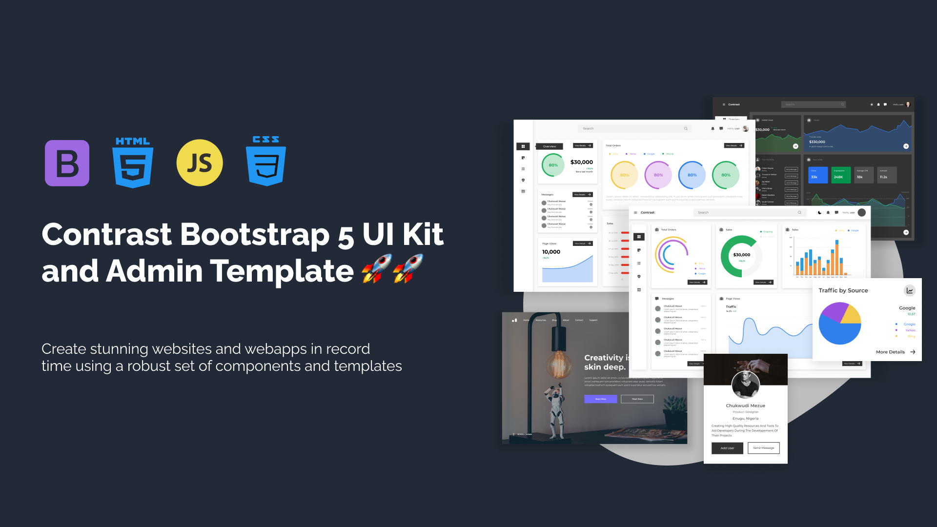
Build modern projects using Bootstrap 5 and Contrast
Trying to create components and pages for a web app or website from
scratch while maintaining a modern User interface can be very tedious.
This is why we created Contrast, to help drastically reduce the amount of time we spend doing that.
so we can focus on building some other aspects of the project.
Contrast Bootstrap PRO consists of a Premium UI Kit Library featuring over 10000+ component variants.
Which even comes bundled together with its own admin template comprising of 5 admin dashboards and 23+ additional admin and multipurpose pages for
building almost any type of website or web app.
See a demo and learn more about Contrast Bootstrap Pro by clicking here.