Tailwind CSS Border Width
Tailwind Border Width
The Tailwind border width utility classes allow you to easily control the width of borders applied to elements in your web applications. With a range of options and flexibility, you can achieve different border thicknesses and create visually appealing designs.
Setting Tailwind Border Width
<div class="border-0 bg-blue-300...">border-0</div><div class=" border-4 blue-300...">Border with a fixed width of 2 pixels</div><div class="border-t-4 bg-blue-300...">Top border with a fixed width of 4 pixels</div><div class="border-b-8 bg-blue-300...">Bottom border with the default width</div>Preview
Tailwind Border Width Scale Customization
Tailwind CSS provides a flexible way to customize the border width scale to suit your project's needs. You can modify the default border width values or add new ones to create a unique scale. To customize the tailwind border width scale, you can update the theme section of your Tailwind CSS configuration file.
Here's an example of how you can customize the border width scale in your tailwind.config.js file:
Copy codemodule.exports = { theme: { borderWidth: { DEFAULT: '2px', '0': '0', '4': '4px', '8': '8px', '10': '10px', }, }, // ...other configuration options};In the above example, we modified the default border Width scale and added additional values like 4, 8, and 10 pixels. After customizing the scale, you can use the updated values in your HTML markup.
Tailwind Border Width Class Table
| Class | Properties |
|---|---|
| border-0 | border-width: 0px; |
| border-2 | border-width: 2px; |
| border-4 | border-width: 4px; |
| border-8 | border-width: 8px; |
| border | border-width: 1px; |
| border-t-0 | border-top-width: 0px; |
| border-r-0 | border-right-width: 0px; |
| border-b-0 | border-bottom-width: 0px; |
| border-l-0 | border-left-width: 0px; |
| border-t-2 | border-top-width: 2px; |
| border-r-2 | border-right-width: 2px; |
| border-b-2 | border-bottom-width: 2px; |
| border-l-2 | border-left-width: 2px; |
| border-t-4 | border-top-width: 4px; |
| border-r-4 | border-right-width: 4px; |
| border-b-4 | border-bottom-width: 4px; |
| border-l-4 | border-left-width: 4px; |
| border-t-8 | border-top-width: 8px; |
| border-r-8 | border-right-width: 8px; |
| border-b-8 | border-bottom-width: 8px; |
| border-l-8 | border-left-width: 8px; |
| border-t | border-top-width: 1px; |
| border-r | border-right-width: 1px; |
| border-b | border-bottom-width: 1px; |
| border-l | border-left-width: 1px; |
Windframe Tailwind blocks
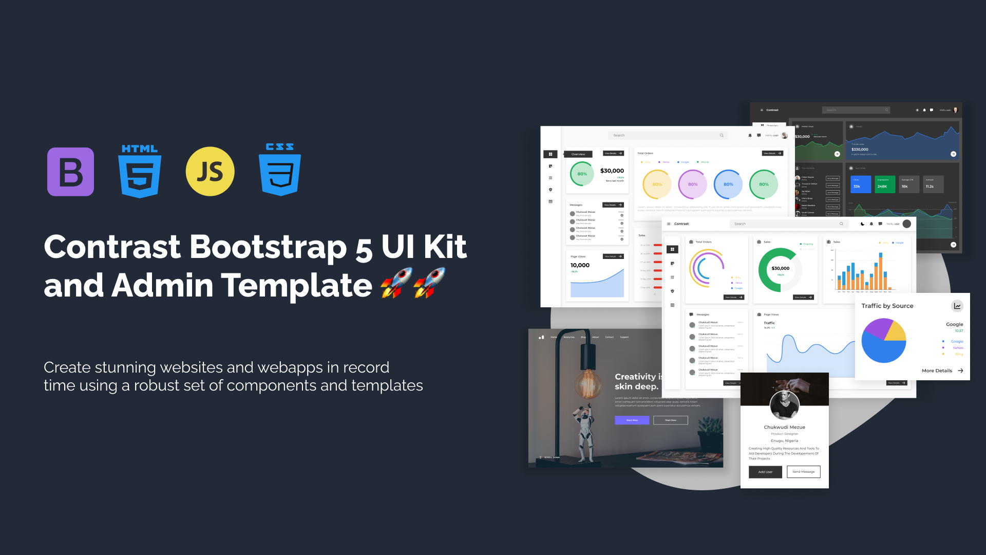
Build modern projects using Bootstrap 5 and Contrast
Trying to create components and pages for a web app or website from
scratch while maintaining a modern User interface can be very tedious.
This is why we created Contrast, to help drastically reduce the amount of time we spend doing that.
so we can focus on building some other aspects of the project.
Contrast Bootstrap PRO consists of a Premium UI Kit Library featuring over 10000+ component variants.
Which even comes bundled together with its own admin template comprising of 5 admin dashboards and 23+ additional admin and multipurpose pages for
building almost any type of website or web app.
See a demo and learn more about Contrast Bootstrap Pro by clicking here.