Visually build tailwind css projects 10x faster using AI
Build Tailwind websites visually and ship projects to production in minutes instead of days. Generates code from your designs to export to your favourite frameworks like React, Vue, Angular.

React Bootstrap 5 Collapse is a content toggler component. It's useful for collecting a lot of text and/or visuals into expandable and collapsible pieces.
Collapse is a tool for displaying and hiding content. Buttons or anchors serve as triggers for certain items that you toggle. When you collapse an element, the 'height' value will animate from its current value to '0'.
Begin by importing 'CDBCollapse' into your project to use the React Bootstrap 5 Collapse component. We'll also use the CDBBtn component in this tutorial, To learn more, see our docs.
import { CDBCollapse } from 'cdbreact';The isOpen prop is passed to the Contrast React Bootstrap 5 Collapse component. The isOpen property accepts a Boolean value that indicates whether the Accordion is open or closed. The Accordion is opened if its value is 'true.'
We define a variable collapseID in the code block below, which we will provide into the isOpen prop on the CDBCollapse.
The toggleCollapse function toggles between true and false for the collapseID. The toggleCollapse function is triggered by the CDBBtn component.
import React from 'react';import { CDBBtn, CDBCollapse, CDBContainer } from 'cdbreact';
class Collapse extends Component {  state = {    collapseID: '',  };
  toggleCollapse = collapseID => () => {    this.setState(prevState => ({      collapseID: prevState.collapseID !== collapseID ? collapseID : '',    }));  };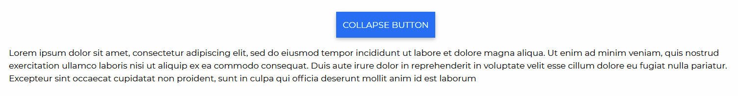
render() { return ( <CDBContainer> <div style={{ margin: 'auto', width: '80%', display: 'flex', flexDirection: 'column', alignItems: 'center', justifyContent: 'center', minHeight: '100vh', }} > <CDBBtn color="primary" onClick={this.toggleCollapse('basicCollapse')} style={{ marginBottom: '1rem' }} > COLLAPSE BUTTON </CDBBtn> <CDBCollapse id="basicCollapse" isOpen={this.state.collapseID}> <p> Lorem ipsum dolor sit amet, consectetur adipiscing elit, sed do eiusmod tempor incididunt ut labore et dolore magna aliqua. Ut enim ad minim veniam, quis nostrud exercitation ullamco laboris nisi ut aliquip ex ea commodo consequat. Duis aute irure dolor in reprehenderit in voluptate velit esse cillum dolore eu fugiat nulla pariatur. Excepteur sint occaecat cupidatat non proident, sunt in culpa qui officia deserunt mollit anim id est laborum </p> </CDBCollapse> </div> </CDBContainer> ); }}The props you get to use with the React Bootstrap 5 Collapse component will be expanded upon in this section. You'll learn what these props do, how to utilize them in your code, and what their default values are.
Other prop alternatives for the 'CDBCollapse' component are listed in the table below.
| Name | Type | Default | Description | Example |
|---|---|---|---|---|
| className | String | Adds custom classes | <CDBCollapse className="myClass" ... /> | |
| delay | Number or Object | {show: 350, hide: 350} | Defines how many milliseconds the open/close event are delayed | <CDBCollapse delay={{show: 3000, hide: 7000}} ... /> |
| disable | Boolean | false | Disables Collapse component | <CDBCollapse disabled .../> |
| navbar | Boolean | false | Adds navbar-collapse bootstrap class to class name property | <CDBCollapse navbar ... /> |
| isOpen | String or Boolean | Defines if accordion is opened or closed | <CDBCollapse isOpen ... /> | |
| onOpened | function | Defines the function which fires when Accordion has opened | <CDBCollapse onOpened={yourFunction} ... /> | |
| onClosed | function | Defines the function which fires when Accordion has closed | <CDBCollapse onClosed={yourFunction} ... /> |
Build Tailwind websites visually and ship projects to production in minutes instead of days. Generates code from your designs to export to your favourite frameworks like React, Vue, Angular.
Trying to create components and pages for a web app or website from
scratch while maintaining a modern User interface can be very tedious.
This is why we created Contrast, to help drastically reduce the amount of time we spend doing that.
so we can focus on building some other aspects of the project.
Contrast Bootstrap PRO consists of a Premium UI Kit Library featuring over 10000+ component variants.
Which even comes bundled together with its own admin template comprising of 5 admin dashboards and 23+ additional admin and multipurpose pages for
building almost any type of website or web app.
See a demo and learn more about Contrast Bootstrap Pro by clicking here.
