Visually build tailwind css projects 10x faster using AI
Build Tailwind websites visually and ship projects to production in minutes instead of days. Generates code from your designs to export to your favourite frameworks like React, Vue, Angular.

React Bootstrap 5 time picker is a component which uses a dialog to select a single time in hours:minutes format. The selected time is indicated by the filled circle at the end of the clock hand.
To use the Contrast React Bootstrap 5 TimePicker component, you import CDBTimePicker into your project.
import { CDBTimePicker } from "cdbreact";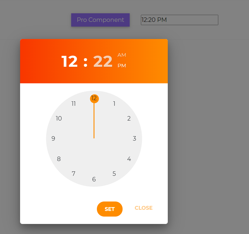
import React from "react";import { CDBTimePicker, CDBContainer } from "cdbreact";
export const TimePicker = () => { return ( <CDBContainer> <CDBTimePicker placeholder="10:05 AM" theme="classic" colorPalette="dark" /> </CDBContainer> );};This section will build on your information about the props you get to use with the Contrast React Bootstrap 5 TimePicker component. You will find out what these props do, their default values, and how you would use them in your code.
The table below lists other prop options of the CDBTimePicker component.
| Name | Type | Default | Description | Example |
|---|---|---|---|---|
| placeholder | String | Required! Sets placeholder for time indicator input | <CDBTimePicker placeholder="placeholder" ... /> | |
| time | String | Sets the time | <CDBTimePicker time="09:30:30 AM" ... /> | |
| className | String | Adds custom classes | Adds custom classes | <CDBTimePicker className="myClass" ... /> |
| theme | String | Sets the theme of the time picker. Can be either material, classic or neomorphism | <CDBTimePicker theme="classic" ... /> | |
| colorPalette | String | light | Changes the color palette of the time picker. Can be either light or dark | <CDBTimePicker colorPalette="dark" ... /> |
| tag | String | div | Changes default input tag | <CDBCheckbox tag="input" ... /> |
| disable | Boolean | false | Disables TimePicker component | <CDBTimePicker disabled .../> |
Build Tailwind websites visually and ship projects to production in minutes instead of days. Generates code from your designs to export to your favourite frameworks like React, Vue, Angular.
Trying to create components and pages for a web app or website from
scratch while maintaining a modern User interface can be very tedious.
This is why we created Contrast, to help drastically reduce the amount of time we spend doing that.
so we can focus on building some other aspects of the project.
Contrast Bootstrap PRO consists of a Premium UI Kit Library featuring over 10000+ component variants.
Which even comes bundled together with its own admin template comprising of 5 admin dashboards and 23+ additional admin and multipurpose pages for
building almost any type of website or web app.
See a demo and learn more about Contrast Bootstrap Pro by clicking here.
