Visually build tailwind css projects 10x faster using AI
Build Tailwind websites visually and ship projects to production in minutes instead of days. Generates code from your designs to export to your favourite frameworks like React, Vue, Angular.

The React Bootstrap 5 modal is a simple, yet powerful, popup that can be used for a number of purposes.
It's a type of dialog box/popup window that can be used for light boxes, user notifications, UI upgrades, e-commerce components, and a multitude of other things.
It's simple to adjust. Size, position, and content can all be customized.
Begin by importing CDBModal into your project to use the React Bootstrap 5 Modal component.
import { CDBModal } from 'cdbreact';
Along with the CDBModal component, other React Bootstrap 5 components are used in this tutorial. We use the CDBCard component, and the CDBBtn component. In the docs, you'll find more information.
import React, { useState } from 'react';import {  CDBModal,  CDBCardImage,  CDBCardBody,  CDBCardTitle,  CDBCardText,  CDBCard,  CDBBtn,  CDBContainer,} from 'cdbreact-pro';
const Modal = () => {  const [state, setState] = useState({    modal1: false,  });  const toggle = nr => () => {    let modalNumber = 'modal' + nr;    setState({      ...state,      [modalNumber]: !state[modalNumber],    });  };  return (    <CDBContainer>      <CDBBtn onClick={toggle(1)} color="dark">        Modal      </CDBBtn>      <CDBModal isOpen={state.modal1} toggle={toggle(1)} centered fade>        <CDBCard>          <CDBCardImage className="img-fluid" src="img/modal.jpg" />          <CDBCardBody>            <CDBCardTitle>Title</CDBCardTitle>            <CDBCardText>              Proin ut dui sed metus pharetra hend rerit vel non mi. Nulla orcane faucibus ex, non              facilisis nisl. Maexenas aliquet mauris ut tempus.            </CDBCardText>            <div className="d-flex">              <div className="d-flex justify-content-start" style={{ flex: ' 50%' }}>                <CDBBtn color="light" flat>                  Label                </CDBBtn>              </div>              <div className="d-flex justify-content-end" style={{ flex: ' 50%' }}>                <CDBBtn color="white" flat onClick={toggle(1)}>                  Cancel                </CDBBtn>                <CDBBtn color="dark" flat>                  Done                </CDBBtn>              </div>            </div>          </CDBCardBody>        </CDBCard>      </CDBModal>    </CDBContainer>  );};export default Modal;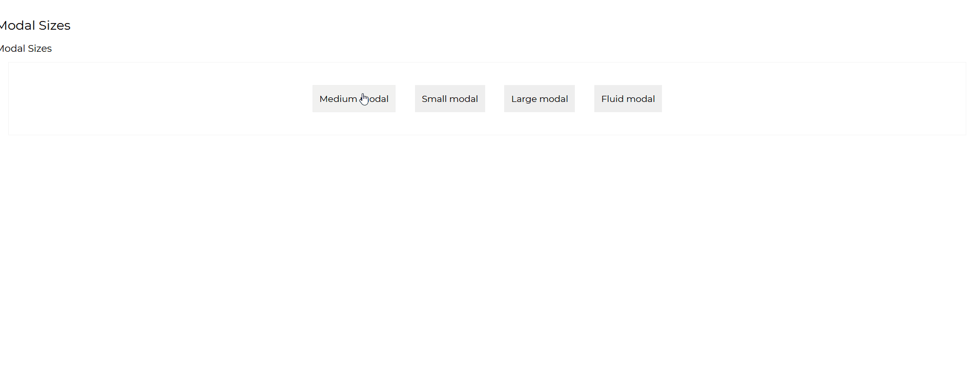
import React, { useState } from 'react';import {  CDBModal,  CDBCardImage,  CDBCardBody,  CDBCardTitle,  CDBCardText,  CDBCard,  CDBBtn,  CDBContainer,} from 'cdbreact-pro';
const Modal = () => {  const [state, setState] = useState({    modal1: false,  });  const toggle = nr => () => {    let modalNumber = 'modal' + nr;    setState({      ...state,      [modalNumber]: !state[modalNumber],    });  };  return (    <CDBContainer>      <CDBBtn color="light" flat onClick={toggle(2)}>        Medium modal      </CDBBtn>      <CDBModal isOpen={state.modal2} toggle={toggle(2)}>        <CDBCard border>          <CDBCardImage className="img-fluid" src="img/modal.jpg" />          <CDBCardBody>            <CDBCardTitle>Title</CDBCardTitle>            <CDBCardText>              Proin ut dui sed metus pharetra hend rerit vel non mi. Nulla orcane faucibus ex, non              facilisis nisl. Maexenas aliquet mauris ut tempus.            </CDBCardText>            <div className="d-flex">              <div className="d-flex justify-content-start" style={{ flex: ' 50%' }}>                <CDBBtn color="light" flat>                  Label                </CDBBtn>              </div>              <div className="d-flex justify-content-end" style={{ flex: ' 50%' }}>                <CDBBtn color="white" flat onClick={toggle(2)}>                  Cancel                </CDBBtn>                <CDBBtn color="dark" flat>                  Done                </CDBBtn>              </div>            </div>          </CDBCardBody>        </CDBCard>      </CDBModal>      <CDBBtn color="light" flat onClick={toggle(3)}>        Small modal      </CDBBtn>      <CDBModal isOpen={state.modal3} toggle={toggle(3)} size="sm">        <CDBCard>          <CDBCardImage className="img-fluid" src="img/modal.jpg" />          <CDBCardBody>            <CDBCardTitle>Title</CDBCardTitle>            <CDBCardText>              Proin ut dui sed metus pharetra hend rerit vel non mi. Nulla orcane faucibus ex, non              facilisis nisl. Maexenas aliquet mauris ut tempus.            </CDBCardText>            <div className="d-flex">              <div className="d-flex justify-content-start" style={{ flex: ' 50%' }}>                <CDBBtn color="light" flat>                  Label                </CDBBtn>              </div>              <div className="d-flex justify-content-end" style={{ flex: ' 50%' }}>                <CDBBtn color="white" flat onClick={toggle(3)}>                  Cancel                </CDBBtn>                <CDBBtn color="dark" flat>                  Done                </CDBBtn>              </div>            </div>          </CDBCardBody>        </CDBCard>      </CDBModal>      <CDBBtn color="light" flat onClick={toggle(4)}>        Large modal      </CDBBtn>      <CDBModal isOpen={state.modal4} toggle={toggle(4)} size="lg">        <CDBCard border>          <CDBCardBody>            <CDBCardTitle>Title</CDBCardTitle>            <CDBCardText>              Proin ut dui sed metus pharetra hend rerit vel non mi. Nulla orcane faucibus ex, non              facilisis nisl. Maexenas aliquet mauris ut tempus.            </CDBCardText>            <div className="d-flex">              <div className="d-flex justify-content-start" style={{ flex: ' 50%' }}>                <CDBBtn color="light" flat>                  Label                </CDBBtn>              </div>              <div className="d-flex justify-content-end" style={{ flex: ' 50%' }}>                <CDBBtn color="white" flat onClick={toggle(4)}>                  Cancel                </CDBBtn>                <CDBBtn color="dark" flat>                  Done                </CDBBtn>              </div>            </div>          </CDBCardBody>        </CDBCard>      </CDBModal>      <CDBBtn color="light" flat onClick={toggle(5)}>        Fluid modal      </CDBBtn>      <CDBModal isOpen={state.modal5} toggle={toggle(5)} size="fluid">        <CDBCard border>          <CDBCardBody>            <CDBCardTitle>Title</CDBCardTitle>            <CDBCardText>              Proin ut dui sed metus pharetra hend rerit vel non mi. Nulla orcane faucibus ex, non              facilisis nisl. Maexenas aliquet mauris ut tempus.            </CDBCardText>            <div className="d-flex">              <div className="d-flex justify-content-start" style={{ flex: ' 50%' }}>                <CDBBtn color="light" flat>                  Label                </CDBBtn>              </div>              <div className="d-flex justify-content-end" style={{ flex: ' 50%' }}>                <CDBBtn color="white" flat onClick={toggle(5)}>                  Cancel                </CDBBtn>                <CDBBtn color="dark" flat>                  Done                </CDBBtn>              </div>            </div>          </CDBCardBody>        </CDBCard>      </CDBModal>    </CDBContainer>  );};export default Modal;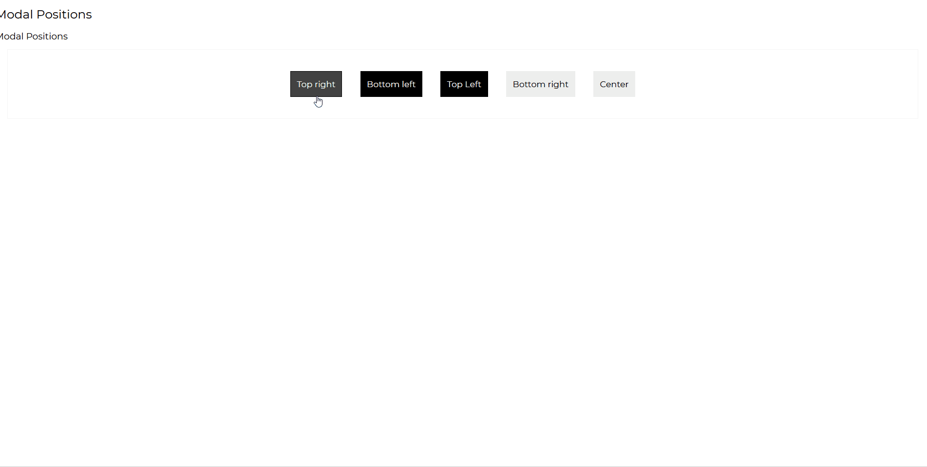
import React, { useState } from 'react';import {  CDBModal,  CDBModalHeader,  CDBModalBody,  CDBModalFooter,  CDBCardImage,  CDBCardBody,  CDBCardTitle,  CDBCardText,  CDBCard,  CDBBtn,  CDBContainer,} from 'cdbreact-pro';const [state, setState] = useState({  modal1: false,});const toggle = nr => () => {  let modalNumber = 'modal' + nr;  setState({    ...state,    [modalNumber]: !state[modalNumber],  });};
const Modal = () => { return ( <CDBContainer> <CDBBtn color="dark" flat onClick={toggle(6)}> Top right </CDBBtn> <CDBModal isOpen={state.modal6} toggle={toggle(6)} side position="top-right"> <CDBModalHeader toggle={toggle(6)}>Title</CDBModalHeader> <CDBModalBody> Lorem ipsum dolor sit amet, consectetur adipisicing elit, sed do eiusmod tempor incididunt ut labore et dolore magna aliqua. Ut enim ad minim veniam, quis nostrud exercitation ullamco laboris nisi ut aliquip ex ea commodo consequat. </CDBModalBody> <CDBModalFooter> <CDBBtn color="dark" flat onClick={toggle(6)}> Close </CDBBtn> <CDBBtn color="light" flat> Save changes </CDBBtn> </CDBModalFooter> </CDBModal> <CDBBtn color="dark" flat onClick={toggle(7)}> Bottom left </CDBBtn> <CDBModal isOpen={state.modal7} toggle={toggle(7)} side position="bottom-left"> <CDBModalHeader toggle={toggle(7)}>Title</CDBModalHeader> <CDBModalBody> Lorem ipsum dolor sit amet, consectetur adipisicing elit, sed do eiusmod tempor incididunt ut labore et dolore magna aliqua. Ut enim ad minim veniam, quis nostrud exercitation ullamco laboris nisi ut aliquip ex ea commodo consequat. </CDBModalBody> <CDBModalFooter> <CDBBtn color="dark" flat onClick={toggle(7)}> Close </CDBBtn> <CDBBtn color="light" flat> Save changes </CDBBtn> </CDBModalFooter> </CDBModal> <CDBBtn color="dark" flat onClick={toggle(8)}> Top Left </CDBBtn> <CDBModal isOpen={state.modal8} toggle={toggle(8)} side position="top-left"> <CDBModalHeader toggle={toggle(8)}>Title</CDBModalHeader> <CDBModalBody> Lorem ipsum dolor sit amet, consectetur adipisicing elit, sed do eiusmod tempor incididunt ut labore et dolore magna aliqua. Ut enim ad minim veniam, quis nostrud exercitation ullamco laboris nisi ut aliquip ex ea commodo consequat. </CDBModalBody> <CDBModalFooter> <CDBBtn color="dark" flat onClick={toggle(8)}> Close </CDBBtn> <CDBBtn color="light" flat> Save changes </CDBBtn> </CDBModalFooter> </CDBModal> <CDBBtn color="light" flat onClick={toggle(9)}> Bottom right </CDBBtn> <CDBModal isOpen={state.modal9} toggle={toggle(9)} side position="bottom-right"> <CDBModalHeader toggle={toggle(9)}>Title</CDBModalHeader> <CDBModalBody> Lorem ipsum dolor sit amet, consectetur adipisicing elit, sed do eiusmod tempor incididunt ut labore et dolore magna aliqua. Ut enim ad minim veniam, quis nostrud exercitation ullamco laboris nisi ut aliquip ex ea commodo consequat. </CDBModalBody> <CDBModalFooter> <CDBBtn color="dark" onClick={toggle(6)}> Close </CDBBtn> <CDBBtn color="light" flat> Save changes </CDBBtn> </CDBModalFooter> </CDBModal> <CDBBtn color="light" flat onClick={toggle(9)}> Center </CDBBtn> <CDBModal isOpen={state.modal9} toggle={toggle(9)} side> <CDBModalHeader toggle={toggle(9)}>Title</CDBModalHeader> <CDBModalBody> Lorem ipsum dolor sit amet, consectetur adipisicing elit, sed do eiusmod tempor incididunt ut labore et dolore magna aliqua. Ut enim ad minim veniam, quis nostrud exercitation ullamco laboris nisi ut aliquip ex ea commodo consequat. </CDBModalBody> <CDBModalFooter> <CDBBtn color="dark" onClick={toggle(6)}> Close </CDBBtn> <CDBBtn color="light" flat> Save changes </CDBBtn> </CDBModalFooter> </CDBModal> </CDBContainer> );};export default Modal;The props you get to use with the Contrast React Bootstrap 5 Modal component will be expanded on in this section. You'll learn what these props are for, how to utilize them in your code, and what their default values are.
Other choices for the CDBModal component are listed in the table below.
| Name | Type | Default | Description | Example |
|---|---|---|---|---|
| className | String | Adds custom modal-content classes | <CDBModal className="myClass" ... /> | |
| wrapperClassName | String | Adds custom class to wrapper container | <CDBModal wrapperClassName="myClass" ... /> | |
| modalClassName | String | Adds custom modal-dialog element | <CDBModal modalClassName="myClass" ... /> | |
| contentClassName | String | Adds custom modal-content classes | <CDBModal contentClassName="myClass" ... /> | |
| backdropClassName | String | Adds custom class to modal-backdrop element | <CDBModal backdropClassName="myClass" ... /> | |
| disableBackdrop | Boolean | false | Disable backdrop if this prop is true. | <CDBModal disableBackdrop .../> |
| animation | String | Changes direction of animation. Choose from top / bottom / right / left. | <CDBModal animation="bottom" ... /> | |
| autoFocus | Boolean | true | Defines if modal should receive focus | <CDBModal autoFocus={false} .../> |
| backdrop | Boolean | true | If false, the backdrop is not rendered. | <CDBModal backdrop={false} .../> |
| cascading | Boolean | false | Adds cascading-class to modal-dialog element | <CDBModal cascading .../> |
| centered | Boolean | false | Add custom class to modal-dialog element | <CDBModal centered .../> |
| disableFocusTrap | Boolean | true | If true, removes focus trap effect. | <CDBModal disableFocusTrap={false} .../> |
| fade | Boolean | true | Removes transition | <CDBModal fade={false} .../> |
| frame | Boolean | false | Changes the position of the modal. It has to be used along with position prop equal to bottom / top | <CDBModal frame position="bottom" .../> |
| fullHeight | Boolean | false | Changes the position of the modal. It has to be used along with position prop equal to bottom / top | <CDBModal fullHeight position="bottom" .../> |
| isOpen | Boolean | true | If true, removes focus trap effect. | <CDBModal isOpen={Modal} .../> |
| keyboard | Boolean | true | Closes the modal when the escape key is pressed. | <CDBModal keyboard={false} .../> |
| labelledBy | String | Changes aria-labelledby attribute | <CDBModal labelledBy="myLabel" ... /> | |
| modalStyle | String | Predefines modal style. Choose one of success / info / danger / warning. | <CDBModal modalStyle="warning" ... /> | |
| position | String | Changes the position of the modal | <CDBModal position="top-right" ... /> | |
| side | Boolean | false | Changes the position of the modal. It has to be used along with position prop equal to bottom-right/bottom-left/top-right/top-left | <CDBModal side position="bottom-left" .../> |
| size | String | Changes the size of the modal. Choose from sm / lg / fluid | <CDBModal size="fluid" ... /> | |
| toggle | function | Defines function which fires on close/open event | <CDBModal toggle={myFunction} ... /> | |
| hiddenModal | function | This event is fired after the modal is closed. | <CDBModal hiddenModal={myFunction} ... /> | |
| hideModal | function | This event is fired just before the modal is hidden. | <CDBModal hideModal={myFunction} ... /> | |
| showModal | function | This event is fired just before the modal is open. | <CDBModal showModal={myFunction} ... /> |
This section will elaborate on the props available with the React Bootstrap 5 ModalBody component. You'll discover what these props are used for, how to use them, and what their default values are.
Other CDBModalBody component prop options are listed in the table below.
| Name | Type | Default | Description | Example |
|---|---|---|---|---|
| className | String | Adds custom class ModalBody component | <CDBModalBody className="myClass" ... /> |
The props you get to use with the Contrast React Bootstrap 5 ModalFooter component will be expanded upon in this section. You'll learn what these props do, how to utilize them in your code, and what their default values are.
Other prop options for the CDBModalFooter component are listed in the table below.
| Name | Type | Default | Description | Example |
|---|---|---|---|---|
| className | String | Adds custom class ModalFooter component | <CDBModalFooter className="myClass" ... /> |
The props you get to use with the Contrast React Bootstrap 5 ModalHeader component will be expanded upon in this section. You'll learn what these props do, how to utilize them in your code, and what their default values are.
Other CDBModalHeader component prop possibilities are included in the table below.
| Name | Type | Default | Description | Example |
|---|---|---|---|---|
| className | String | Adds custom class ModalHeader component | <CDBModalHeader className="myClass" ... /> | |
| titleClass | String | Adds custom class to title element. | <CDBModalHeader titleClass="myTitleClass" ... /> | |
| closeArialLabel | String | Close | Defines custom label for close button | <CDBModalHeader closeArialLabel="myClass" ... /> |
| toggle | function | Defines function which fires on close/open event | <CDBModalHeader toggle={myFunction} ... /> | |
| tag | String | h4 | Defines custom tag for ModalHeader | <CDBModalHeader tag="h2" ... /> |
Build Tailwind websites visually and ship projects to production in minutes instead of days. Generates code from your designs to export to your favourite frameworks like React, Vue, Angular.
Trying to create components and pages for a web app or website from
scratch while maintaining a modern User interface can be very tedious.
This is why we created Contrast, to help drastically reduce the amount of time we spend doing that.
so we can focus on building some other aspects of the project.
Contrast Bootstrap PRO consists of a Premium UI Kit Library featuring over 10000+ component variants.
Which even comes bundled together with its own admin template comprising of 5 admin dashboards and 23+ additional admin and multipurpose pages for
building almost any type of website or web app.
See a demo and learn more about Contrast Bootstrap Pro by clicking here.
