
Visually build tailwind css projects 10x faster using AI
Build Tailwind websites visually and ship projects to production in minutes instead of days. Generates code from your designs to export to your favourite frameworks like React, Vue, Angular.

React Bootstrap 5 Panels are content wrappers that are both dynamic and expandable. They may hold a range of content, have contextual background colors, and have strong display choices. They're similar to cards, however they don't have any media attached to them.
Start by importing CDBPanel into your project to use the Contrast React Bootstrap 5 Panel component.
import { CDBPanel } from "cdbreact";In addition to the CDBPanel component, you import the CDBPanelTitle component to write titles in your pane, the CDBPaneText component to write texts or messages in your pane, and the CDBPaneImage component to write pane images.
import { CDBPanel, CDBPanelTitle, CDBPanelText } from "cdbreact"; We nest the Contrast React Bootstrap 5 Dropdown component in this tutorial section, CDBDropDown, in the CDBPanel component. We now have dropdowns in our panel as a result of this.

Chicago
import React from "react";import { CDBPanel, CDBPanelTitle, CDBPanelText, CDBDropDown, CDBDropDownToggle, CDBDropDownMenu, CDBDropDownItem, CDBPane, CDBIcon, CDBPaneImage, CDBContainer } from "cdbreact";
const Panel = () => { return ( <CDBContainer> <CDBPanel style={{ width: "25rem", borderRadius: "15px" }}> <CDBPane style={{display: "flex", flexDirection: "row", justifyContent: "space-between", alignItems: "center"}}> <div style={{display: "flex", flexDirection: "row", justifyContent: "space-between", alignItems: "center"}}> <CDBPaneImage style={{width: "4rem", height: "4rem"}} src="https://media.istockphoto.com/photos/beautiful-woman-wearing-brown-curly-hairstyle-picture-id495006065?s=170x170" alt="paneImage"/> <div style={{marginLeft: "12px"}}> <CDBPanelTitle style={{ fontWeight: "600" }}>Warren Briggs</CDBPanelTitle> <CDBPanelText small>Chicago</CDBPanelText> </div> </div> <CDBDropDown className="ms-auto"> <CDBDropDownToggle color="white"><CDBIcon className="text-muted" fas icon="ellipsis-h" /></CDBDropDownToggle> <CDBDropDownMenu> <CDBDropDownItem disabled>Action</CDBDropDownItem> <CDBDropDownItem divider /> <CDBDropDownItem>Another action</CDBDropDownItem> <CDBDropDownItem>Something else here</CDBDropDownItem> </CDBDropDownMenu> </CDBDropDown> </CDBPane> <CDBPanelText className="my-3"> Lorem ipsum dolor sit amet, consectetur adipisicing elit, sed do eiusmod tempor incididunt ut labore et dolore magna aliqua. Ut enim ad minim veniam, quis nostrud exercitation ullamco laboris nisi ut aliquip ex ea commodo </CDBPanelText> <CDBPanelText style={{ fontWeight: "600" }} small> <CDBIcon far icon="thumbs-up" />127 likes <CDBIcon className="ms-2" far icon="comment" style={{marginLeft: "15px"}}/>54 comments </CDBPanelText> </CDBPanel> </CDBContainer> );};export default Panel;In this tutorial section, we nest the CDBPaneImage component in the CDBPanel component. With this, our panel now has user images in it.
Lorem ipsum dolor sit amet, consectetur adipisicing elit, sed do eiusmod tempor incididunt ut labore et dolore magna aliqua.
import React from "react";import { CDBPanel,CDBPanelTitle, CDBPanelText, CDBCardImage, CDBPaneImage, CDBContainer } from "cdbreact";
const Panel = () => {  return (    <CDBContainer>            <CDBPanel  style={{ width: "20rem", borderRadius: "15px" }}>                  <CDBCardImage  style={{ borderRadius: "8px" }} src="https://images.unsplash.com/photo-1581274050302-581149d3b4c5?ixlib=rb-4.0.3&ixid=MnwxMjA3fDB8MHxwaG90by1wYWdlfHx8fGVufDB8fHx8&auto=format&fit=crop&w=1374&q=80" />                  <div style={{padding: "0.6rem"}}>                    <CDBPanelTitle tag="h4" style={{ fontWeight: "600" }}>Bristol</CDBPanelTitle>                    <CDBPanelText className="my-3">                      Lorem ipsum dolor sit amet, consectetur adipisicing elit, sed do eiusmod                      tempor incididunt ut labore et dolore magna aliqua.                    </CDBPanelText>                    <div style={{display: "flex", flexDirection: "row", justifyContent: "space-between", alignItems: "center", paddingLeft: "12px", paddingRight: "32px"}}>                    <CDBPaneImage style={{width: "3rem", height: "3rem}} src="https://i.imgur.com/eltDhxZ.png"/>                    <CDBPaneImage style={{width: "3rem", height: "3rem}}   src="https://media.istockphoto.com/photos/beautiful-woman-wearing-brown-curly-hairstyle-picture-id495006065?s=170x170"/>                    <CDBPaneImage style={{width: "3rem", height: "3rem}}  src="https://encrypted-tbn0.gstatic.com/images?q=tbn%3AANd9GcQ7ntUU7AzmOxa5HB8zS83sa-JFHEfZJAoI2A&usqp=CAU" alt="Contrast React Bootstrap 5 Panel With Progress component" />                    </div>                                     </div>                </CDBPanel>    </CDBContainer>  );};


export default Panel;In this tutorial section, we nest the CDBBadge component in the CDBPanel component. With this, our panel now has badges in it, which can serve as labels.
import React from "react";import { CDBPanel,CDBPanelTitle, CDBPanelText, CDBBadge, CDBIcon, CDBPaneImage, CDBContainer } from "cdbreact";
const Panel = () => { return ( <CDBContainer> <CDBPanel style={{ width: "22rem", borderRadius: "15px" }}> <div style={{display: "flex", flexDirection: "row", justifyContent: "start", alignItems: "start"}}> <CDBBadge style={{borderRadius: "0px", fontSize: "10px", color: "white", marginRight: "12px", backgroundColor: "black" }}>Label 1</CDBBadge> <CDBBadge style={{borderRadius: "0px", fontSize: "10px", color: "white", marginRight: "12px", backgroundColor: "#f9e076"}}>Label 2</CDBBadge> <CDBBadge style={{borderRadius: "0px", fontSize: "10px", color: "white", marginRight: "12px" , backgroundColor: "#e3242b"}} >Label 3</CDBBadge> </div> <div className="mt-3 d-flex align-items-center"> <CDBPanelTitle tag="h3" style={{fontWeight: "700"}} >Moon Fevers</CDBPanelTitle> </div> <CDBPanelText className="my-3"> Lorem ipsum dolor sit amet, consectetur adipisicing elit, sed do eiusmod tempor incididunt </CDBPanelText> <CDBPaneImage style={{height: 3rem , width: "3rem"}} src="https://media.istockphoto.com/photos/beautiful-woman-wearing-brown-curly-hairstyle-picture-id495006065?s=170x170 style={{marginRight: "22px"}}/> <CDBPaneImage style={{height: "3rem", width: "3rem"}} src="https://encrypted-tbn0.gstatic.com/images?q=tbn%3AANd9GcQ7ntUU7AzmOxa5HB8zS83sa-JFHEfZJAoI2A&usqp=CAU" /> </CDBPanel> </CDBContainer> );};export default Panel;My Messages
Cooking
6mins Ago
Cooking
10mins Ago
Cooking
15mins Ago
Cooking
30mins Ago
Cooking
45mins Ago
import React from "react";import { CDBPanel,CDBPanelTitle, CDBPanelText, CDBDropDown, CDBDropDownToggle, CDBDropDownMenu, CDBDropDownItem, CDBPane, CDBIcon, CDBPaneImage, CDBContainer } from "cdbreact";
const Panel = () => { return ( <CDBContainer> <CDBPanel style={{ width: "22rem", borderRadius: "15px" }}> <CDBPane> <CDBPanelText muted>My Messages</CDBPanelText> <CDBDropDown className="ms-auto"> <CDBDropDownToggle color="white"><CDBIcon className="text-muted" fas icon="ellipsis-h" /></CDBDropDownToggle> <CDBDropDownMenu> <CDBDropDownItem disabled>Edit Profile</CDBDropDownItem> <CDBDropDownItem divider /> <CDBDropDownItem>Action 1</CDBDropDownItem> <CDBDropDownItem>Action 2</CDBDropDownItem> </CDBDropDownMenu> </CDBDropDown> </CDBPane> <CDBPane style={{marginTop: "12px" , display: "flex", flexDirection: "row", justifyContent: "between", alignItems: "center" }}> <div style={{display: "flex" , flexDirection: "start", alignItems: "start", flex: 1}}> <CDBPaneImage style={{height: "3rem", width: "3rem"}} src="https://encrypted-tbn0.gstatic.com/images?q=tbn%3AANd9GcQ7ntUU7AzmOxa5HB8zS83sa-JFHEfZJAoI2A&usqp=CAU" /> <div style={{marginLeft: "12px"}}> <CDBPanelTitle style={{ fontWeight: "600" }}>Warren Briggs</CDBPanelTitle> <CDBPanelText small>Cooking</CDBPanelText> </div> </div> <div style={{flex: 0.5}}> <CDBPanelText muted small style={{textAlign: "end"}}>5mins ago</CDBPanelText> </div> </CDBPane> <CDBPane style={{marginTop: "12px" , display: "flex", flexDirection: "row", justifyContent: "between", alignItems: "center" }}> <div style={{display: "flex" , flexDirection: "start", alignItems: "start", flex: 1}}> <CDBPaneImage style={{height: "3rem", width: "3rem"}} src="https://media.istockphoto.com/photos/beautiful-woman-wearing-brown-curly-hairstyle-picture-id495006065?s=170x170" /> <div style={{marginLeft: "12px"}}> <CDBPanelTitle style={{ fontWeight: "600" }}>Lu Chen</CDBPanelTitle> <CDBPanelText small>Cooking</CDBPanelText> </div> </div> <div style={{flex: 0.5}}> <CDBPanelText muted small style={{textAlign: "end"}}>10mins ago</CDBPanelText> </div> </CDBPane> <CDBPane style={{marginTop: "12px" , display: "flex", flexDirection: "row", justifyContent: "between", alignItems: "center" }}> <div style={{display: "flex" , flexDirection: "start", alignItems: "start", flex: 1}}> <CDBPaneImage style={{height: "3rem", width: "3rem"}} src="https://i.imgur.com/eltDhxZ.png"/> <div style={{marginLeft: "12px"}}> <CDBPanelTitle style={{ fontWeight: "600" }}>Sam</CDBPanelTitle> <CDBPanelText small>Cooking</CDBPanelText> </div> </div> <div style={{flex: 0.5}}> <CDBPanelText muted small style={{textAlign: "end"}}>15mins ago</CDBPanelText> </div> </CDBPane> <CDBPane style={{marginTop: "12px" , display: "flex", flexDirection: "row", justifyContent: "between", alignItems: "center" }}> <div style={{display: "flex" , flexDirection: "start", alignItems: "start", flex: 1}}> <CDBPaneImage style={{height: "3rem", width: "3rem"}} src="https://media.istockphoto.com/photos/beautiful-woman-wearing-brown-curly-hairstyle-picture-id495006065?s=170x170" /> <div style={{marginLeft: "12px"}}> <CDBPanelTitle style={{ fontWeight: "600" }}>Danny</CDBPanelTitle> <CDBPanelText small>Cooking</CDBPanelText> </div> </div> <div style={{flex: 0.5}}> <CDBPanelText muted small style={{textAlign: "end"}}>30mins ago</CDBPanelText> </div> </CDBPane> <CDBPane style={{marginTop: "12px" , display: "flex", flexDirection: "row", justifyContent: "between", alignItems: "center" }}> <div style={{display: "flex" , flexDirection: "start", alignItems: "start", flex: 1}}> <CDBPaneImage style={{height: "3rem", width: "3rem"}} src="https://media.istockphoto.com/photos/beautiful-woman-wearing-brown-curly-hairstyle-picture-id495006065?s=170x170" /> <div style={{marginLeft: "12px"}}> <CDBPanelTitle style={{ fontWeight: "600" }}>Lilah Loselev</CDBPanelTitle> <CDBPanelText small>Cooking</CDBPanelText> </div> </div> <div style={{flex: 0.5}}> <CDBPanelText muted small style={{textAlign: "end"}}>45mins ago</CDBPanelText> </div> </CDBPane> </CDBPanel> </CDBContainer> );};export default Panel;Along with the 'CDBPanel' component, we use other React Bootstrap 5 Components in this tutorial. These components are the CDBDropDown for our panel dropdowns, CDBProgress to have progress bars in our panels, CDBPane, and the CDBIcon component for icons in our panels. Check out the docs to get more insight.
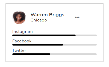
import React from "react";import { CDBPanel,CDBPanelTitle, CDBPanelText, CDBDropDown, CDBDropDownToggle, CDBDropDownMenu, CDBDropDownItem, CDBProgress, CDBPane, CDBIcon, CDBPaneImage, CDBContainer } from "cdbreact";
const Panel = () => { return ( <CDBContainer> <CDBPanel style={{ width: "320px", borderRadius: "15px" }}> <CDBPane> <div style={{display: "flex" , flex: 1, }}> <CDBPaneImage size="md" src="/img/pane/pane1.png" /> <div style={{marginTop: "6px" , marginLeft: "12px"}}> <CDBPanelTitle style={{ fontWeight: "600" }}>Warren Briggs</CDBPanelTitle> <CDBPanelText small>Chicago</CDBPanelText> </div> </div> <CDBDropDown style={{flex: 0.5}}> <CDBDropDownToggle color="white"><CDBIcon className="text-muted" fas icon="ellipsis-h" /></CDBDropDownToggle> <CDBDropDownMenu> <CDBDropDownItem disabled>Edit Profile</CDBDropDownItem> <CDBDropDownItem divider /> <CDBDropDownItem>Action 1</CDBDropDownItem> <CDBDropDownItem>Action 2</CDBDropDownItem> </CDBDropDownMenu> </CDBDropDown> </CDBPane> <CDBPanelText style={{ fontWeight: "600", marginTop: "15px" }} small>Instagram</CDBPanelText> <CDBProgress value={75} height={5}></CDBProgress> <CDBPanelText style={{ fontWeight: "600", marginTop: "15px" }} small>Facebook</CDBPanelText> <CDBProgress value={60} height={5}></CDBProgress> <CDBPanelText style={{ fontWeight: "600", marginTop: "15px" }} small>Twitter</CDBPanelText> <CDBProgress value={45} height={5}></CDBProgress> </CDBPanel> </CDBContainer> );};export default Panel;This session will increase your understanding of the props accessible with the React Bootstrap 5 Pane component. You'll discover what these properties do, what their default values are, and how to use them in your code.
Other prop options for the CDBPanel component are included in the table below.
| Name | Type | Default | Description | Example |
|---|---|---|---|---|
| className | String | Adds custom classes | <CDBPanel className="myClass" ... /> | |
| tag | String | div | Changes default tag | <CDBPanel tag="input" ... /> |
| color | string | Sets the color of the panel | <CDBPanel color="#000" .../> |
The table below provides the various prop options for the CDBPanelTitle component.
| Name | Type | Default | Description | Example |
|---|---|---|---|---|
| className | String | Adds custom classes | <CDBPanelTitle className="myClass" ... /> | |
| tag | String | h6 | Changes default tag | <CDBPanelTitle tag="h5" ... /> |
The table below provides the various prop options for the 'CDBPanelText' component.
| Name | Type | Default | Description | Example |
|---|---|---|---|---|
| className | String | Adds custom classes | <CDBPanelText className="myClass" ... /> | |
| tag | String | p | Changes default tag | <CDBPanelText tag="p" ... /> |
| small | Boolean | false | Uses html small as component's tag | <CDBPanelText small ... /> |
| muted | Boolean | false | Mutes the text color | <CDBPanelText muted ... /> |
Build Tailwind websites visually and ship projects to production in minutes instead of days. Generates code from your designs to export to your favourite frameworks like React, Vue, Angular.
Trying to create components and pages for a web app or website from
scratch while maintaining a modern User interface can be very tedious.
This is why we created Contrast, to help drastically reduce the amount of time we spend doing that.
so we can focus on building some other aspects of the project.
Contrast Bootstrap PRO consists of a Premium UI Kit Library featuring over 10000+ component variants.
Which even comes bundled together with its own admin template comprising of 5 admin dashboards and 23+ additional admin and multipurpose pages for
building almost any type of website or web app.
See a demo and learn more about Contrast Bootstrap Pro by clicking here.
