Visually build tailwind css projects 10x faster using AI
Build Tailwind websites visually and ship projects to production in minutes instead of days. Generates code from your designs to export to your favourite frameworks like React, Vue, Angular.

The React Bootstrap 5 Progress bar is a component that shows the state of a user-interactive process. Their color, shape, and animation can all be modified.
If your website takes too long to load, a simple progress bar will relieve your user's anxiety. The content you're looking for will load in a few seconds.
Import CDBProgress into your project to use the React Bootstrap 5 Progress component. You can also use circular progress bars with the Contrast React Bootstrap. To do so, add the CDBCircularProgress component to your project.
import { CDBProgress, CDBCircularProgress} from "cdbreact";The CDBCircularProgress component accepts a 'value' parameter that represents the progression of the metric we are trying to measure.
The max prop displays the progress bar's maximum value, whereas the min prop displays the progress bar's minimum value. You can write text on your progress bar with the text attribute. To alter the background color of your progress bar, use the color prop.
import React from "react";import { CDBCircularProgress, CDBContainer } from "cdbreact";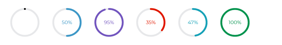
export const Progress = () => { return ( <CDBContainer> <CDBCircularProgress value={25} max={100} min={0} text={`${25}%`} /> <CDBCircularProgress value={50} max={100} min={0} text={`${50}%`} color="primary" /> <CDBCircularProgress value={95} max={100} min={0} color="secondary" text={`${95}%`} /> <CDBCircularProgress value={35} max={100} min={0} color="danger" text={`${35}%`} /> <CDBCircularProgress value={47} max={100} min={0} color="info" text={`${47}%`} /> <CDBCircularProgress value={100} max={100} min={0} color="success" text={`${100}%`} /> </CDBContainer> );};You can use the size attribute to determine how big or small you want your progress bar to be.
import React from "react";import { CDBCircularProgress, CDBContainer } from "cdbreact";
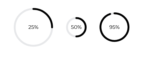
export const Progress = () => { return ( <CDBContainer> <CDBCircularProgress value={25} max={100} min={0} text={`${25}%`} size="lg" /> <CDBCircularProgress value={50} max={100} min={0} text={`${50}%`} size="sm" /> <CDBCircularProgress value={95} max={100} min={0} text={`${95}%`} size="md" /> </CDBContainer> );};
import React from "react";import { CDBProgress, CDBContainer } from "cdbreact";
export const Progress = () => {  return (    <CDBContainer>              <CDBProgress value={69} text={`${69}%`}/>    </CDBContainer>  );};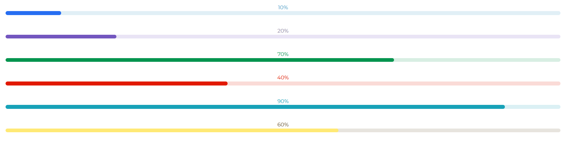
import React from "react";import { CDBProgress, CDBContainer } from "cdbreact";
export const Progress = () => {  return (    <CDBContainer>              <CDBProgress                value={10}                text={`${10}%`}                colors="primary"              />              <CDBProgress                value={20}                text={`${20}%`}                colors="secondary"              />              <CDBProgress                value={70}                text={`${70}%`}                colors="success"              />              <CDBProgress                value={40}                text={`${40}%`}                colors="danger"              />              <CDBProgress                value={90}                text={`${90}%`}                colors="info"              />              <CDBProgress                value={60}                text={`${60}%`}                colors="warning"              />    </CDBContainer>  );};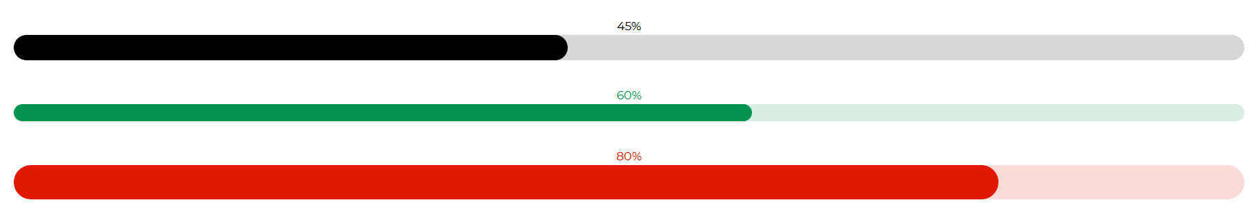
import React from "react";import { CDBProgress, CDBContainer } from "cdbreact";
export const Progress = () => { return ( <CDBContainer> <CDBProgress value={45} colors="dark" height={30} text={`${45}%`} /> <CDBProgress value={60} colors="success" height={20} text={`${60}%`} /> <CDBProgress value={80} colors="danger" height={40} text={`${80}%`} /> </CDBContainer> );};This section will expand on the props available with the React Bootstrap 5 Progress component. You'll discover what these props are for, how to use them, and what their default values are.
Other prop options of the CDBProgress and CDBCircularProgress components are included in the table below.
| Name | Type | Default | Description | Example |
|---|---|---|---|---|
| className | String | Adds custom classes to bar wrapper | <CDBProgress className="myClass" ... /> | |
| barClassName | String | Adds custom classes to colorful bar | <CDBProgress barClassName="myClass" ... /> | |
| tag | String | div | Changes default input tag | <CDBProgress tag="input" ... /> |
| disable | Boolean | false | Disables Progress component | <CDBProgress disabled .../> |
| colors | String | dark | Changes bar color; accepts CDB predefined color classes | <CDBProgress colors="primary" ... /> |
| height | String | 10px | Sets custom height of the bar | <CDBProgress height="50px" ... /> |
| max | Number | 100 | Sets maximum value of progress bar | <CDBProgress max={200} ... /> |
| min | Number | 0 | Sets minimum value of progress bar | <CDBProgress min={0} ... /> |
| value | Number | 0 | Sets current value of progress bar | <CDBProgress value={40} ... /> |
| wrapperStyle | Object | {} | Sets additional inline styles for bar's wrapper | <CDBProgress wrapperStyle={{width: "50%"}} ... /> |
Build Tailwind websites visually and ship projects to production in minutes instead of days. Generates code from your designs to export to your favourite frameworks like React, Vue, Angular.
Trying to create components and pages for a web app or website from
scratch while maintaining a modern User interface can be very tedious.
This is why we created Contrast, to help drastically reduce the amount of time we spend doing that.
so we can focus on building some other aspects of the project.
Contrast Bootstrap PRO consists of a Premium UI Kit Library featuring over 10000+ component variants.
Which even comes bundled together with its own admin template comprising of 5 admin dashboards and 23+ additional admin and multipurpose pages for
building almost any type of website or web app.
See a demo and learn more about Contrast Bootstrap Pro by clicking here.
