Visually build tailwind css projects 10x faster using AI
Build Tailwind websites visually and ship projects to production in minutes instead of days. Generates code from your designs to export to your favourite frameworks like React, Vue, Angular.

Bootstrap 5 Widgets are third-party applications that are embedded into the website's body as a stand-alone feature.
An example of a website widget is the direct contact widget, which allows your users to contact you easily like the one found on our website.
In this tutorial we use the CDBCard component to create our widgets. Check our docs for more information on the CDBCard component.
import { CDBCard, CDBCardBody, CDBCardTitle, CDBCardText, CDBCardImage } from "cdbreact";
techlead
Lorem ipsum dolor sit amet, consectetur adipisicing elit, sed do eiusmod tempor incididunt ut labore et dolore magna aliqua. Ut enim ad minim veniam, quis nostrud exercitation ullamco laboris nisi ut aliquip ex ea commodo
import React from "react";import { CDBCard, CDBDropDown, CDBDropDownMenu, CDBDropDownToggle, CDBDropDownItem, CDBPane, CDBPaneImage, CDBCardImage, CDBBtn, CDBCardBody, CDBCardTitle, CDBCardText, CDBIcon, CDBContainer } from "cdbreact";
export const Card = () => {  return (    <CDBContainer>          <CDBCard style={{width: "25rem"}}>            <CDBCardBody className="p-1">              <CDBPane className="border-bottom p-3">                <CDBPaneImage size="xs" src="https://media.istockphoto.com/photos/beautiful-woman-wearing-brown-curly-hairstyle-picture-id495006065?s=170x170" />                <CDBCardText className="m-0 ms-3">techlead</CDBCardText>                <CDBDropDown className="ms-auto">                  <CDBDropDownToggle color="white"><CDBIcon className="text-muted" fas icon="ellipsis-h" /></CDBDropDownToggle>                  <CDBDropDownMenu>                    <CDBDropDownItem disabled>Edit Profile</CDBDropDownItem>                    <CDBDropDownItem divider />                    <CDBDropDownItem>Action 1</CDBDropDownItem>                    <CDBDropDownItem>Action 2</CDBDropDownItem>                  </CDBDropDownMenu>                </CDBDropDown>              </CDBPane>              <CDBCardImage                className="img-fluid my-3"                src="https://cdn.pixabay.com/photo/2015/04/23/22/00/tree-736885__340.jpg"              />              <div className="mx-2 mb-4">                <CDBCardTitle>A Dummy blog title sample</CDBCardTitle>                <CDBCardText className="text-muted mb-5">Lorem ipsum dolor sit amet, consectetur adipisicing elit, sed do eiusmod                tempor incididunt ut labore et dolore magna aliqua. Ut enim ad minim veniam,                quis nostrud exercitation ullamco laboris nisi ut aliquip ex ea commodo</CDBCardText>                <div>                  <CDBBtn color="dark" className="py-1 me-2"><CDBIcon className="ps-0" fas icon="arrow-up"/>11</CDBBtn>                  <CDBBtn color="dark" className="py-1"><CDBIcon className="ps-0" fas icon="arrow-down"/>2</CDBBtn>                </div>                <div className="my-2">                  <CDBBtn flat color="none" className="p-0"><CDBIcon far icon="comments"/>21.4k</CDBBtn>                  <CDBBtn flat color="none" className="p-0 mx-4"><CDBIcon fas icon="share"/>Share</CDBBtn>                  <CDBBtn color="warning" className="py-1"><CDBIcon far icon="save"/>Save</CDBBtn>                </div>              </div>            </CDBCardBody>          </CDBCard>    </CDBContainer>  );};
Our widget above has a dropdown, icons, and buttons. To have these things in your project you would have to import the CDBDropDown ( and dropdown affiliated components, see in the docs), CDBIcons, CDBBtn.
We also import CDBPane for the top of this widget.
Oct 1 - Dec 31, Worldwide
import React from "react";import { CDBCard, CDBCardBody, CDBCardTitle, CDBCardText, CDBIcon, CDBContainer } from "cdbreact";
export const Card = () => { return ( <CDBContainer> <CDBCard style={{width: "25rem"}}> <CDBCardBody> <CDBCardTitle className="lead">Total Downloads</CDBCardTitle> <CDBCardTitle tag="h2">1,057,891</CDBCardTitle> <CDBCardText className="small text-muted">Oct 1 - Dec 31,<CDBIcon fas icon="globe"/> Worldwide</CDBCardText> </CDBCardBody> </CDBCard> </CDBContainer> );};Oct 1 - Dec 31, Worldwide
27.4%Since last quarter
import React from "react";import { CDBCard, CDBCardBody, CDBCardTitle, CDBCardText, CDBIcon, CDBContainer } from "cdbreact";
export const Card = () => { return ( <CDBContainer> <CDBCard style={{width: "25rem"}}> <CDBCardBody> <CDBIcon size="2x" className="p-4 bg-primary" fas icon="chart-line"/> <CDBCardTitle className="lead">Customers</CDBCardTitle> <CDBCardTitle tag="h2">852k</CDBCardTitle> <CDBCardText className="small text-muted">Oct 1 - Dec 31,<CDBIcon fas icon="globe"/> Worldwide</CDBCardText> <CDBCardText className="text-success"> <CDBIcon fas icon="angle-up"/> 27.4% <span style={{fontSize:"0.9em"}} className="ms-2 text-muted">Since last quarter</span> </CDBCardText> </CDBCardBody> </CDBCard> </CDBContainer> );};Manage billing information and view receipts
Billed August 21, 2019
Billed July 21, 2019
import React from "react";import { CDBCard, CDBPane, CDBBtn, CDBCardBody, CDBCardTitle, CDBCardText, CDBContainer } from "cdbreact";
export const Card = () => {  return (    <CDBContainer>          <CDBCard style={{width: "25rem"}}>            <CDBCardBody className="p-0">              <CDBPane className="py-3 px-3 border-bottom">                <div>                  <CDBCardTitle className="mb-3 mt-0 lead" >Order History</CDBCardTitle>                  <CDBCardText className="text-muted">Manage billing information and view receipts</CDBCardText>                </div>              </CDBPane>              <CDBPane className="py-3 px-3 border-bottom">                <div>                  <CDBCardTitle className="mb-3 mt-0 h6" >Invoice #120345</CDBCardTitle>                  <CDBCardText className="text-muted">Billed August 21, 2019</CDBCardText>                </div>                <CDBBtn outline size="small" className="ms-auto" color="success" flat>Pay now</CDBBtn>              </CDBPane>              <CDBPane className="py-3 px-3">                <div>                  <CDBCardTitle className="mb-3 mt-0 h6" >Invoice #120344</CDBCardTitle>                  <CDBCardText className="text-muted">Billed July 21, 2019</CDBCardText>                </div>              </CDBPane>            </CDBCardBody>          </CDBCard>    </CDBContainer>  );};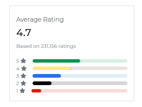
import React from "react";import { CDBCard, CDBProgress, CDBRating, CDBCardBody, CDBCardTitle, CDBCardText, CDBIcon, CDBContainer } from "cdbreact";
export const Card = () => { return ( <CDBContainer> <CDBCard style={{width: "25rem"}}> <CDBCardBody> <CDBCardTitle className="lead">Average Rating</CDBCardTitle> <CDBCardTitle tag="h2">4.7</CDBCardTitle> <CDBRating feedback/> <CDBCardText className="text-muted">Based on 231,156 ratings</CDBCardText> <div className="text-muted"> <div className="d-flex align-items-center"> <span>5</span> <CDBIcon fas icon="star" className="me-3"/> <CDBProgress value={50} colors="success"/> </div> <div className="d-flex align-items-center"> <span>4</span> <CDBIcon fas icon="star" className="me-3"/> <CDBProgress value={40} colors="warning"/> </div> <div className="d-flex align-items-center"> <span>3</span> <CDBIcon fas icon="star" className="me-3"/> <CDBProgress value={30} colors="primary"/> </div> <div className="d-flex align-items-center"> <span>2</span> <CDBIcon fas icon="star" className="me-3"/> <CDBProgress value={20} colors="dark"/> </div> <div className="d-flex align-items-center"> <span>1</span> <CDBIcon fas icon="star" className="me-3"/> <CDBProgress value={10} colors="danger"/> </div> </div> </CDBCardBody> </CDBCard> </CDBContainer> );};Organized by University of Oxford
Time: 6:00AM
Place: Cambridge Boat Club, Cambridge
Organized by University of Oxford
Thu, 12 Sep - Sat, 18 Sep 2020
Place: Denver Expo Club, USA
Organized by University of Oxford
Fri, 20 Sep - Mon, 07 Oct 2020
Place: Toronto , Canada
See All
import React from "react";import { CDBCard, CDBPane, CDBCardBody, CDBCardTitle, CDBCardText, CDBIcon, CDBContainer } from "cdbreact";
export const Card = () => { return ( <CDBContainer> <CDBCard style={{width: "25rem"}}> <CDBCardTitle className="lead p-4 border-bottom">Events</CDBCardTitle> <CDBCardBody className="py-0"> <CDBPane className="border-bottom pb-2"> <CDBIcon size="4x" far icon="calendar-alt text-danger"/> <div className="ms-3"> <CDBCardTitle className="mb-1 font-weight-bold lead">New market Nights</CDBCardTitle> <CDBCardText className="mb-2">Organized by University of Oxford</CDBCardText> <CDBCardText className="mb-0 small text-muted">Time: 6:00AM</CDBCardText> <CDBCardText className="mb-0 small text-muted">Place: Cambridge Boat Club, Cambridge</CDBCardText> </div> </CDBPane> <CDBPane className="border-bottom pb-2"> <CDBIcon size="4x" far icon="calendar-alt text-danger"/> <div className="ms-3"> <CDBCardTitle className="mb-1 font-weight-bold lead">Noco Hemp Expo</CDBCardTitle> <CDBCardText className="mb-2">Organized by University of Oxford</CDBCardText> <CDBCardText className="mb-0 small text-muted">Thu, 12 Sep - Sat, 18 Sep 2020</CDBCardText> <CDBCardText className="mb-0 small text-muted">PPlace: Denver Expo Club, USA</CDBCardText> </div> </CDBPane> <CDBPane className="pb-2"> <CDBIcon size="4x" far icon="calendar-alt text-danger"/> <div className="ms-3"> <CDBCardTitle className="mb-1 font-weight-bold lead">Canadian National Exhibition (CNE)</CDBCardTitle> <CDBCardText className="mb-2">Organized by University of Oxford</CDBCardText> <CDBCardText className="mb-0 small text-muted">Fri, 20 Sep - Mon, 07 Oct 2020</CDBCardText> <CDBCardText className="mb-0 small text-muted">Place: Toronto , Canada</CDBCardText> </div> </CDBPane> </CDBCardBody> <CDBCardText className="p-4 text-center pointer border-top">See All</CDBCardText> </CDBCard> </CDBContainer> );};We use CDBCheckbox to enable our widget have checkboxes in them.
Get Rocket news, announcements, and product updates
Get important notifications about you or activity you've missed
Get an email when a Dribbble Meetup is posted close to my location
import React from "react";import { CDBCard, CDBPane, CDBCheckbox, CDBCardBody, CDBCardTitle, CDBContainer } from "cdbreact";
export const Card = () => { return ( <CDBContainer> <CDBCard style={{width: "25rem"}}> <CDBCardBody className="py-0"> <CDBCardTitle className="lead m-0 py-3 border-bottom">Alerts & Notifications</CDBCardTitle> <CDBPane className="py-3 border-bottom"> <div> <CDBCardTitle className="my-0 mb-2 h6" >Company News</CDBCardTitle> <p className="small m-0">Get Rocket news, announcements, and product updates</p> </div> <CDBCheckbox className="ms-auto"/> </CDBPane> <CDBPane className="py-3 border-bottom"> <div> <CDBCardTitle className="my-0 mb-2 h6" >Account Activity</CDBCardTitle> <p className="small m-0">Get important notifications about you or activity you've missed</p> </div> <CDBCheckbox className="ms-auto"/> </CDBPane> <CDBPane className="py-3"> <div> <CDBCardTitle className="my-0 mb-2 h6" >Meetups Near You</CDBCardTitle> <p className="small m-0">Get an email when a Dribbble Meetup is posted close to my location</p> </div> <CDBCheckbox className="ms-auto"/> </CDBPane> </CDBCardBody> </CDBCard> </CDBContainer> );};In this section you will find advanced information about these widgets. You will find out which modules are required, what are the possibilities of configuring the component, and what events and methods you can use to work with it.
The table below shows the configuration options of the CDBCard component.
| Name | Type | Default | Description | Example |
|---|---|---|---|---|
| className | String | Adds custom classes | <CDBCard className="myClass" ... /> | |
| tag | String | div | Changes default input tag | <CDBCard tag="div" ... /> |
| color | String | Sets background color | <CDBCard color="dark" .../> | |
| border | Boolean | false | Gives border | <CDBCard border .../> |
The table below shows the configuration options of the CDBCardBody component.
| Name | Type | Default | Description | Example |
|---|---|---|---|---|
| className | String | Adds custom classes | <CDBCardBody className="myClass" ... /> | |
| tag | function or String | div | Changes default html tag | <CDBCardBody tag="div" ... /> |
| cascade | Boolean | false | Switches the CardBody to cascade style mode | <CDBCardBody cascade .../> |
The table below shows the configuration options of the CDBCardImage component.
| Name | Type | Default | Description | Example |
|---|---|---|---|---|
| className | String | Adds custom classes | Adds custom classes | <CDBCardImage className="myClass" ... /> |
| tag | function or String | img | Changes default html tag | <CDBCardImage tag="div" ... /> |
| cascade | Boolean | false | Switches the CardBody to cascade style mode | <CDBCardImage cascade .../> |
| hover | Boolean | false | Switches on hover behaviour | <CDBCardImage hover .../> |
| overlay | String | white-light | Sets the color of hover overlay | <CDBCardImage overlay="white-light" ... /> |
| src | String | Source of the image | <CDBCardImage src="image_src" ... /> | |
| top | Boolean | false | Makes image fluid | <CDBCardImage top .../> |
The table below shows the configuration options of the CDBCardText component.
| Name | Type | Default | Description | Example |
|---|---|---|---|---|
| className | String | Adds custom classes | <CDBCardText className="myClass" ... /> | |
| tag | function or String | p | Changes default html tag | <CDBCardText tag="p" ... /> |
| muted | Boolean | false | Mutes the text color | <CDBCardText muted .../> |
| small | Boolean | false | Uses html small as component's tag | <CDBCardText small .../> |
The table below shows the configuration options of the CDBCardTitle component.
| Name | Type | Default | Description | Example |
|---|---|---|---|---|
| className | String | Adds custom classes | <CDBCardTitle className="myClass" ... /> | |
| tag | function or String | h4 | Changes default html tag | <CDBCardTitle tag="h1" ... /> |
| sub | Boolean | false | Styles title as subtitle | <CDBCardTitle sub .../> |
Build Tailwind websites visually and ship projects to production in minutes instead of days. Generates code from your designs to export to your favourite frameworks like React, Vue, Angular.
Trying to create components and pages for a web app or website from
scratch while maintaining a modern User interface can be very tedious.
This is why we created Contrast, to help drastically reduce the amount of time we spend doing that.
so we can focus on building some other aspects of the project.
Contrast Bootstrap PRO consists of a Premium UI Kit Library featuring over 10000+ component variants.
Which even comes bundled together with its own admin template comprising of 5 admin dashboards and 23+ additional admin and multipurpose pages for
building almost any type of website or web app.
See a demo and learn more about Contrast Bootstrap Pro by clicking here.
