Visually build tailwind css projects 10x faster using AI
Build Tailwind websites visually and ship projects to production in minutes instead of days. Generates code from your designs to export to your favourite frameworks like React, Vue, Angular.

The React Bootstrap 5 Select component is the pro version of the React Bootstrap 5 Select2 component,, CDBSelect. For your select button, there are several predefined styles. To use in your project, get the CDB pro version.
Import 'CDBSelect2' into your app to use the Contrast React Bootstrap 5 Rating component.
import { CDBSelect2 } from "cdbreact";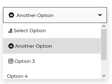
import React from "react";import { CDBSelect2, CDBContainer } from "cdbreact";
export const Select = () => { const [option] = useState([ { text: "Select Option", icon:"stack-overflow", }, { text: "Another Option", icon:"reddit", }, { text: "Option 3", icon:"instagram", }, { text: "Option 4", }, { text: "Last Option", }, ]); return ( <CDBContainer> <CDBSelect2 options={option} iconBrand selected="Choose an option" color="white"/> </CDBContainer> );};To make the select button inactive, use the disabled prop.

import React from "react";import { CDBSelect2, CDBContainer } from "cdbreact";
export const Select = () => { const [option] = useState([ { text: "Select Option", icon:"stack-overflow", }, { text: "Another Option", icon:"reddit", }, { text: "Option 3", icon:"instagram", }, { text: "Option 4", }, { text: "Last Option", }, ]); return ( <CDBContainer> <CDBSelect2 options={option} iconBrand selected="Choose an option" disabled color="none" /> </CDBContainer> );};You can change the background color of the select button with the 'color' prop.
import React from "react";import { CDBSelect2, CDBContainer } from "cdbreact";
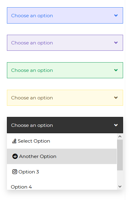
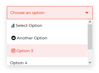
export const Select = () => { const [option] = useState([ { text: "Select Option", icon:"stack-overflow", }, { text: "Another Option", icon:"reddit", }, { text: "Option 3", icon:"instagram", }, { text: "Option 4", }, { text: "Last Option", }, ]); return ( <CDBContainer> <CDBSelect2 options={option} iconBrand selected="Choose an option" color="primary" /> <CDBSelect2 options={option} iconBrand selected="Choose an option" color="secondary" /> <CDBSelect2 options={option} iconBrand selected="Choose an option" color="success" /> <CDBSelect2 options={option} iconBrand selected="Choose an option" color="warning" /> <CDBSelect2 options={option} iconBrand selected="Choose an option" color="dark" /> </CDBContainer> );};The hoverColor component adds a hover effect to your selected options.
import React from "react";import { CDBSelect2, CDBContainer } from "cdbreact";
export const Select = () => { const [option] = useState([ { text: "Select Option", icon:"stack-overflow", }, { text: "Another Option", icon:"reddit", }, { text: "Option 3", icon:"instagram", }, { text: "Option 4", }, { text: "Last Option", }, ]); return ( <CDBContainer> <CDBSelect2 options={option} iconBrand selected="Choose an option" hoverColor color="danger" /> </CDBContainer> );};import React from "react";import { CDBSelect, CDBContainer } from "cdbreact";
export const Select = () => { const option = useState([ { text: "Select Option", icon:"stack-overflow", }, { text: "Another Option", icon:"reddit", }, { text: "Option 3", icon:"instagram", }, { text: "Option 4", }, { text: "Last Option", }, ]); return ( <CDBContainer> <CDBSelect selected="Options" options={option}/> </CDBContainer> );};The props you get to use with the Contrast React Bootstrap 5 Select2 component will be elaborated on in this section. You'll understand what these props are for, how to use them in your code, and what their default values are.
Other 'CDBSelect2' prop options are listed below in the table
| Name | Type | Default | Description | Example |
|---|---|---|---|---|
| className | String | Adds custom classes | <CDBSelect2 className="myClass" ... /> | |
| tag | String | div | Changes default tag | <CDBSelect2 tag="div" ... /> |
| disable | Boolean | false | If true - the option wont be clickable. | <CDBSelect2 disabled .../> |
| color | String | Sets colorful hover effect on select options. | <CDBSelect2 color="primary" ... /> | |
| iconSize | String | Sets size of icon brand in select option | <CDBSelect2 iconSize="20px" ... /> | |
| iconBrand | Boolean | false | adds icon to the select option | <CDBSelect2 iconBrand .../> |
| iconLight | Boolean | false | Sets the icon light | <CDBSelect2 iconLight .../> |
| iconRegular | Boolean | false | Sets the icon regular | <CDBSelect2 iconRegular .../> |
| iconClass | String | Adds custom class to icon | <CDBSelect2 iconClass="myClass" ... /> | |
| options | Array of Objects | Sets options array as source of data. This property is used in alternative Select version. | <CDBSelect2 options={options}" ... /> | |
| hoverColor | Boolean | false | Sets hover effect on select options. | <CDBSelect2 hoverColor .../> |
| selected | String | Set default select text content. | <CDBSelect2 selected="Choose one" ... /> | |
| optionClassName | String | Adds custom classes to options | <CDBSelect2 optionClassName="my-class" ... /> |
Build Tailwind websites visually and ship projects to production in minutes instead of days. Generates code from your designs to export to your favourite frameworks like React, Vue, Angular.
Trying to create components and pages for a web app or website from
scratch while maintaining a modern User interface can be very tedious.
This is why we created Contrast, to help drastically reduce the amount of time we spend doing that.
so we can focus on building some other aspects of the project.
Contrast Bootstrap PRO consists of a Premium UI Kit Library featuring over 10000+ component variants.
Which even comes bundled together with its own admin template comprising of 5 admin dashboards and 23+ additional admin and multipurpose pages for
building almost any type of website or web app.
See a demo and learn more about Contrast Bootstrap Pro by clicking here.
