Visually build tailwind css projects 10x faster using AI
Build Tailwind websites visually and ship projects to production in minutes instead of days. Generates code from your designs to export to your favourite frameworks like React, Vue, Angular.

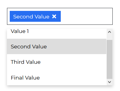
React Bootstrap 5 Multiselect is a form control that displays a collapsible list of numerous values after the user clicks it. It's appropriate for usage in forms, menus, and surveys. They let you to move through alternatives with the ↑ and ↓ arrow keys, and choose the required option using the ↵ key.
Begin by importing 'CDBMultiselect' into your project to use the Contrast React Bootstrap 5 Multiselect component.
import { CDBMultiselect } from "cdbreact";The options argument in the React Bootstrap 5 Multiselect Component accepts an object reflecting a user's multiple choices.
import React from "react";import { CDBMultiselect, CDBContainer } from "cdbreact";
export const Multiselect = () => {
// "showing" key:value pair optionalconst option = [    {      text: "Value 1",      showing: true,    },    {      text: "Second Value",      showing: true,    },    {      text: "Third Value",      showing: true,    },    {      text: "Final Value",      showing: true,    },  ];
return ( <CDBContainer> <CDBMultiselect options={option} selected="Value" /> </CDBContainer> );};To enable users to search for these choices, use the search options parameter.

import React from "react";import { CDBMultiselect, CDBContainer } from "cdbreact";
export const Multiselect = () => {
// "showing" key:value pair optionalconst option = [    {      text: "Value 1",      showing: true,    },    {      text: "Second Value",      showing: true,    },    {      text: "Third Value",      showing: true,    },    {      text: "Final Value",      showing: true,    },  ];
  return (    <CDBContainer>        <CDBMultiselect color="secondary" search options={option} selected="Value" />    </CDBContainer>  );};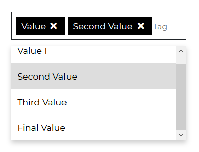
import React from "react";import { CDBMultiselect, CDBContainer } from "cdbreact";
export const Multiselect = () => {
// "showing" key:value pair optionalconst option = [    {      text: "Value 1",      showing: true,    },    {      text: "Second Value",      showing: true,    },    {      text: "Third Value",      showing: true,    },    {      text: "Final Value",      showing: true,    },  ];
  return (    <CDBContainer>        <CDBMultiselect color="dark" submit options={option} selected="Value" />    </CDBContainer>  );};
import React from "react";import { CDBMultiselect, CDBContainer } from "cdbreact";
export const Multiselect = () => {
// "showing" key:value pair optionalconst option = [    {      text: "Value 1",      showing: true,    },    {      text: "Second Value",      showing: true,    },    {      text: "Third Value",      showing: true,    },    {      text: "Final Value",      showing: true,    },  ];
return ( <CDBContainer> <CDBMultiselect color="danger" limitedOptions options={option} selected="Value" /> </CDBContainer> );};The props you get to use with the React Bootstrap 5 Multiselect component will be expanded upon in this section. You'll learn what these props do, how to utilize them in your code, and what their default values are.
Other CDBMultiselect component prop options are listed in the table below.
| Name | Type | Default | Description | Example |
|---|---|---|---|---|
| className | String | Adds custom classes | Adds custom classes | <CDBMultiselect className="myClass" ... /> |
| tag | String | div | Changes default tag | <CDBMultiselect tag="div" ... /> |
| search | Boolean | false | Search element will appear as the first child of select. | <CDBMultiselect search .../> |
| color | String | primary | Sets colorful hover effect on select options. | <CDBMultiselect color="secondary" ... /> |
| options | array of objects | Sets options array as source of data. This property is used in alternative Select version. | <CDBMultiselect options={option} ... /> | |
| selected | String | Set default select text content. | <CDBMultiselect selected="choose_option" ... /> |
Build Tailwind websites visually and ship projects to production in minutes instead of days. Generates code from your designs to export to your favourite frameworks like React, Vue, Angular.
Trying to create components and pages for a web app or website from
scratch while maintaining a modern User interface can be very tedious.
This is why we created Contrast, to help drastically reduce the amount of time we spend doing that.
so we can focus on building some other aspects of the project.
Contrast Bootstrap PRO consists of a Premium UI Kit Library featuring over 10000+ component variants.
Which even comes bundled together with its own admin template comprising of 5 admin dashboards and 23+ additional admin and multipurpose pages for
building almost any type of website or web app.
See a demo and learn more about Contrast Bootstrap Pro by clicking here.
