Tailwind Slider: Elevate Your Website Design with Dynamic Content

By Emmanuel Chinonso
Web Developer/Writer
Introduction
In today's digital landscape, incorporating visual content is essential for creating an engaging and memorable user experience. With the Tailwind CSS slider, you can effortlessly display your images or other media in a dynamic and interactive manner, captivating your visitors' attention from the moment they land on your website.
Table of Contents
- What is the Tailwind CSS Slider?
- Key Features of the Tailwind CSS Slider
- Implementing the Tailwind CSS Slider in Your Website
- Customization Options for Tailwind CSS Slider
- Benefits of Using the Tailwind CSS Slider
- Real-World Examples of Tailwind CSS Slider
- Conclusion
- Build your Tailwind slider or any components using windframe now
What is the Tailwind Slider?
The Tailwind slider is a feature-rich component that enables you to create versatile sliders and carousels using the popular Tailwind CSS framework. It provides a set of pre-designed styles and utilities that make it easy to build visually appealing and responsive sliders with minimal effort.
Key Features of the Tailwind CSS Slider
Responsive Design
The Tailwind CSS slider is designed with responsiveness in mind. It automatically adjusts to different screen sizes, ensuring that your slider looks great on desktops, tablets, and mobile devices. This feature is crucial in today's mobile-first world, where users access websites from a variety of devices.
Slide Transitions
The Tailwind CSS slider offers a variety of slide transition effects, allowing you to create smooth and captivating animations between slides. Whether you prefer a fade-in, slide, or zoom effect, the Tailwind CSS slider provides options to suit your design needs.
Navigation and Pagination Controls
To provide a seamless user experience, the Tailwind CSS slider includes built-in navigation and pagination controls. Users can easily navigate through slides using arrows or dots, making it intuitive and user-friendly.
Lazy Loading
The Tailwind CSS slider incorporates lazy loading, which means that images are loaded only when they come into view. This optimization technique improves page loading times, ensuring a smooth and fast experience for your visitors.
Implementing the Tailwind CSS Slider in Your Website
Implementing the Tailwind CSS slider in your website is a straightforward process. Here's a step-by-step guide to get you started:
Install Tailwind CSS: Begin by installing Tailwind CSS in your project. You can either include it via CDN or install it using npm.
Include the Slider Component: Import the Tailwind CSS slider component into your project and include it in your HTML markup.
Add Content to Slides: Insert your desired content, such as images, videos, or text, into the individual slides. Tailwind CSS slider allows you to create visually rich and engaging multimedia experiences.
Customize the Slider: Tailwind CSS slider provides various customization options to tailor it to your specific needs. You can modify the transition effects, navigation controls, pagination styles, and more.
Test and Refine: Thoroughly test your Tailwind CSS slider implementation across different devices and screen sizes. Make any necessary adjustments to ensure a seamless user experience.
Customization Options for Tailwind Slider The Tailwind CSS slider offers extensive customization options to match your website's branding and design. Some of the key customization options include:
- Slide duration and delay
- Transition effects and speeds
- Navigation control styles
- Pagination styles
- Autoplay settings
With these customization options, you can create a Tailwind CSS slider that aligns perfectly with your website's aesthetics.
Benefits of Using the Tailwind CSS Slider
Incorporating the Tailwind CSS slider into your website design offers several benefits:
Enhanced Visual Appeal: The Tailwind CSS slider allows you to showcase your content in a visually stunning and interactive manner, attracting and retaining the attention of your visitors.
Improved User Experience: The intuitive navigation and smooth animations of the Tailwind CSS slider contribute to a seamless and enjoyable user experience.
Increased Engagement: By presenting your content in an engaging and dynamic way, the Tailwind CSS slider encourages users to interact with your website and explore further.
Mobile-Friendly: With its responsive design, the Tailwind CSS slider ensures that your content looks great on any device, providing an optimized mobile user experience.
Time and Cost Savings: The Tailwind CSS slider simplifies the process of creating and managing interactive content, saving you time and reducing development costs.
Conclusion
The Tailwind slider is a valuable tool for enhancing your website design with dynamic and visually appealing content. With its responsive design, customizable features, and seamless user experience, it empowers you to create engaging sliders, carousels, and galleries that captivate your visitors' attention. Incorporate the Tailwind CSS slider into your web design arsenal and elevate your website to new heights of visual storytelling.
Real-World Examples of Tailwind CSS Slider
Build your Tailwind slider or any components using windframe now
Windframe is a Visual tailwind builder for rapidly prototyping and building stunning webpages using tailwind css. Speed up your web development process and ship in minutes, not weeks. The tool makes it easier for you to create a Tailwind Slider or any components and import the code and add to your project. You can even create a whole page or pages without writing any code by simply drag and drop. You can start by checcking the link on windframe.
Build modern projects using Bootstrap 5 and Contrast
Trying to create components and pages for a web app or website from
scratch while maintaining a modern User interface can be very tedious.
This is why we created Contrast, to help drastically reduce the amount of time we spend doing that.
so we can focus on building some other aspects of the project.
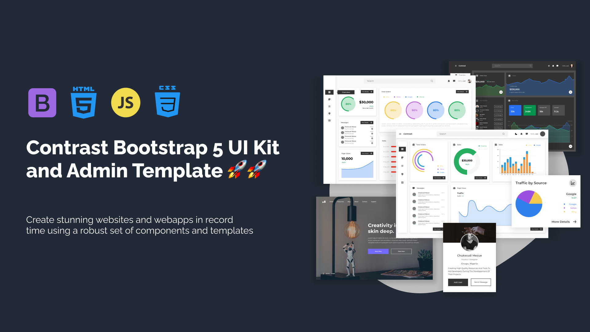
Contrast Bootstrap PRO consists of a Premium UI Kit Library featuring over 10000+ component variants.
Which even comes bundled together with its own admin template comprising of 5 admin dashboards and 23+ additional admin and multipurpose pages for
building almost any type of website or web app.
See a demo and learn more about Contrast Bootstrap Pro by clicking here.

Related Posts
Comments
...