

How to create Beautiful Bootstrap Tabs in Bootstrap 5

By Amarachi Iheanacho
Technical Writer
Bootstrap 5 Tabs
Bootstrap 5 Tabs are small pieces of a clickable area that help the user navigate different web pages in a single window. They are considered excellent User Interface control as they are an efficient tool for handling a large amount of web content at a time.
Bootstrap 5 Tabs allows you to switch options in a program, and separate documents. They act as a link in that the tab a user is currently on is usually highlighted.
Table Of Contents
- What are we building?
- Prerequisites
- What is Contrast?
- Creating our Bootstrap 5 Tabs
- The Default Tabs
- Tabs Justified
- Tabs Fill
- Tabs Vertical
- Conclusion
- Resources
What we are building
In this article, we will walk through building Bootstrap 5 tabs with the bootstrap library Contrast.
We are going to build a navigation bar just like the image we have below.

Prerequisites
To make the most of this article, you have the following:
- A basic understanding of HTML.
- A basic understanding of CSS.
What is Contrast and why?
Contrast or Contrast Design Bootstrap is an elegant bootstrap UI kit featuring over 2000+ essential components. Contrast helps simplify the web development process and can be integrated with any project to build mobile-first, responsive, and elegant websites and web apps. With predefined styles, you can now create web pages faster than ever.
Installing the Contrast library CDN
Contrast Bootstrap allows us to use predefined styles, accessed with the contrast library class names. To be able to use this style in our HTML project, we need to install the Contrast Bootstrap library by adding the CDNs
We include the CSS CDN responsible for the Bootstrap styling in the <head> in our HTML file.
<link rel="stylesheet" href="https://cdn.jsdelivr.net/npm/cdbootstrap/css/bootstrap.min.css" /><link rel="stylesheet" href="https://cdn.jsdelivr.net/npm/cdbootstrap/css/cdb.min.css" />After including the CSS CDN, we include the JavaScript CDN links at the bottom of our project in the <body>. We do this because we want the components to load before adding the interactive functionality that JavaScript gives us.
<script src="https://cdn.jsdelivr.net/npm/cdbootstrap/js/bootstrap.min.js"></script><script src="https://cdn.jsdelivr.net/npm/cdbootstrap/js/popper.min.js"></script><script src="https://cdn.jsdelivr.net/npm/cdbootstrap/js/cdb.min.js"></script>After adding both the CSS and JavaScript CDNs, our HTML file should look like this.
<!DOCTYPE html><html lang="en"> <head> <meta charset="UTF-8" /> <meta http-equiv="X-UA-Compatible" content="IE=edge" /> <meta name="viewport" content="width=device-width, initial-scale=1.0" /> <link rel="stylesheet" href="https://cdn.jsdelivr.net/npm/cdbootstrap/css/bootstrap.min.css" /> <link rel="stylesheet" href="https://cdn.jsdelivr.net/npm/cdbootstrap/css/cdb.min.css" /> <title>Document</title> </head> <body> <script src="https://cdn.jsdelivr.net/npm/cdbootstrap/js/bootstrap.min.js"></script> <script src="https://cdn.jsdelivr.net/npm/cdbootstrap/js/popper.min.js"></script> <script src="https://cdn.jsdelivr.net/npm/cdbootstrap/js/cdb.min.js"></script> </body></html>Creating our Bootstrap Tabs
With Contrast Bootstrap, we can create four different types of tabs:
- The Default Tab
- Tab Justified
- Tabs Fill
- Tabs Vertical
In this article, we are going to discuss building these four kinds of tabs.
The Default Tab
To create our Bootsrap 5 tabs, we make use of the following HTML elements:
<ul></ul>, ul, which stands for the unordered link, is used to group links without numbers (e.g., bullet points, hyphens, etc.).<li></li>represents a list item in the group list (<ul></ul>). In this, we embed links and icon tags so that our links can have them.<a href= ""></a>for links, use thehrefattribute to pass the link as a parameter.<i></i>this tag is used to put icons in our project.
<ul class="nav nav-tabs mb-3" id="ex1" role="tablist"> <li class="nav-item" role="presentation"> <a class="nav-link active" id="ex1-tab-1" data-toggle="tab" href="#ex1-tabs-1" role="tab" aria-controls="ex1-tabs-1" aria-selected="true" >Tab 1</a > </li> <li class="nav-item" role="presentation"> <a class="nav-link" id="ex1-tab-2" data-toggle="tab" href="#ex1-tabs-2" role="tab" aria-controls="ex1-tabs-2" aria-selected="false" >Tab 2</a > </li> <li class="nav-item" role="presentation"> <a class="nav-link" id="ex1-tab-3" data-toggle="tab" href="#ex1-tabs-3" role="tab" aria-controls="ex1-tabs-3" aria-selected="false" >Tab 3</a > </li></ul><div class="tab-content" id="ex1-content"> <div class="tab-pane fade show active" id="ex1-tabs-1" role="tabpanel" aria-labelledby="ex1-tab-1" > Tab 1 content </div> <div class="tab-pane fade" id="ex1-tabs-2" role="tabpanel" aria-labelledby="ex1-tab-2"> Tab 2 content </div> <div class="tab-pane fade" id="ex1-tabs-3" role="tabpanel" aria-labelledby="ex1-tab-3"> Tab 3 content </div></div>Our Bootstrap 5 Tab should look like the image below:
;
Tabs Justified
Use the nav-justified class to stretch the tab container from one end of the web page.
<ul class="nav nav-tabs nav-justified mb-3" id="ex1" role="tablist">  <li class="nav-item" role="presentation">    <a      class="nav-link active"      id="ex3-tab-1"      data-toggle="tab"      href="#ex3-tabs-1"      role="tab"      aria-controls="ex3-tabs-1"      aria-selected="true"      >Link</a    >  </li>  <li class="nav-item" role="presentation">    <a      class="nav-link"      id="ex3-tab-2"      data-toggle="tab"      href="#ex3-tabs-2"      role="tab"      aria-controls="ex3-tabs-2"      aria-selected="false"      >Very very very very long link</a    >  </li>  <li class="nav-item" role="presentation">    <a      class="nav-link"      id="ex3-tab-3"      data-toggle="tab"      href="#ex3-tabs-3"      role="tab"      aria-controls="ex3-tabs-3"      aria-selected="false"      >Another link</a    >  </li></ul>
<div class="tab-content" id="ex2-content">  <div    class="tab-pane fade show active"    id="ex3-tabs-1"    role="tabpanel"    aria-labelledby="ex3-tab-1"  >    Tab 1 content Lorem, ipsum dolor sit amet consectetur adipisicing elit. Voluptates, doloremque    minima mollitia sapiente illo ut harum fugit explicabo error perspiciatis at cumque nisi eaque    commodi culpa est sed ad amet.  </div>  <div class="tab-pane fade" id="ex3-tabs-2" role="tabpanel" aria-labelledby="ex3-tab-2">    Tab 2 content Lorem, ipsum dolor sit amet consectetur adipisicing elit. Voluptates, doloremque    minima mollitia sapiente illo ut harum fugit explicabo error perspiciatis at cumque nisi eaque    commodi culpa est sed ad amet.  </div>  <div class="tab-pane fade" id="ex3-tabs-3" role="tabpanel" aria-labelledby="ex3-tab-3">    Tab 3 content Lorem, ipsum dolor sit amet consectetur adipisicing elit. Voluptates, doloremque    minima mollitia sapiente illo ut harum fugit explicabo error perspiciatis at cumque nisi eaque    commodi culpa est sed ad amet.  </div></div>
Our Bootstrap 5 Tabs Justified should look like the image below:
 ;
;
Tabs Fill
<ul class="nav nav-tabs nav-fill mb-3" id="ex1" role="tablist"> <li class="nav-item" role="presentation"> <a class="nav-link active" id="ex2-tab-1" data-toggle="tab" href="#ex2-tabs-1" role="tab" aria-controls="ex2-tabs-1" aria-selected="true" >Link</a > </li> <li class="nav-item" role="presentation"> <a class="nav-link" id="ex2-tab-2" data-toggle="tab" href="#ex2-tabs-2" role="tab" aria-controls="ex2-tabs-2" aria-selected="false" >Very very very very long link</a > </li> <li class="nav-item" role="presentation"> <a class="nav-link" id="ex2-tab-3" data-toggle="tab" href="#ex2-tabs-3" role="tab" aria-controls="ex2-tabs-3" aria-selected="false" >Another link</a > </li></ul><div class="tab-content" id="ex2-content"> <div class="tab-pane fade show active" id="ex2-tabs-1" role="tabpanel" aria-labelledby="ex2-tab-1" > Tab 1 content </div> <div class="tab-pane fade" id="ex2-tabs-2" role="tabpanel" aria-labelledby="ex2-tab-2"> Tab 2 content </div> <div class="tab-pane fade" id="ex2-tabs-3" role="tabpanel" aria-labelledby="ex2-tab-3"> Tab 3 content </div></div>Our Bootstrap 5 Tabs Fill should look like the image below:
 ;
;
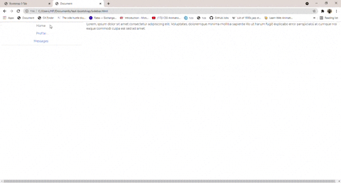
Tabs Vertical
The Tabs Vertical changes the orientation of the tabs to vertical. To do so, give the div element containing your tab component a class of rows, and change the direction of the individual div element located in the container an aria-orientation = "vertical".
<div class="row">  <div class="col-3">    <div      class="nav flex-column nav-tabs text-center"      id="v-tabs-tab"      role="tablist"      aria-orientation="vertical"    >      <a        class="nav-link active"        id="v-tabs-home-tab"        data-toggle="tab"        href="#v-tabs-home"        role="tab"        aria-controls="v-tabs-home"        aria-selected="true"        >Home</a      >      <a        class="nav-link"        id="v-tabs-profile-tab"        data-toggle="tab"        href="#v-tabs-profile"        role="tab"        aria-controls="v-tabs-profile"        aria-selected="false"        >Profile</a      >      <a        class="nav-link"        id="v-tabs-messages-tab"        data-toggle="tab"        href="#v-tabs-messages"        role="tab"        aria-controls="v-tabs-messages"        aria-selected="false"        >Messages</a      >    </div>  </div>
  <div class="col-9">    <div class="tab-content" id="v-tabs-tabContent">      <div        class="tab-pane fade show active"        id="v-tabs-home"        role="tabpanel"        aria-labelledby="v-tabs-home-tab"      >        Lorem, ipsum dolor sit amet consectetur adipisicing elit. Voluptates, doloremque minima        mollitia sapiente illo ut harum fugit explicabo error perspiciatis at cumque nisi eaque        commodi culpa est sed ad amet.      </div>      <div        class="tab-pane fade"        id="v-tabs-profile"        role="tabpanel"        aria-labelledby="v-tabs-profile-tab"      >        Lorem, ipsum dolor sit amet consectetur adipisicing elit. Voluptates, doloremque minima        mollitia sapiente illo ut harum fugit explicabo error perspiciatis at cumque nisi eaque        commodi culpa est sed ad amet.      </div>      <div        class="tab-pane fade"        id="v-tabs-messages"        role="tabpanel"        aria-labelledby="v-tabs-messages-tab"      >        Lorem, ipsum dolor sit amet consectetur adipisicing elit. Voluptates, doloremque minima        mollitia sapiente illo ut harum fugit explicabo error perspiciatis at cumque nisi eaque        commodi culpa est sed ad amet.      </div>    </div>  </div></div>
Our Bootstrap 5 Tabs Vertical should look like the image below:
 ;
;
Conclusion
In this article, we discussed Bootstrap tabs and why a user might need a bootstrap tab to be present on a web page. We then walked through building different types of bootstrap tabs using Contrast.
Resources
You may find this resource useful.
Build modern projects using Bootstrap 5 and Contrast
Trying to create components and pages for a web app or website from
scratch while maintaining a modern User interface can be very tedious.
This is why we created Contrast, to help drastically reduce the amount of time we spend doing that.
so we can focus on building some other aspects of the project.
Contrast Bootstrap PRO consists of a Premium UI Kit Library featuring over 10000+ component variants.
Which even comes bundled together with its own admin template comprising of 5 admin dashboards and 23+ additional admin and multipurpose pages for
building almost any type of website or web app.
See a demo and learn more about Contrast Bootstrap Pro by clicking here.

Related Posts