
How to create a Angular Bootstrap Sidebar

By Amarachi Iheanacho
Technical Writer
Bootstrap Angular Sidebar
A sidebar is a user interface element usually to the left or right of your website that contains pieces of additional information. Examples of this additional information are navigational links, and supplementary information about the information conveyed on the main part of the website.
In this article, we would be discussing building an angular bootstrap sidebar using Contrast.
Table Of Contents
- What are we building?
- Prerequisites
- What is Contrast
- Creating a new Angular Project
- Adding Routing ability in our Angular project
- Installing the Contrast Angular Bootstrap in your project
- Creating our Angular Bootstrap Sidebar
- Default Sidebar
- Multilevel Sidebar
- Resources
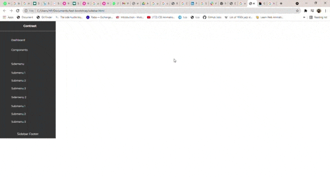
What we are building
In this article, we are going to walk through building an Angular Bootstrap sidebar with Contrast. Like the image we have below:
Prerequisites
To follow along, you should have:
- A basic understanding of HTML.
- A basic understanding of CSS.
- Node and its package manager, npm. Run the command node -v && npm -v to verify we have them installed, or install them from here.
- Alternatively, we can use another package manager, Yarn.
What is Contrast
Contrast or Contrast Design Bootstrap is an elegant bootstrap UI kit featuring over 2000+ essential components. Contrast helps simplify the web development process and can be integrated with any project to build mobile-first, responsive, and elegant websites and web apps.
Creating a new Angular Project
To create an angular project, we first have to make sure we have the angular CLI installed, to do this we go to our terminal and run this command.
npm install -g @angular/cliThe -g flag indicates that we want it installed globally and not just in one file.
Then we go on to create the angular project. We do this by first changing the directory to the location we want our project to be installed and then running this command.
cd <location path>ng new <name of our project>We then cd into our newly created project and run ng serve to see our application on the browser.
cd <name of our project>ng serveWe should see our application on the browser when we go to http://localhost:4200/
Adding Routing ability in our project
Even though our application is a single page, we would still need the ability to route between different pages. To do this we need to import the RouterModule into the app.module.ts file of our project.
import { RouterModule } from '@angular/router';Next, we add it to the imports array.
imports: [ BrowserModule, RouterModule.forRoot([])]Installing the Contrast Angular Bootstrap in your project
npm install --save ng-cdbangularor
yarn add ng-cdbangularNext, we add our bootstrap-css file, into angular.json
"styles": [ "node_modules/bootstrap-css-only/css/bootstrap.min.css"]We then import the module we need, in this case the SidebarModule and add it to the the imports array.
import { SidebarModule } from 'ng-cdbangular';
@NgModule({  imports: [    BrowserModule,    RouterModule.forRoot([]),    SidebarModule  ]})
Our app.module.ts file should look like this
import { BrowserModule } from '@angular/platform-browser';import { RouterModule, Routes } from '@angular/router';import {  SidebarModule } from 'ng-cdbangular';

import { AppComponent } from './app.component';
@NgModule({  declarations: [    AppComponent  ],  imports: [    BrowserModule,    RouterModule.forRoot([]),    SidebarModule  ],  providers: [],  bootstrap: [AppComponent]})export class AppModule { }
Creating our Angular Bootstrap Sidebar
With the Contrast Angular Bootstrap Sidebar, we get access to two types of sidebars.
- Default Sidebar
- Multilevel Sidebar
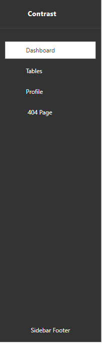
Default Sidebar
To create a default sidebar using Contrast, we use different components to create different parts of the sidebar. These components are :
CDBSidebarHeader: This is used to create the header, the top part of the sidebar. It also takes in a prefix prop which indicates what element you want before the text in your header.
CDBSidebarContent: This component is the body of the sidebar. It acts as a container that holds the sidebar menu and its items. CDBSidebarMenu: This component holds a group of items. This group of items is usually an unordered list of navigational links or text.
CDBSidebarMenuItem: This component refers to each item in the CDBSidebarMenu container. In the block of code below, this component takes in two props, the icon prop, which indicates what icon you want before the text in the menu item, and the link prop, which defines the path you want the item to lead you to once you click on it.
CDBSidebarFooter: This component is used to hold the footer of the sidebar. A sidebar's footer usually consists of a website's trademark etc.
<div class="app" style="display: flex; height: 100vh; overflow:scroll initial">    <CDBSidebar textColor="#ffffff" backgroundColor="#333333">        <CDBSidebarHeader [prefix]="icon" >            <ng-template #icon>                <i class="fa fa-bars fa-large"></i>            </ng-template>
            Contrast        </CDBSidebarHeader>
        <CDBSidebarContent>            <CDBSidebarMenu class="sidebar-content">                <CDBSidebarMenuItem link='/' icon="columns" >                    Dashboard                </CDBSidebarMenuItem>                <CDBSidebarMenuItem link='/tables' icon="table" >                    Tables                </CDBSidebarMenuItem>                <CDBSidebarMenuItem link='/profile' icon="user" >                    Profile                </CDBSidebarMenuItem>                <CDBSidebarMenuItem href='/404' icon="exclamation-circle" >                    <span style="margin-left: 5px;">404 Page</span>                </CDBSidebarMenuItem>            </CDBSidebarMenu>        </CDBSidebarContent>        <div class="mt-auto">
            <CDBSidebarFooter style="text-align: center; margin-top: auto;">                <div class="sidebar-btn-wrapper" style="padding: 20px 5px">                    Sidebar Footer                </div>            </CDBSidebarFooter>        </div>    </CDBSidebar></div>
With this, we end up with a sidebar that looks like the picture below
Multilevel Sidebar
The multilevel sidebar is only available to Contrast PRO users, the sidebar gives you access to create submenus in your sidebar, that is a menubar in a menubar.
Installing CDBAngular PRO
To use Cdbangular PRO in your project you must add the tgz file in the root of your project.
Next, you go to your package.json file and to the dependencies object you add
"cdbangular": "<file path of the tgz file in the root of your project>"Finally, we run npm install
npm installCreating our Multilevel Sidebar
With the multilevel sidebar, we get access to the CDBSidebarSubMenu component, which allows us to create the submenus.
In creating the multilevel sidebar we used other Contrast Bootstrap Angular components like CDBIcon, and CDBBadge, so to use them in our project we have to import their modules in the app.module.ts file.
import { SidebarModule, IconModule, BadgeModule } from 'ng-cdbangular';
@NgModule({ imports: [ BrowserModule, RouterModule.forRoot([]), SidebarModule, IconModule, BadgeModule ]})<CDBSidebar textColor="#f4f4f4" backgroundColor="#000000"> <CDBSidebarHeader [prefix]="icon"> <ng-template #icon> <CDBIcon icon="bars" size="lg"></CDBIcon> </ng-template>
Contrast </CDBSidebarHeader>
<CDBSidebarContent> <CDBSidebarMenu> <CDBSidebarMenuItem icon="th-large" [suffix]="badge1"> <ng-template #badge1> <CDBBadge color="danger" size="small" borderType="pill">new</CDBBadge> </ng-template>
Dashboard </CDBSidebarMenuItem>
<CDBSidebarMenuItem icon="sticky-note" [suffix]="badge2"> <ng-template #badge2> <CDBBadge color="danger" size="small" borderType="pill">new</CDBBadge> </ng-template>
Components </CDBSidebarMenuItem> </CDBSidebarMenu>
<CDBSidebarMenu> <CDBSidebarSubMenu title="Sidemenu" icon="th" textColor="#f4f4f4" backgroundColor="#000000"> <CDBSidebarMenuItem>submenu 1</CDBSidebarMenuItem> <CDBSidebarMenuItem>submenu 2</CDBSidebarMenuItem> <CDBSidebarMenuItem>submenu 3</CDBSidebarMenuItem> </CDBSidebarSubMenu>
<CDBSidebarSubMenu title="Sidemenu2" icon="book" [suffix]="badge3" textColor="#f4f4f4" backgroundColor="#000000" > <ng-template #badge3> <CDBBadge color="danger" size="small" borderType="pill">new</CDBBadge> </ng-template>
<CDBSidebarMenuItem>submenu 1</CDBSidebarMenuItem> <CDBSidebarMenuItem>submenu 2</CDBSidebarMenuItem> <CDBSidebarMenuItem>submenu 3</CDBSidebarMenuItem> </CDBSidebarSubMenu>
<CDBSidebarSubMenu title="MultiLevel with Icon" icon="table" textColor="#f4f4f4" backgroundColor="#000000" > <CDBSidebarMenuItem>submenu 1</CDBSidebarMenuItem> <CDBSidebarMenuItem>submenu 2</CDBSidebarMenuItem>
<CDBSidebarSubMenu title="submenu 3" textColor="#f4f4f4" backgroundColor="#000000"> <CDBSidebarMenuItem>submenu 3.1</CDBSidebarMenuItem> <CDBSidebarMenuItem>submenu 3.2</CDBSidebarMenuItem>
<CDBSidebarSubMenu title="subnt" textColor="#f4f4f4" backgroundColor="#000000"> <CDBSidebarMenuItem>submenu 3.3.1</CDBSidebarMenuItem> <CDBSidebarMenuItem>submenu 3.3.2</CDBSidebarMenuItem> <CDBSidebarMenuItem>submenu 3.3.3</CDBSidebarMenuItem> </CDBSidebarSubMenu> </CDBSidebarSubMenu> </CDBSidebarSubMenu> </CDBSidebarMenu> </CDBSidebarContent>
<div class="mt-auto"> <CDBSidebarFooter style="text-align: center"> <div class="sidebar-btn-wrapper" style="padding: 20px 5px"> Sidebar Footer </div> </CDBSidebarFooter> </div></CDBSidebar>Conclusion
Finally, by following the steps discussed above, you can create a powerful and user-friendly sidebar. Additionally, by using Bootstrap with Angular, you can create a responsive design that looks great on any device.
Resources
You may also find the following resources useful
- Link to the the code on github
- Contrast Angular Documentation
- Get Contrast PRO
- How to create a Responsive Bootstrap 5 Sidebar -How to create Beautiful Bootstrap Tabs in Bootstrap 5
Build modern projects using Bootstrap 5 and Contrast
Trying to create components and pages for a web app or website from
scratch while maintaining a modern User interface can be very tedious.
This is why we created Contrast, to help drastically reduce the amount of time we spend doing that.
so we can focus on building some other aspects of the project.
Contrast Bootstrap PRO consists of a Premium UI Kit Library featuring over 10000+ component variants.
Which even comes bundled together with its own admin template comprising of 5 admin dashboards and 23+ additional admin and multipurpose pages for
building almost any type of website or web app.
See a demo and learn more about Contrast Bootstrap Pro by clicking here.

Related Posts