


How to create a Responsive Navigation bar Using Tailwind CSS

By Emmanuel Chinonso
Technical Writer
Tailwind navbar
Almost every website out there has a navigation bar. The tailwind css navbar is built to help users navigate around a webpage easily. It is important to have a responsive navigation bar available for users to increase user experience.
Table of content
- Introduction
- Understanding the Importance of a Responsive Navigation Bar
- Prerequisites
- Add Tailwind CSS to project
- HTML Code
- Adding the website logo
- Adding the primary menu items
- how to make Tailwind navbar responsive
- Adding functionality
- overview
- Conclusion
Introduction
Building a responsive website with a fluid navigation bar is crucial to ensuring that your visitors can effortlessly navigate your site, regardless of the device they're using. Today, we are going to create a responsive navigation bar using Tailwind CSS, a framework renowned for its efficiency and ease of use. Let's explore the steps and best practices for crafting a seamless navigation bar that not only enhances user experience but also helps you stand out in the competitive digital arena.
Understanding the Importance of a Responsive Navigation Bar
Before we dive into the technicalities, let's discuss why a responsive navigation bar is indispensable. A responsive navigation bar is essential for providing an optimal user experience. With the proliferation of mobile devices, users access websites on various screen sizes. A well-designed responsive navigation bar adapts to these different screen sizes, ensuring that users can easily access the content they need.
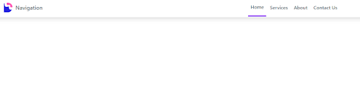
The responsive Tailwind CSS navbar we are going to build will look like the image below

Prerequisites
To follow along with the tailwind CSS tutorial, you need to have the following
- Install The latest version of Tailwind CSS
- Basic HTML knowledge
- Basic CSS knowledge
- Basic JavaScript knowledge
Add Tailwind CSS to project
To use the Tailwind CSS responsive navbar in your project, you have to install Tailwind CSS. There are several ways to install Tailwind CSS but the most recommended one is to use the package manager method.
You can check our article on how to install tailwind to your project here.
However, you will need to add the tailwind CSS you have installed into the project and you can do so by using the link tag in the head part of your HTML code to link the Tailwind CSS file to the HTML template. The code below shows how that can be done.
Code:
<!DOCTYPE html><html lang="en">  <head>    <meta charset="UTF-8" />    <meta http-equiv="X-UA-Compatible" content="IE=edge" />    <meta name="viewport" content="width=device-width, initial-scale=1.0" />    <title>Navigation</title>    <link rel="stylesheet" href="style.css" />  </head>
  <body></body></html>
HTML Code
In our HTML code, we added some containment div to help us build our Tailwind CSS responsive navbar better. We first created a Navtag. On the Navtag, we added white background and a shadow class to the tailwind CSS navbar project.
Next, we created three div elements. The first div is the container div which is where all our navigation bar items will be placed. We added some classes to our div tag.
Code:
<nav class="bg-white shadow-lg"> <div class="max-w-6xl mx-auto px-4"> <div class="flex justify-between"> <div class="flex space-x-7"></div> </div> </div></nav>Adding the website logo
We used a basic image logo and modified its height and width to fit the navigation bar using Tailwind CSS classes. The code for adding the website logo is below
Code:
<div class="flex space-x-7">  <!--Website Logo-->
  <a href="#" class="flex items-center py-4 px-2">    <img src="images/devwares-logo.png" alt="Logo" class="h-8 w-8 mr-2" />    <span class="font-semibold text-gray-500 text-lg">      Navigation    </span>  </a></div>
Adding the primary menu items
At this stage, we will add the necessary menu items to help users navigate around the website. Below is the code for the menu
Code:
<div class="hidden md:flex items-center space-x-1"> <a href="" class="py-4 px-2 text-gray-500 border-b-4 border-purple-500 font-semibold"> Home </a> <a href="" class="py-4 px-2 text-gray-500 font-semibold hover:text-purple-500 transition duration-300"> Services </a> <a href="" class="py-4 px-2 text-gray-500 font-semibold hover:text-purple-500 transition duration-300"> About </a> <a href="" class="py-4 px-2 text-gray-500 font-semibold hover:text-purple-500 transition duration-300"> Contact Us </a> </div> </div> </div> </nav></body>In the code above, we added some classes to the menu to help it fit into our navigation bar.
how to make Tailwind navbar responsive
To make the Tailwind navbar responsive, we need to add a mobile button and a mobile menu that appears when the button is clicked. This ensures the navbar works well on both large and small screens.
Add the mobile button
Next, we are going to create a menu for small screens. Then We can go ahead to use JavaScript to toggle the menu we created.
Code:
<div class="md:hidden flex items-center"> <button class="outline-none menu-button"> <svg class="w-6 h-6 text-gray-500" x-show="! showMenu" fill="none" stroke-linecap="round" stroke-linejoin="round" stroke-width="2" viewBox="0 00 24 24" stroke="currentColor"><path d="m4 6h16M4 12h16M4 18h16"><path></svg> </button> </div>In the code above, we used SVG to create a hamburger for the small screen and gave it a height and weight of 6. We also changed the color to gray.
Other classes we included are :
flexis used to set the hamburger menu along with the items in the Tailwind CSS navbar.outline-noneremoves outline borders on the button when clickedmd:hiddenclass is used to hide the mobile menu button when viewed on a large screen.
Adding the responsive mobile menu
We can now add the tailwind mobile menu for our Tailwind CSS navbar to make it more responsive.
Code:
<div class="hidden mobile-menu"> <ul class=""> <li class="active"> <a href="nav.html" class="block text-sm px-2 py-4 text-white bg-purple-500 font-semibold" >Home </a> </li> <li> <a href="#services" class="block.text-sm.px-2.py-4 hover:bg-purple-500 transition duration-300" > Services </a> </li> <li> <a href="#About" class="block.text-sm.px-2.py-4 hover:bg-purple-500 transition duration-300"> About </a> </li> <li> <a href="#Contact Us" class="block.text-sm.px-2.py-4 hover:bg-purple-500 transition duration-300" > Contact Us </a> </li> </ul></div>In the above code, we created a menu using the ul and li tags. We also went ahead to style them with some Tailwind CSS classes. which include
Blockclass which aligns the menu items in a vertical positionHiddenclass, which is used to hide the menu on a large screen but only shows when in mobile size.
Adding functionality
Moreover, we will need to add functionality to our responsive Tailwind CSS navbar to make it responsive on all devices. The JavaScript code will be written using the <script> tag.
We can go ahead and grab the HTML tag we will use to apply this functionality.
Code:
const btn = document.querySelector('button.menu-button');const menu = document.querySelector('.mobile-menu');Once this is done the next step is to create a function that has an event listener. This will add the toggle functionality to the mobile menu button when it is clicked on.
Code:
btn.addEventListener('click', () => { menu.classList.toggle('hidden');});The JavaScript code will look like the code below
Code:
<script> const btn = document.querySelector('button.menu-button'); const menu = document.querySelector('.mobile-menu'); btn.addEventListener('click', () => { menu.classList.toggle('hidden'); });</script>Overview
The overall code will be like the code below
Code:
<!DOCTYPE html><html lang="en">
<head>    <meta charset="UTF-8">    <meta http-equiv="X-UA-Compatible" content="IE=edge">    <meta name="viewport" content="width=device-width, initial-scale=1.0">    <title>Navigation</title>    <link rel="stylesheet" href="style.css"></head>
<body>
<nav class="bg-white shadow-lg">       <div class="max-w-6xl mx-auto px-4">           <div class="flex justify-between">               <div class="flex space-x-7">                   <!--Website Logo-->
                   <a href="#" class="flex items-center py-4 px-2"><img src="images/devwares-logo.png" alt="Logo" class="h-8 w-8 mr-2">                       <span class="font-semibold text-gray-500 text-lg">                           Navigation                       </span>                   </a>               </div>               <div class="hidden md:flex items-center space-x-1">                <a href=""class="py-4 px-2 text-gray-500 border-b-4 border-purple-500 font-semibold">      Home</a>               <a href=""               class="py-4 px-2 text-gray-500 font-semibold hover:text-purple-500 transition duration-300">            Services</a>               <a href=""               class="py-4 px-2 text-gray-500 font-semibold hover:text-purple-500 transition duration-300">            About      </a>               <a href=""               class="py-4 px-2 text-gray-500 font-semibold hover:text-purple-500 transition duration-300">            Contact Us</a>                </div>
  <div class="md:hidden flex items-center">    <button class="outline-none menu-button">                <svg class="w-6 h-6 text-gray-500" x-show="! showMenu" fill="none" stroke-linecap="round"                    stroke-linejoin="round" stroke-width="2" viewBox="0 00 24 24" stroke="currentColor"><path d="m4 6h16M4 12h16M4 18h16"></path></svg>            </button>        </div>
        <div class="hidden mobile-menu">            <ul class="">                <li class="active">                  <a href="nav.html"                   class="block text-sm px-2 py-4 text-white bg-purple-500 font-semibold">                  Home                </li>                <li>                  <a href="#services"                   class="block.text-sm.px-2.py-4 hover:bg-purple-500 transition duration-300">                  Services                </a>                </li>                <li>                <a href="#About"                 class="block.text-sm.px-2.py-4 hover:bg-purple-500 transition duration-300">                About              </a>                </li>                <li>                 <a href="#Contact Us"                  class="block.text-sm.px-2.py-4 hover:bg-purple-500 transition duration-300">                Contact Us          </a></li>            </ul>        </div>    </div></div>    </nav>    <script>        const btn = document.querySelector('button.menu-button');        const menu = document.querySelector(".mobile-menu");        btn.addEventListener("click", () => {            menu.classList.toggle("hidden");        })    </script></body>
</html>
Once you are done, Our final tailwind CSS responsive navbar will look like the images below.
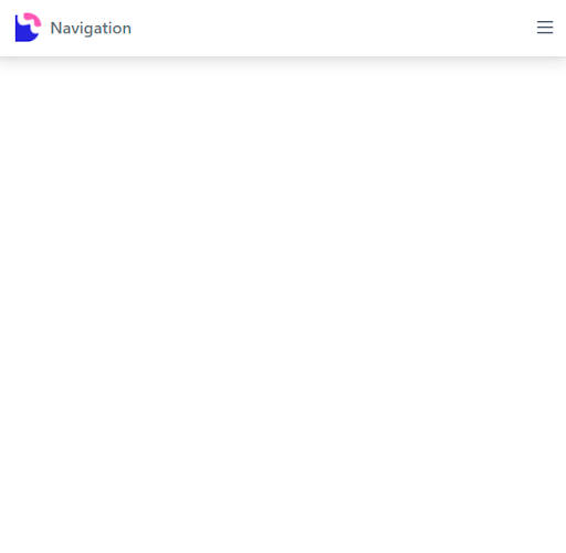
and for the mobile screen, the tailwind mobile menu will look like the image below.
Conclusion
In this Tailwind CSS tutorial, we learned how to create a responsive Tailwind CSS navbar for our project, and we looked at some of the classes used in these projects. We hope you enjoyed this tutorial.
Build modern projects using Bootstrap 5 and Contrast
Trying to create components and pages for a web app or website from
scratch while maintaining a modern User interface can be very tedious.
This is why we created Contrast, to help drastically reduce the amount of time we spend doing that.
so we can focus on building some other aspects of the project.
Contrast Bootstrap PRO consists of a Premium UI Kit Library featuring over 10000+ component variants.
Which even comes bundled together with its own admin template comprising of 5 admin dashboards and 23+ additional admin and multipurpose pages for
building almost any type of website or web app.
See a demo and learn more about Contrast Bootstrap Pro by clicking here.

Related Posts