


How to create a React Modal using Tailwind CSS.

By Amarachi Iheanacho
Technical Writer
Tailwind React Modal
React Modals have solidified their presence on the modern web page, they provide new information asides from the information presented to the user on the main page without any need to refresh.
With their presence providing quality user experience, by making users focus on particular information, usually deemed important by the creators of the website, there is a high chance that you have seen or experienced a modal.
Table of Content
- What is React Modal
- Prerequisites
- What is Tailwind CSS
- Creating our React Project
- Installing Tailwind CSS
- Creating your React Bootstrap Modal
- Conclusion
- Resources
What is a React Modal
A React Modal is a component, a web element that displays information over the entire web page, which in turn disables the web page. When a modal is displayed, it usually places a dark overlay over the rest of the webpage excluding the overlay, this allows us to focus on the information the modal is passing through or focus on performing the task or completing the interaction the modal is requesting for.
A modal window is used for user interaction and does not allow users to interact with the rest of the webpage until it is closed.
Prerequisities
To make the most of this article, you must have the following:
- A basic understanding of HTML.
- A basic understanding of CSS.
- A basic understanding of React.
- Node and its package manager, npm, Run the command node -v && npm -v to verify we have them installed, or install them from here.
- Alternatively, we can use another package manager, Yarn.
What is Tailwind CSS
TailwindCSS refers to itself as a utility-first CSS framework, which has been designed to help ease the development process of creating web applications by creating custom-made styles that are available to developers via special classes, which are then added to the elements.
Getting Started with React and Tailwind CSS
To create a new react project, we go to our terminal, cd in the directory we want, and then run this command npx create-react-app project-name.
cd Documentsnpx create-react-app project-nameInstalling Tailwind CSS
To have tailwind CSS available in your project, cd into the project you created earlier
cd project-namenext run
npm install -D tailwindcss postcss autoprefixernpx tailwindcss init -pConfiguring your templates path
To configure your paths go to your tailwind.config.js, and edit your module.exports object, add the paths to your template files in your content array.
module.exports = { content: ['./src/**/*.{js,jsx,ts,tsx}'], theme: { extend: {}, }, plugins: [],};Next add the Tailwind directives to your CSS
Add the tailwind directives in your ./src/index.css file.
@tailwind base;@tailwind components;@tailwind utilities;After this, we run our project
npm run startYou should see this in your browser when you go to http://localhost:3000/.

Tailwind modal: Creating your Tailwind CSS Modal
To create a tailwindcss modal using the template in the docs, we need to install a headlessui in react to use and build our Tailwind modal. We choose headlesssui because it also has support for tailwind css. To do that, we run the following command :
// npm
npm install @headlessui/react
or
// Yarn
yarn add @headlessui/react
Building Your React Modal
Creating a Modal Component
Here we can create a modal component that houses the Tailwind css modal functionality. The headless ui component helps us add some functionality and beautiful ui to our modal.
Simple Model
/* This example requires Tailwind CSS v2.0+ */import { Fragment, useRef, useState } from 'react';import { Dialog, Transition } from '@headlessui/react';import { ExclamationIcon } from '@heroicons/react/outline';
export default function Example() { const [open, setOpen] = useState(true);
const cancelButtonRef = useRef(null);
return ( <Transition.Root show={open} as={Fragment}> <Dialog as="div" className="fixed z-10 inset-0 overflow-y-auto" initialFocus={cancelButtonRef} onClose={setOpen} > <div className="flex items-end justify-center min-h-screen pt-4 px-4 pb-20 text-center sm:block sm:p-0" > <Transition.Child as={Fragment} enter="ease-out duration-300" enterFrom="opacity-0" enterTo="opacity-100" leave="ease-in duration-200" leaveFrom="opacity-100" leaveTo="opacity-0" > <Dialog.Overlay className="fixed inset-0 bg-gray-500 bg-opacity-75 transition-opacity" /> </Transition.Child>
{/* This element is to trick the browser into centering the modal contents. */} <span className="hidden sm:inline-block sm:align-middle sm:h-screen" aria-hidden="true"> ​ </span> <Transition.Child as={Fragment} enter="ease-out duration-300" enterFrom="opacity-0 translate-y-4 sm:translate-y-0 sm:scale-95" enterTo="opacity-100 translate-y-0 sm:scale-100" leave="ease-in duration-200" leaveFrom="opacity-100 translate-y-0 sm:scale-100" leaveTo="opacity-0 translate-y-4 sm:translate-y-0 sm:scale-95" > <div className="inline-block align-bottom bg-white rounded-lg text-left overflow-hidden shadow-xl transform transition-all sm:my-8 sm:align-middle sm:max-w-lg sm:w-full" > <div className="bg-white px-4 pt-5 pb-4 sm:p-6 sm:pb-4"> <div className="sm:flex sm:items-start"> <div className="mx-auto flex-shrink-0 flex items-center justify-center h-12 w-12 rounded-full bg-red-100 sm:mx-0 sm:h-10 sm:w-10" > <ExclamationIcon className="h-6 w-6 text-red-600" aria-hidden="true" /> </div> <div className="mt-3 text-center sm:mt-0 sm:ml-4 sm:text-left"> <Dialog.Title as="h3" className="text-lg leading-6 font-medium text-gray-900"> Deactivate account </Dialog.Title> <div className="mt-2"> <p className="text-sm text-gray-500"> Are you sure you want to deactivate your account? All of your data will be permanently removed. This action cannot be undone. </p> </div> </div> </div> </div> <div className="bg-gray-50 px-4 py-3 sm:px-6 sm:flex sm:flex-row-reverse"> <button type="button" className="w-full inline-flex justify-center rounded-md border border-transparent shadow-sm px-4 py-2 bg-red-600 text-base font-medium text-white hover:bg-red-700 focus:outline-none focus:ring-2 focus:ring-offset-2 focus:ring-red-500 sm:ml-3 sm:w-auto sm:text-sm" onClick={() => setOpen(false)} > Deactivate </button> <button type="button" className="mt-3 w-full inline-flex justify-center rounded-md border border-gray-300 shadow-sm px-4 py-2 bg-white text-base font-medium text-gray-700 hover:bg-gray-50 focus:outline-none focus:ring-2 focus:ring-offset-2 focus:ring-indigo-500 sm:mt-0 sm:ml-3 sm:w-auto sm:text-sm" onClick={() => setOpen(false)} ref={cancelButtonRef} > Cancel </button> </div> </div> </Transition.Child> </div> </Dialog> </Transition.Root> );}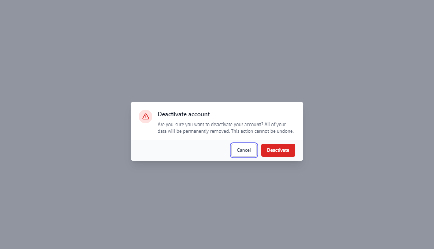
In the piece of code above we used the useState hook from react to create a piece of state that will be used to control whether or not the modal is opened. We use the Transition component to animate in and out the modal element and the Dialog component to communicate with the user, this component holds the information we want to pass to the user.
Conclusion
In this comprehensive guide, we've explored the process of creating a React Modal using Tailwind CSS. By combining the power of React's component-based architecture and the utility-first approach of Tailwind CSS, you can craft stunning modals that enhance user experience and engagement on your web applications.
Resources
You may find the following resources useful:
Build modern projects using Bootstrap 5 and Contrast
Trying to create components and pages for a web app or website from
scratch while maintaining a modern User interface can be very tedious.
This is why we created Contrast, to help drastically reduce the amount of time we spend doing that.
so we can focus on building some other aspects of the project.
Contrast Bootstrap PRO consists of a Premium UI Kit Library featuring over 10000+ component variants.
Which even comes bundled together with its own admin template comprising of 5 admin dashboards and 23+ additional admin and multipurpose pages for
building almost any type of website or web app.
See a demo and learn more about Contrast Bootstrap Pro by clicking here.

Related Posts