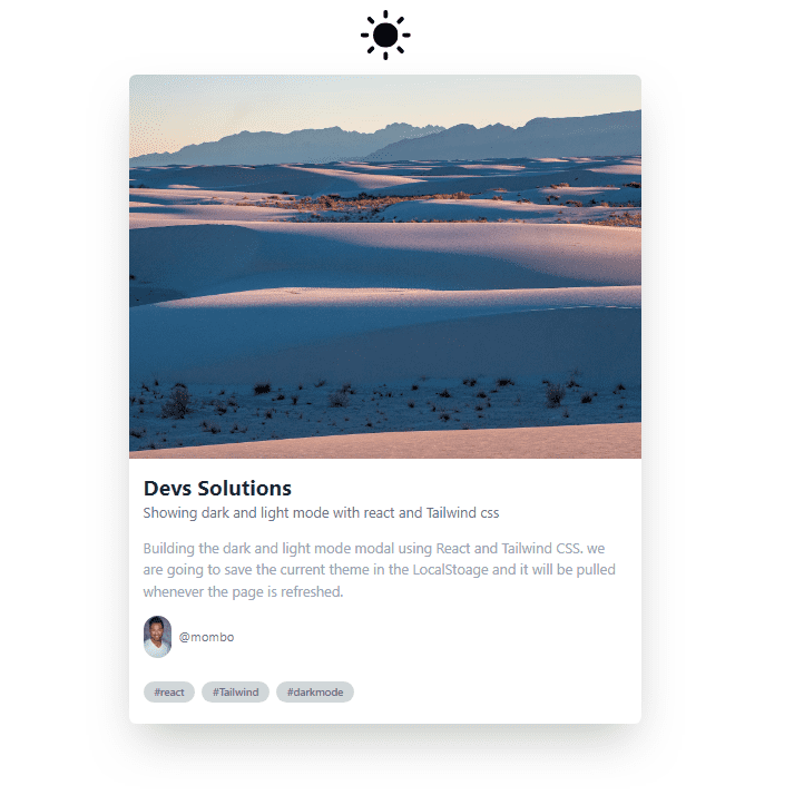
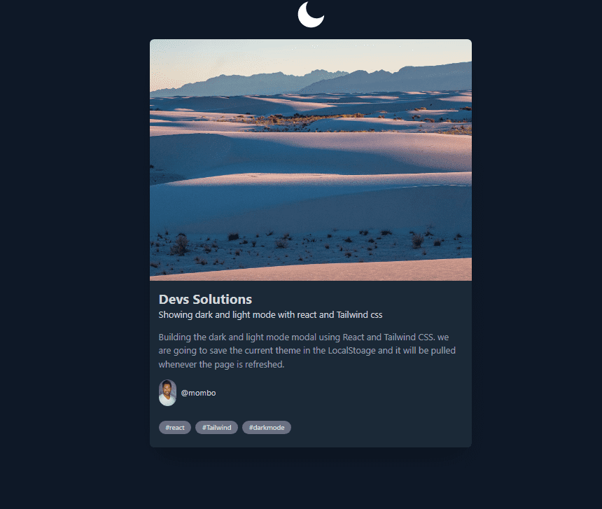
.png)
How to implement dark mode in React using tailwind css.

By Emmanuel Ovuoba
Technical Writer/Web developer
Tailwind Dark Mode
Dark mode is a popular feature that is becoming increasingly common in web and mobile applications. It provides a darker color scheme that can be easier on the eyes, especially in low light environments. In this blog post, we will explore how to implement dark mode in a React application using Tailwind CSS.
What is Tailwind CSS?
Tailwind CSS is a utility-first CSS framework that provides a set of pre-defined classes that you can use to style your UI components. Instead of creating custom CSS styles for each component, you can use the pre-defined classes to apply styles in a more consistent and efficient way.
Tailwind CSS also provides features like responsive design and dark mode support.
Setting up Tailwind CSS
Before we can implement dark mode in our React application using Tailwind CSS, we need to set up Tailwind CSS. Here are the steps to do that:
Install Tailwind CSS as a dependency in your project
To install Tailwind css, you need to open your terminal and run the following code below on your terminal.
npm install tailwindcssThis will install tailwindcss as a dependency on your react application
Create a tailwind.config.js file in the root of your project
npx tailwindcss initThis initializes the Tailwind config file. You can add the paths to all of your template files in the file including the dark mode configurations.
module.exports = { darkMode: 'class', content: ['./src/**/*.{js,jsx,ts,tsx}'], theme: { extend: {}, }, plugins: [],};In this file, we specify the configuration for Tailwind CSS. We also set purge to specify the files to be scanned for used classes and optimize the output. Finally, we set darkMode to class to enable dark mode by default.
Import Tailwind CSS in your index.css file
/*/_ ./src/index.css _/ */@import 'tailwindcss/base';@import 'tailwindcss/components';@import 'tailwindcss/utilities';Here, we import the base, components, and utilities styles from Tailwind CSS.
Import the index.css file in your index.js file:
Copy codeimport React from 'react';import ReactDOM from 'react-dom';import './index.css';import App from './App';
ReactDOM.render(<React.StrictMode><App /></React.StrictMode>,document.getElementById('root'));
With these steps, we have set up Tailwind CSS in our React application.
Implementing dark mode Now that we have set up Tailwind CSS, we can implement dark mode in our React application. Here are the steps to do that:
Enable dark mode in the tailwind.config.js file:
module.exports = { purge: ['./src/**/*.{js,jsx,ts,tsx}', './public/index.html'], darkMode: 'class', // enable dark mode theme: { extend: {}, }, variants: { extend: {}, }, plugins: [],};Here, we set darkMode to 'class' to enable dark mode using the class attribute. This means that when dark mode is enabled, the dark class will be added to the html element, and we can use this class to apply different styles for dark mode.
Building the a project with the dark mode feture.
In order to demonstrate the dark mode features, we are going to build a card and use a switch UI to show the dark and light features.
Presequite
- Node install
- React installed
- Tailwind installed and set up
After installing the packages as we did above we can go ahead to build out our components where the event will run, then the actual event itself and a hook that catches the theme.
The Tailwind UI component
To show the dark and light mode in tailwind, we need a UI component where the event will run. Such UI components could be a switch, checkbox, button or radio. In this case we will be using a switch.
Before we build this we will build the custom hook first.
You can create a folder and inside the folder you create a file called useDarkSide.js
Building a custom Hook
Inside your useDarkSide.js, write the following code.
import { useEffect, useState } from 'react';
export default function useDarkSide() {  const [theme, setTheme] = useState(localStorage.theme);  const colorTheme = theme === 'dark' ? 'light' : 'dark';
  useEffect(() => {    const root = window.document.documentElement;    root.classList.remove(colorTheme);    root.classList.add(theme);
    // save theme to local storage    localStorage.setItem('theme', theme);  }, [theme, colorTheme]);
  return [colorTheme, setTheme];}
The custom hook uses the useState and useEffect hooks.
The useState hook initializes the theme state with the value of localStorage.theme. The localStorage object provides a way to store data in the browser and it persists even if the user refreshes or closes the browser.
The colorTheme variable is derived from the theme state. If theme is set to "dark", colorTheme will be "light" and vice versa. This allows the hook to toggle between two themes.
The useEffect hook is used to update the HTML document with the appropriate theme based on the theme and colorTheme states. It also saves the theme to the localStorage.
The useEffect hook takes two arguments: a function and an array of dependencies. In this code, the array of dependencies is [theme, colorTheme], which means that the function inside the useEffect hook will be executed whenever theme or colorTheme changes.
Inside the useEffect function, the classList property is used to add or remove a class from the HTML document's root element (window.document.documentElement). This will allow for the styling of the document based on the theme.
Finally, the useDarkSide hook returns an array that contains the current colorTheme and the setTheme function, which can be used to update the theme state. This allows other components to access and update the theme state without having to write the same code repeatedly.
Building the Switcher UI Component
create a file name Switcher.js on the src folder and write the following code.
import React, { useState } from 'react';import useDarkSide from './Hook/useDarkSide';import { DarkModeSwitch } from 'react-toggle-dark-mode';
export default function Switcher() {  const [colorTheme, setTheme] = useDarkSide();  const [darkSide, setDarkSide] = useState(colorTheme === 'light' ? true : false);
  const toggleDarkMode = checked => {    setTheme(colorTheme);    setDarkSide(checked);  };
  return (    <>      <div>        <DarkModeSwitch checked={darkSide} onChange={toggleDarkMode} size={56} />      </div>    </>  );}
The code above imports and uses two other custom hooks: useDarkSide and DarkModeSwitch.
The useState hook is also imported from the react library.
The useDarkSide hook returns the current color theme and a function to update it.
The DarkModeSwitch is a toggle switch component from the react-toggle-dark-mode library that accepts three props:
checked which is a boolean value indicating whether the switch is toggled on or off, and is initialized to the value of darkSide state.
onChange which is a function that gets called whenever the switch is toggled on or off, and is set to toggleDarkMode.
size which is an optional number that determines the size of the switch, and is set to 56 in this code.
The useState hook is used to initialize the darkSide state, which is set to true if the current colorTheme is light, and false otherwise.
The toggleDarkMode function is called whenever the DarkModeSwitch is toggled on or off. It updates the colorTheme using the setTheme function from the useDarkSide hook, and sets the darkSide state to the new value of the switch.
Finally, the Switcher component returns the DarkModeSwitch component wrapped in a div element, and rendered as the default export of the module.
Building Our card component
Also create a file on the src folder called Card.js. Write the following code inside
import React from 'react';import me from './images/modal.jpg';function Card() {  return (    <div className="w-full md:w-1/2 lg:w-2/6">      <div className="bg-white dark:bg-gray-800 m-4 rounded-lg shadow-2xl">        <img          src="https://images.unsplash.com/photo-1678595367575-b020f6ff28d1?ixlib=rb-4.0.3&ixid=MnwxMjA3fDB8MHxwaG90by1wYWdlfHx8fGVufDB8fHx8&auto=format&fit=crop&w=1548&q=80"          alt="Post"          className="rounded-t-lg"        />        <div className="px-4 pt-2">          <h1 className="font-bold mt-2 text-2xl text-gray-800 dark:text-gray-300">            Devs Solutions          </h1>          <h3 className="text-gray-500 dark:text-gray-300">            {' '}            Showing dark and light mode with react and Tailwind css          </h3>          <p className="text-gray-400 dark:text-gray-400 my-4">            Building the dark and light mode modal using React and Tailwind CSS. we are going to            save the current theme in the LocalStoage and it will be pulled whenever the page is            refreshed.          </p>        </div>        <div className="px-4 pb-2">          <a            href="https://www.linkedin.com/in/emmanuel-ovuoba-929155103/overlay/background-image/"            target="_blank"            rel="nonreferrer"            className="flex items-center"          >            <img src={me} width="32" alt="Avatar" className="rounded-full" />            <div className="ml-2">              <p className="text-gray-500 dark:text-gray-300 text-sm">@mombo</p>            </div>          </a>        </div>        <div className="p-4">          <span className="inline-block bg-gray-300 dark:bg-gray-500 rounded-full px-3 py-1 text-xs font-semibold text-gray-500 dark:text-gray-300 mr-2 mb-2">            #react          </span>          <span className="inline-block bg-gray-300 dark:bg-gray-500 rounded-full px-3 py-1 text-xs font-semibold text-gray-500 dark:text-gray-300 mr-2 mb-2">            #Tailwind          </span>          <span className="inline-block bg-gray-300 dark:bg-gray-500 rounded-full px-3 py-1 text-xs font-semibold text-gray-500 dark:text-gray-300 mr-2 mb-2">            #darkmode          </span>        </div>      </div>    </div>  );}
export default Card;
This code defines a React component named Card that renders a card with a title, description, image, and some tags. The card showcases an example of implementing dark and light mode using React and Tailwind CSS.
Rendering our component
import Card from './Card';import Switcher from './Switcher';
function App() {  return (    <div className="min-h-screen flex flex-col items-center transition duration-200 dark:bg-gray-900 p-10">      <Switcher />      <Card />    </div>  );}
export default App;
This is a React application that imports two components: Card and Switcher. The Card component is used to display a card with some information about a topic, while the Switcher component is used to toggle between dark and light mode for the app.
The App component is the entry point of the application that renders the Card and Switcher components and sets the background color and other styles based on the theme (dark or light).
Rendering the APP Component
We are going to go ahead and render the App component in the index.js file.
import React from 'react';import ReactDOM from 'react-dom/client';import './index.css';import App from './App';
const root = ReactDOM.createRoot(document.getElementById('root'));root.render(  <React.StrictMode>    <App />  </React.StrictMode>);
the code above sets up the application to render the App component and ensures that the application runs in StrictMode.
Now, Your application should look like the image below
Conclusion
In conclusion, implementing dark mode in React using Tailwind CSS is a simple process that can enhance the user experience of a web application. We can achieve this by utilizing the useState and useEffect hooks to manage the theme state and the use of class manipulation in JavaScript to update the CSS classes of the HTML elements. With the addition of the react-toggle-dark-mode package, we can provide a switcher button for the user to easily toggle between the light and dark modes. Overall, implementing dark mode in React using Tailwind CSS is a straightforward process that can be easily integrated into any web application.
Build modern projects using Bootstrap 5 and Contrast
Trying to create components and pages for a web app or website from
scratch while maintaining a modern User interface can be very tedious.
This is why we created Contrast, to help drastically reduce the amount of time we spend doing that.
so we can focus on building some other aspects of the project.
Contrast Bootstrap PRO consists of a Premium UI Kit Library featuring over 10000+ component variants.
Which even comes bundled together with its own admin template comprising of 5 admin dashboards and 23+ additional admin and multipurpose pages for
building almost any type of website or web app.
See a demo and learn more about Contrast Bootstrap Pro by clicking here.
Related Posts

