


How to create Tailwind CSS Modal:A Step-by-Step Guide

By Emmanuel Chinonso
Technical Writer/Web developer
Tailwind Modals
Modal windows or pop-ups are a popular UI element used in modern web design to provide extra information or interaction. They are an effective way of grabbing user attention without taking them away from the current page. In this article, we will guide you on how to create a modal using Tailwind CSS, a popular utility-first CSS framework.
Table of content
- Introduction
- What is a modal dialog
- Prerequisites
- Add Tailwind CSS to your Project
- Linking HTML page to Tailwind CSS
- Create the button
- Adding an overlay effect
- Create the modal dialog
- Adding functionality
- Conclusion
Introduction
Tailwind CSS is a self-described utility-first CSS framework. It is used for building beautiful user interfaces. It is non-opinionated and therefore easy to style.
If you do not have Tailwind CSS already installed in your HTML project, check out our article here to figure out how to install the Tailwind CSS and use it in your projects. Apart from learning how to install Tailwind in your project, we are going to build a Tailwind Modal to help you kick off your development.
Tailwind modal: What is a modal dialog
A modal is simply a popup window that appears on top of the main content of a web application. Modal dialog always seeks user interaction. there can also be used to give critical warnings to users to prevent errors.
Throughout the Tailwind CSS tutorial, we are going to use Tailwind CSS, HTML, and JavaScript to build our Tailwind modal dialog. The Tailwind CSS modal popup window will look like the image below
Prerequisite
- Latest version of Tailwind CSS
- Knowledge of HTML
- Knowledge of CSS
- Knowledge of JavaScript
Add Tailwind CSS to your Project
Before we can go on, it is assumed you have Tailwind CSS installed on your system. If you haven’t, you can check out how to do this How to use TailwindCSS in HTML.
Linking HTML page to Tailwind CSS
The first step to building our Tailwind modal after installation of the Tailwind CSS is to link the Html to the Tailwind CSS like the code below.
Code:
<!DOCTYPE html><html lang="en"> <head> <meta charset="UTF-8" /> <meta http-equiv="X-UA-Compatible" content="IE=edge" /> <meta name="viewport" content="width=device-width, initial-scale=1.0" /> <title>modal dialog</title> <link rel="stylesheet" href="style.css" /> </head></html>Creating a button for Tailwind Modal
Once your Tailwind CSS stylesheet is correctly linked. The next thing we are going to do is to create a button for our Tailwind Modal. To do this, we wrapped our button under a “div” container and added instructions on our page to click on the button. You can see the code below
Code:
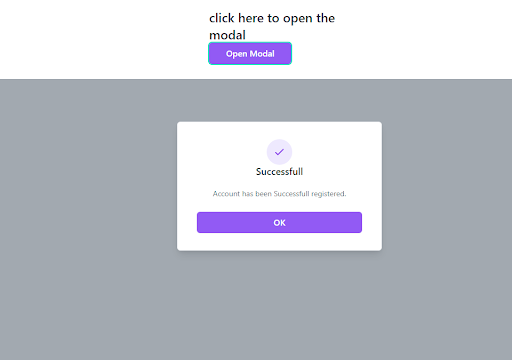
<div class="w-80 mx-auto mt-5 p-7"> <p class="text-2xl font-medium text-gray-800"> click here to open the modal </p> <button class="bg-purple-500 text-white rounded-md px-8 py-2 text-base font-medium hover:bg-blue-600 focus:outline-none focus:ring-2 focus:ring-green-300" id="open-btn" > Open Modal </button></div>In the code above, we created the button and styled it with Tailwind CSS styles. At this point, Our Tailwind modal popup will look like the image below.

Overlap effect for Tailwind modal
We can go ahead to create an overlapping effect. The overlap effect makes sure the user attends to the Tailwind modal dialog box first before continuing with the site.
Code:
<div class="fixed hidden insert-0 bg-gray-600 bg-opacity-50 overflow-y-auto h-full w-full" id="modal"></div>In the code above, we used some Tailwind CSS style to render an overlapping effect on our page.
Creating the Tailwind CSS modal dialog
We initially stated at the beginning of our tutorial how important the Tailwind modal dialog is and what it does for the user. In our case, we created a Tailwind CSS modal dialog that tells the user whether he/she has successfully created an account.
Code:
<div class="relative top-20 mx-auto p-5 border w-96 shadow-lg rounded-md bg-white"> <div class="mt-3 text-center"> <div class="mx-auto flex items-center justify-center h-12 w-12 rounded-full bg-purple-100"> <svg class="h-6 w-6 text-purple-600" fill="none" stroke="currentColor"viewBox="0 0 24 24"xmlnx="http://www.w.org/2000/svg"><path stroke-linecap="round" stroke-linejoin="round" stroke-width="2"d="M5 13l4 4L19 7"></path></svg> </div> <h3 class="text-lg leading-6 font-medium text-gray-900">Successfull</h3> <div class="mt-2 px-7 py-3"> <p class="text-sm text-gray-500">Account has been Successful registered.</p> </div> <div class="items-center px-4 py-3"> <button id="ok-btn" class="px-4 py-2 bg-purple-500 text-white text-base font-medium rounded-md w-full shadow-sm hover:bg-purple-600 focus:outline-none focus:ring-2 focus:ring-purple-300"> OK </button> </div> </div> </div></div>In the code above, we first started by styling the head of our Tailwind modal dialog. We did this by adding classes that will enable us to align our elements inside the parent “div”. we went ahead to create a child “div” which contained an “SVG” element. Some classes we added to our modal dialog include
text-centerwhich centers all the text presentfont-mediumwhich changes the font weight to 500px-4andpy-3which adds padding of 16px to the y-axis and 8px to the y-axisfocus:ring-2which creates an outline ring on the buttonfocus: ring-purple-300which creates a purple outline ringhover: bg-purple-600simply adds a hover effect on the button by changing the background color.
We have successfully styled our Tailwind CSS modal dialog. We can now go ahead and add some functionality to our Tailwind CSS modal
Tailwind Modal: Functionality of the Tailwind CSS Modal dialog
We initially added some IDs to the buttons when we were creating the style for the modal dialog and the instruction button. We are going to go ahead and add functionality to these buttons by first grabbing all our IDs. You can write the code inside the script tag at the bottom of our page.
Code:
<script> let modal = document.getElementById('modal'); let btn = document.getElementById('open-btn'); let button = document.getElementById('ok-btn');</script>In the code above, we used the “document.getElementById” to grab the IDs we have given to the buttons on our page. We can now make the buttons do what we want. First, we want our “open modal” button to open the modal dialog when clicked and our “OK “ button on the Tailwind CSS modal dialog to close when clicked. To do this we have to create a function for both buttons to do. The functions are written below
Code:
btn.onclick = function() {  modal.style.display = 'block';};
button.onclick = function() {  modal.style.display = 'none';};
Moreover, we need the button to close too when the user clicks anywhere on the window. So we are going to create a function that will do this for us.
Code:
window.onclick = function (event) { if (event.target == modal) { modal.style.display = "none"; } } </script>With the code above, our Tailwind CSS modal popup is ready. It should look like the image below.
Overview of the Tailwind modal with Html
Although we have gone through the code on how to build your own Html modal using Tailwind CSS, you can also create this modal using react and other frameworks. You can check our article on how to make the Tailwind modal with React.
However, here is the entire code for the Tailwind modal we created using Html and tailwind.
<div class="w-80 mx-auto mt-5 p-7">    <p class="text-2xl font-medium text-gray-800">        click here to open the modal    </p>    <button class="bg-purple-500 text-white rounded-md px-8 py-2 text-base font-medium hover:bg-blue-600    focus:outline-none focus:ring-2 focus:ring-green-300" id="open-btn">        Open Modal    </button></div>
<!---Modal --><div class="fixed hidden insert-0 bg-gray-600 bg-opacity-50 overflow-y-auto h-full w-full" id="modal"><div class="relative top-20 mx-auto p-5 border w-96 shadow-lg rounded-md bg-white">    <div class="mt-3 text-center">        <div class="mx-auto flex items-center justify-center h-12 w-12 rounded-full bg-purple-100">            <svg class="h-6 w-6 text-purple-600" fill="none" stroke="currentColor" viewBox="0 0 24 24"                xmlnx="http://www.w.org/2000/svg">                <path stroke-linecap="round" stroke-linejoin="round" stroke-width="2" d="M5 13l4 4L19 7">                </path>            </svg>        </div>        <h3 class="text-lg leading-6 font-medium text-gray-900">Successfull</h3>        <div class="mt-2 px-7 py-3">            <p class="text-sm text-gray-500">Account has been Successful registered.</p>        </div>        <div class="items-center px-4 py-3">            <button id="ok-btn" class="px-4 py-2 bg-purple-500 text-white                            text-base font-medium rounded-md w-full                            shadow-sm hover:bg-purple-600 focus:outline-none focus:ring-2 focus:ring-purple-300">                OK            </button>
        </div>    </div>
</div></div></div><script>  let modal = document.getElementById('modal');   let btn = document.getElementById('open-btn');    let button = document.getElementById('ok-btn');
    btn.onclick = function () {            modal.style.display = 'block';        };
        button.onclick = function () {            modal.style.display = 'none';        };
window.onclick = function (event) {if (event.target == modal) {modal.style.display = "none";}}
</script>
Conclusion
Creating a modal using Tailwind CSS is a straightforward process that can be accomplished with just a few lines of code. By following the steps outlined in this article, you can create a modal that is fully customizable and can be integrated into any website or web application.
Build modern projects using Bootstrap 5 and Contrast
Trying to create components and pages for a web app or website from
scratch while maintaining a modern User interface can be very tedious.
This is why we created Contrast, to help drastically reduce the amount of time we spend doing that.
so we can focus on building some other aspects of the project.
Contrast Bootstrap PRO consists of a Premium UI Kit Library featuring over 10000+ component variants.
Which even comes bundled together with its own admin template comprising of 5 admin dashboards and 23+ additional admin and multipurpose pages for
building almost any type of website or web app.
See a demo and learn more about Contrast Bootstrap Pro by clicking here.

Related Posts