

How to create Tailwind CSS Components for your Website

By Emmanuel Chinonso
Technical Writer
Tailwind CSS is a growing popular Utility-first CSS framework for building custom website components.
It means that it doesn’t provide pre-styled components, unlike other frameworks. It's rather a low-level utility class for styling CSS properties. Tailwind CSS is continuously growing in popularity, especially with the community.
We are going to walk through the process of creating Tailwind CSS components for your website. We are going to build a pricing Component using HTML and Tailwind CSS.
Table of content
- Prerequisites
- Creating the files
- Installation of Tailwind CSS
- Configuration of styles
- Building the pricing component.
- Other Examples of Tailwind components
- Conclusion
Prerequisites
To follow along with our tailwind CSS tutorial, you need to know the following:
- Knowledge of HTML
- Knowledge of basic CSS
- Knowledge of Tailwind CSS
- Knowledge of Npm
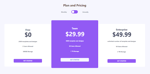
Our pricing component will look like the image below
Creating the files
The first thing we can do here is to create a folder for our project by running the following on our terminal
Code:
mkdir website-componentmkdir creates a folder and you can call your folder any name of your choice. We choose to call our folder a website component.
You can go ahead and change the directory to the new folder you created by running the following command.
Code:
cd website-component.After this, the next you will need to do is to create a package.json file inside the project by running the following command
Code:
npm init –y.you can now go ahead to create an Html file with the following code inside.
HTML CODE:
<head> <meta charset="UTF-8"> <meta name="viewport" content="width=device-width, initial-scale=1.0"> <title>Tailwind website Component</title></head><body></body></html>Installation of Tailwind CSS
Tailwind CSS can be used in two different ways. These include the CDN and the package manager. When using the CDN, you can simply grab the latest configuration build via CDN and link it to the head tag of your HTML
Code:
<link href=https://unpkg.com/tailwindcss@^1.0/dist/tailwind.min.css” rel =”stylesheet”>Using the Package manager
To Install Tailwind CSS using the Yarn package manager all you need to do is to run the following command on your terminal
Code:
yarn add tailwindcssThis command will add the latest stable version of Tailwind CSS as a dependency. if you don’t wish to use the yarn. You can proceed to create a default configuration file. This file helps to customize your tailwind CSS installation. You can do this by writing the following command on your terminal.
Code:
npx tailwindcss init.The command will create a tailwindcss.config.js file in the root of your project directory. The file allows you to customize your Tailwind CSS however you wish. If you want to customize your entire tailwind CSS by removing the default. You can add —full to your command.
Code:
npx tailwindcss init –fullyou can learn more about customizing your configuration file by checking out the documentation.
Configuration of styles
At this stage, we are going to configure our styles. Before we can do that, we must first create the styles folder and set up the files. We can create the styles folder by running the following command on our terminal
Code:
mkdir <name of the folder>.Next, we create two styles of files inside the folder. Styles.css and tailwind.css files. The tailwind.css files will contain the compiled output of the styles.css file while the styles.css file is where we will be importing our
Tailwind base styles.
You should copy this code and paste it into your style.css file.
Code:
@tailwind base;@tailwind components;@tailwind utilities;After this, you can proceed to import the tailwind.css file into your project. You can do these as a link to your HTML file.
Code:
<link href="styles/tailwind.css" rel="stylesheet" />In our tailwind CSS component, we wish to configure some styles to fit the project we are going to build. First, we create an extended object inside the theme object to configure the colors and font of our styles. we can do these by writing the following code
Code:
module.exports = { purge: [], darkMode: false, // or 'media' or 'class' theme: { extend: { colors: { primary: { blue: 'hsl(237, 63%, 64%)', 'very-light': 'hsl(240,78%, 98%)', light: 'hsl(234, 14%,74%)', normal: 'hsl(23, 13%, 33%)', dark: 'hsl(232,13%,33%)', }, }, width: { custom: '31%', }, }, fontfamily: { sans: ['Montserrat', 'sans-serif'], }, }, variants: { extend: {}, }, plugins: [],};The code above is how your tailwind.config.js file should look after including all the configuration you need.
We created an extended object on the theme object to not remove the entire Tailwind CSS color palate. We rather added our color palate to the existing ones. We also added the font family object to add a new font family to our Tailwind CSS component.
The next thing we do is to import the Montserrat we created on our config file to the styles.css file
Code:
@import url ('https://fonts.googleapis.com/csss2?family=Montserrat:wght@400;700;900&display=swap');We can now compile and build the styles that will be generated from your styles.css file to our tailwind.css file by using the following code on the terminal
Code:
npx tailwindcss build styles/styles.css –o styles/tailwind.css.This command will generate a unique set of base styles and your custom styles defined in the tailwind.config.js file. We can now proceed to build our tailwind CSS components.
Building the website component
There are many components you can build with Tailwind CSS, which include button components, card components, or even a component avatar. To build any tailwind CSS components for a website, you need to follow the following procedure.
Steps for building Tailwind CSS components
- Install tailwind CSS
- Configure your tailwind CSS style
- Customize your styles (optional)
- Set up your files
- Build your Tailwind CSS component
Today, we are going to build a pricing component for a website. We have already gone through the procedure for making a component except for the last part. We can now proceed by opening our Html file and writing the following code.
Code:
<!DOCTYPE html><html lang="en">  <head>    <meta charset="UTF-8" />    <meta name="viewport" content="width=device-width, initial-scale=1.0" />    <link href="styles/styles.css" rel="stylesheet" />    <title>Tailwind Pricing Component</title>  </head>
  <body class="h-full py-16 antialiased bg-primary-very-light font-sans">    <header class="flex flex-col items-center mb-12">      <h2 class="text-3xl text-primary-normal font-bold">Plan and Pricing</h2>      <div class="pt-8 w-3/5 lg:w-1/5 flex justify-around ">        <p class="text-sm text-gray-500 font-bold mt-2">Monthly</p>        <div>          <label for="toggle" class="relative">            <input type="checkbox" name="toggle" id="" class="hidden" />            <div class="absolute w-16 h-8 rounded-full shadow-inner inset-y-0 bg-purple-500 "></div>            <div class="absolute w-6 h-6 bg-white rounded-full shadow inset-y-0 mt-1 ml-1 "></div>          </label>        </div>        <p class="text-sm text-gray-500 font-bold mt-2 ml-16">Annually</p>      </div>    </header>    <section      class="flex flex-col lg:flex-row items-start  lg:justify-center       w-full lg:px-10 py-12 "    >      <article        class="bg-white w-4/5 lg:w-custom mb-10 lg:px-4 px-6 py-10 text-center text-primary-dark         rounded-lg"      >        <h5 class="font-bold  text-2xl">Free</h5>        <h2 class="pb-4 flex justify-center font-bold ">          <span class="text-3xl mt-6 mr-1"></span><span class="text-6xl"> $0</span>        </h2>        <ul class="text-sm font-bold">          <li class="pt-4 pb-4 text-primary-dark">2500 templates and designs</li>          <li class="pt-3 pb-4 text-primary-dark">2 Users Allowed</li>          <li class="pt-4 pb-4 text-primary-dark">500GB Storage</li>        </ul>        <button          class=" uppercase text-center text-sm mt-12 xl:px-24 px-12 sm:px-16 py-2 font-bold           text-primary-very-light rounded-md bg-purple-500"        >          Get Started        </button>      </article>      <article        class="lg:w-custom w-4/5 mb-10 px-6 py-16 lg:-mt-6 text-white text-center rounded-lg bg-purple-500"      >        <h5 class="font-bold  text-2xl">Team</h5>        <h2 class="font-bold pb-4 mt-2 flex justify-center">          <span class="text-3xl mt-6 mr-1"></span><span class="text-6xl "> $29.99</span>        </h2>        <ul class=" text-sm font-bold">          <li class="pt-4 pb-4">5000 template and designs</li>          <li class="pt-4 pb-4">20 Users Allowed</li>          <li class="pt-4 pb-4 ">1 TB Storage</li>        </ul>        <button          class="uppercase text-center text-sm mt-10 xl:px-24 px-12 sm:px-16 py-2           rounded-md font-bold bg-primary-very-light text-primary-blue"        >          Get Started        </button>      </article>      <article        class="bg-white w-4/5 lg:w-custom mb-10 lg:px-4 px-6 py-10 text-center text-primary-dark         rounded-lg"      >        <h5 class="font-bold  text-2xl">Enterprise</h5>        <h2 class="flex justify-center pb-4 font-bold">          <span class="text-3xl mt-6 mr-1"></span><span class="text-6xl">$49.99</span>        </h2>        <ul class="text-sm font-bold">          <li class="pt-4 pb-4 ">unlimited number of template and designs</li>          <li class="pt-4 pb-4 ">50 Users Allowed</li>          <li class="pt-4 pb-4 ">2 TB Storage</li>        </ul>        <button          class="uppercase text-center text-sm mt-12 xl:px-24 px-12 sm:px-16 py-2 rounded-md           font-bold text-primary-very-light bg-purple-500"        >          Get Started        </button>      </article>    </section>  </body></html>
When we are done styling our pricing component, our webpage should look like the image below.

Other Examples of Tailwind components
Other Tailwind components are built with Tailwind. we are going to explore other Tailwind Components.
Tailwind Form
Tailwind hero section
Tailwind Navigation bar
Tailwind Card
function App() {  return (    <section className="App h-screen w-full flex justify-center items-center bg-purple-500">      <div className="w-full max-w-md bg-white-800">        <div          className="rounded-t-xl bg-white px-6 py-6 md:p-6 text-lg md:text-xl leading-8Md:leading-8 font-semibold"        >          <p className="text-purple-900 text-xl md:text-xl font-black text-center pb-2">            Tailwind CSS          </p>
          <p            className="text-indigo-700 text-base md:text-base italicfont-normal text-center"          >            "A utility-first CSS framework for rapid UI development. "          </p>        </div>
        <div          className="flex items-center space-x-4 p-6 md:px-6 md:py-6bg-gradient-to-tr from-purple-700 to-indigo-700 rounded-b-xlleading-6 font-semibold text-white"        >          <div            className="flex-none w-14 h-14 bg-white rounded-full shadow-2xlitems-center justify-center"          >            <svg              height="54"              preserveAspectRatio="xMidYMid"              width="54"              xmlns="http://www.w3.org/2000/svg"              viewBox="0 0 256 153.6"            >              <linearGradient id="a" x1="-2.778%" y1="32%" y2="67.556%">                <stop offset="0" stop-color="#2298bd" />                <stop offset="1" stop-color="#0ed7b5" />              </linearGradient>              <path                d="M128 0C93.867 0 72.533 17.067 64 51.2 76.8 34.133 91.733 27.733 108.8 32c9.737 2.434 16.697 9.499 24.401 17.318C145.751 62.057 160.275 76.8 192 76.8c34.133 0 55.467-17.067 64-51.2-12.8 17.067-27.733 23.467-44.8 19.2-9.737-2.434-16.697-9.499-24.401-17.318C174.249 14.743 159.725 0 128 0zM64 76.8C29.867 76.8 8.533 93.867 0 128c12.8-17.067 27.733-23.467 44.8-19.2 9.737 2.434 16.697 9.499 24.401 17.318C81.751 138.857 96.275 153.6 128 153.6c34.133 055.467-17.067 64-51.2-12.8 17.067-27.733 23.467-44.8 19.2-9.737-2.434-16.697-9.499-24.401-17.318C110.249 91.54395.725 76.8 64 76.8z"                fill="url(#a)"              />            </svg>          </div>
          <div className="flex-auto text-base md:text-base font-thin">            Created By            <br />            <span className="text-xl md:text-xl text-purple-200 font-black">Adam Wathan</span>          </div>        </div>      </div>    </section>  );}
export default App;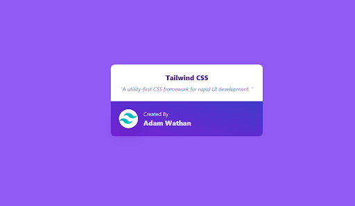
etc
Conclusion
In our tailwind CSS tutorial today, we learned what Tailwind CSS is, and we proceeded to show how you can set up your project to build tailwind CSS components. We used the pricing component as an example to build a Tailwind CSS component, we also included a button component on our pricing component. I hope you enjoyed the article.
Build modern projects using Bootstrap 5 and Contrast
Trying to create components and pages for a web app or website from
scratch while maintaining a modern User interface can be very tedious.
This is why we created Contrast, to help drastically reduce the amount of time we spend doing that.
so we can focus on building some other aspects of the project.
Contrast Bootstrap PRO consists of a Premium UI Kit Library featuring over 10000+ component variants.
Which even comes bundled together with its own admin template comprising of 5 admin dashboards and 23+ additional admin and multipurpose pages for
building almost any type of website or web app.
See a demo and learn more about Contrast Bootstrap Pro by clicking here.

Related Posts
Comments
...