

How to create Tailwind CSS React Forms.

By Amarachi Iheanacho
Technical Writer
Forms have been used throughout modern history, whether they be physical forms or virtual forms. They have been used to collect information for various reasons, whether it be government forms, or health or pension forms, and all have that same underlying rule.
React Tailwind forms are no different. They are usually found on a web application and they allow you to keep in touch with your users, use the data collected from the forms to better satisfy your users, and increase the chances of better decision-making.
In this article, we are going to walk you through building a React Tailwind form.
Table of Content
- Prerequisites
- What is TailwindCSS
- Creating our React Project
- Installing TailwindCSS
- Creating Tailwind CSS form in our App.js
- Conclusion
- Resources
Prerequisities
To make the most of this article, you must have the following:
- A basic understanding of HTML.
- A basic understanding of CSS.
- A basic understanding of React.
- Node and its package manager, npm,
Run the command
node -v npm -vTo verify we have them installed, or install them from here.
- Alternatively, we can use another package manager, Yarn.
What is Tailwind CSS
Tailwind CSS, according to the documentation on their website, tailwind CSS is a utility-first CSS framework. Tailwind CSS helps developers bring designs to life, it is fast and easy to use, with its custom class names that gift our application with ready-to-use styles.
Creating our React project
To create a new react project, we go to our terminal, cd in the directory we want, and then run this command npx create-react-app project-name.
cd Documentsnpx create-react-app project-nameInstalling Tailwind CSS
To have tailwind CSS available in your project, cd into the project you created earlier
cd project-namenext run
npm install -D tailwindcss postcss autoprefixerThis helps to install the tailwind CSS and its peer dependencies, we then generate our tailwind.config.js and postcss.config.js files by running this command:
npx tailwindcss init -pConfiguring your templates path
To configure your paths go to your tailwind.config.js, and edit your module.exports object, add the paths to your template files in your content array.
module.exports = { content: ['./src/**/*.{js,jsx,ts,tsx}'], theme: { extend: {}, }, plugins: [],};Next add the Tailwind directives to your CSS
Add the tailwind directives in your ./src/index.css file.
@tailwind base;@tailwind components;@tailwind utilities;After this, we run our project
npm run startYou should see the image below on your browser when you go to http://localhost:3000/.

Creating Tailwind CSS Form in our Appjs
Simple no labels Tailwind CSS Form
This "simple no labels" form can also be referred to as the default form. Similar to forms built with traditional CSS, Tailwind CSS forms consist of input elements and labels to differentiate the input elements and what information goes into the input elements.
In the form below, we are going to use a lock icon in our buttons, so to be able to use this in our code, we have to install Heroicon in our project. To do that, we have to run the command below.
npm install @heroicons/reactNext, we import the icon we want LockClosedIcon from @heroicons/react/solid.
import './App.css';
import { LockClosedIcon } from '@heroicons/react/solid'
export default function App() { return (
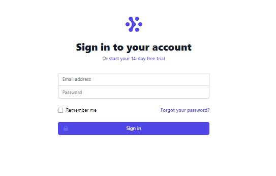
<div className="min-h-full flex items-center justify-center py-12 px-4 sm:px-6 lg:px-8"> <div className="max-w-md w-full space-y-8"> <div> <img className="mx-auto h-12 w-auto" src="https://tailwindui.com/img/logos/workflow-mark-indigo-600.svg" alt="Workflow" /> <h2 className="mt-6 text-center text-3xl font-extrabold text-gray-900">Sign in to your account</h2> <p className="mt-2 text-center text-sm text-gray-600"> Or{' '} <a href="#" className="font-medium text-indigo-600 hover:text-indigo-500"> start your 14-day free trial </a> </p> </div> <form className="mt-8 space-y-6" action="#" method="POST"> <input type="hidden" name="remember" defaultValue="true" /> <div className="rounded-md shadow-sm -space-y-px"> <div> <label htmlFor="email-address" className="sr-only"> Email address </label> <input id="email-address" name="email" type="email" autoComplete="email" required className="appearance-none rounded-none relative block w-full px-3 py-2 border border-gray-300 placeholder-gray-500 text-gray-900 rounded-t-md focus:outline-none focus:ring-indigo-500 focus:border-indigo-500 focus:z-10 sm:text-sm" placeholder="Email address" /> </div> <div> <label htmlFor="password" className="sr-only"> Password </label> <input id="password" name="password" type="password" autoComplete="current-password" required className="appearance-none rounded-none relative block w-full px-3 py-2 border border-gray-300 placeholder-gray-500 text-gray-900 rounded-b-md focus:outline-none focus:ring-indigo-500 focus:border-indigo-500 focus:z-10 sm:text-sm" placeholder="Password" /> </div> </div>
<div className="flex items-center justify-between"> <div className="flex items-center"> <input id="remember-me" name="remember-me" type="checkbox" className="h-4 w-4 text-indigo-600 focus:ring-indigo-500 border-gray-300 rounded" /> <label htmlFor="remember-me" className="ml-2 block text-sm text-gray-900"> Remember me </label> </div>
<div className="text-sm"> <a href="#" className="font-medium text-indigo-600 hover:text-indigo-500"> Forgot your password? </a> </div> </div>
<div> <button type="submit" className="group relative w-full flex justify-center py-2 px-4 border border-transparent text-sm font-medium rounded-md text-white bg-indigo-600 hover:bg-indigo-700 focus:outline-none focus:ring-2 focus:ring-offset-2 focus:ring-indigo-500" > <span className="absolute left-0 inset-y-0 flex items-center pl-3"> <LockClosedIcon className="h-5 w-5 text-indigo-500 group-hover:text-indigo-400" aria-hidden="true" /> </span> Sign in </button> </div> </form> </div> </div> </> )}With this, we have created our react Tailwind form that looks a lot like the image below.
Sometimes as a developer you might not want to write elaborate classes as they might be hard to keep up with, another UI library we could use is Contrast. Check out their documentation here to learn more about it.
Other React Tailwind Forms
Tailwind Signup Form
import React from "react"

export default function FormExample5 = () => {    return (        <div className="relative flex flex-col justify-center min-h-screen overflow-hidden">            <div className="w-full p-6 m-auto bg-white rounded-md shadow-xl shadow-rose-600/40 ring-2 ring-indigo-600 lg:max-w-xl">                <h1 className="text-3xl font-semibold text-center text-indigo-700 underline uppercase decoration-wavy">                    Sign UP                </h1>                <form className="mt-6">                    <div className="mb-2">                        <label                            for="email"                            className="block text-sm font-semibold text-gray-800"                        >                            Firstname                        </label>                        <input                            type="email"                            className="block w-full px-4 py-2 mt-2 text-indigo-700 bg-white border rounded-md focus:border-indigo-400 focus:ring-indigo-300 focus:outline-none focus:ring focus:ring-opacity-40"                        />                    </div>                    <div className="mb-2">                        <label                            for="email"                            className="block text-sm font-semibold text-gray-800"                        >                            Lastname                        </label>                        <input                            type="email"                            className="block w-full px-4 py-2 mt-2 text-indigo-700 bg-white border rounded-md focus:border-indigo-400 focus:ring-indigo-300 focus:outline-none focus:ring focus:ring-opacity-40"                        />                    </div>                    <div className="mb-2">                        <label                            for="email"                            className="block text-sm font-semibold text-gray-800"                        >                            Email                        </label>                        <input                            type="email"                            className="block w-full px-4 py-2 mt-2 text-indigo-700 bg-white border rounded-md focus:border-indigo-400 focus:ring-indigo-300 focus:outline-none focus:ring focus:ring-opacity-40"                        />                    </div>                    <div className="mb-2">                        <label                            for="password"                            className="block text-sm font-semibold text-gray-800"                        >                            Password                        </label>                        <input                            type="password"                            className="block w-full px-4 py-2 mt-2 text-indigo-700 bg-white border rounded-md focus:border-indigo-400 focus:ring-indigo-300 focus:outline-none focus:ring focus:ring-opacity-40"                        />                    </div>                    <div className="mt-6">                        <button className="w-full px-4 py-2 tracking-wide text-white transition-colors duration-200 transform bg-indigo-700 rounded-md hover:bg-indigo-600 focus:outline-none focus:bg-indigo-600">                            Login                        </button>                    </div>                </form>
                <p className="mt-8 text-xs font-light text-center text-gray-700">                    {" "}                    Already have an account?{" "}                    <a                        href="#"                        className="font-medium text-indigo-600 hover:underline"                    >                        Sign in                    </a>                </p>            </div>        </div>    );}
Sign UP
Already have an account? Sign in
Tailwind Contact Form
import React from 'react';
const FormExample6 = () => {  return (    <div className="relative flex flex-col justify-center min-h-screen overflow-hidden ">      <div className="w-full p-6 m-auto bg-white rounded-md shadow-xl shadow-rose-600/40 ring-2 ring-indigo-600 lg:max-w-xl">        <h1 className="text-3xl font-semibold text-center text-indigo-700 underline uppercase decoration-wavy">          Contact Form        </h1>        <form className="mt-6">          <div className="mb-2">            <label>              <span className="text-gray-700">Your name</span>              <input                type="text"                name="name"                className="
            w-full            block px-16 py-2 mt-2            border-gray-300            rounded-md            shadow-sm            focus:border-indigo-300            focus:ring            focus:ring-indigo-200            focus:ring-opacity-50          "                placeholder="John cooks"              />            </label>          </div>          <div className="mb-2">            <label>              <span className="text-gray-700">Email address</span>              <input                name="email"                type="email"                className="            block            w-full            mt-2 px-16 py-2            border-gray-300            rounded-md            shadow-sm            focus:border-indigo-300            focus:ring            focus:ring-indigo-200            focus:ring-opacity-50          "                placeholder="john.cooks@example.com"                required              />            </label>          </div>          <div className="mb-2">            <label>              <span class="text-gray-700">Message</span>              <textarea                name="message"                className="            block            w-full            mt-2 px-16 py-8            border-gray-300            rounded-md            shadow-sm            focus:border-indigo-300            focus:ring            focus:ring-indigo-200            focus:ring-opacity-50          "                rows="5"              ></textarea>            </label>          </div>
          <div class="mb-6">            <button              type="submit"              className="            h-10            px-5            text-indigo-100            bg-indigo-700            rounded-lg            transition-colors            duration-150            focus:shadow-outline            hover:bg-indigo-800          "            >              Contact Us            </button>          </div>          <div></div>        </form>      </div>    </div>  );};
export default FormExample6;
Contact Form
Conclusion
In this article, we discussed what Tailwind CSS is, and how to install it in your project. Finally, we created a form using the template provided by tailwind CSS in their documentation.
Resources
You may also find the following resources useful:
Build modern projects using Bootstrap 5 and Contrast
Trying to create components and pages for a web app or website from
scratch while maintaining a modern User interface can be very tedious.
This is why we created Contrast, to help drastically reduce the amount of time we spend doing that.
so we can focus on building some other aspects of the project.
Contrast Bootstrap PRO consists of a Premium UI Kit Library featuring over 10000+ component variants.
Which even comes bundled together with its own admin template comprising of 5 admin dashboards and 23+ additional admin and multipurpose pages for
building almost any type of website or web app.
See a demo and learn more about Contrast Bootstrap Pro by clicking here.

Related Posts
Comments
...