

How to create Beautiful Bootstrap 5 Checkboxes and Radios.

By Amarachi Iheanacho
Technical Writer
How to customize bootstrap 5 checkbox
what is form check in bootstrap
how to use radio button in bootstrap 5
Bootstrap 5 Checkbox
A Bootstrap 5 Checkbox is a user interface component that is used to allow a user to choose an item or several items from a group of options. It differs from radio buttons in the fact, that they are can allow a user to select multiple options, while a radio button exists for a user to choose one and only one option from the group of options.
A Bootstrap 5 Checkbox looks a lot like you think it would, you have seen some in paper government forms, school forms, and health insurance forms, and in this section of the tutorial, we are going to walk through creating these buttons with a UI library called Contrast.
Table Of Contents
- What is Form Check in Bootstrap
- What is Contrast
- Adding the Contrast library(CDB) CDN
- Creating our Bootstrap 5 Checkbox
- How to customize bootstrap 5 Checkbox
- How to Use Radio Buttons in Bootstrap 5
- Radio Buttons
- Conclusion
- Resources
What is Form Check in Bootstrap
The form-check class in Bootstrap is a wrapper used to style checkboxes and radio buttons. It ensures proper alignment and spacing, making the form controls look consistent across different devices and browsers.
What we are building
In this article, we are going to create bootstrap 5 checkboxes and radio buttons with Contrast.
Prerequisites
To make the most of this article, you must have the following:
- A basic understanding of HTML.
- A basic understanding of CSS.
- A basic understanding of JavaScript
What is Contrast
Contrast or Contrast Design Bootstrap(CDB) is an elegant bootstrap UI kit featuring over 2000+ essential components. Contrast helps simplify the web development process and can be integrated with any project to build mobile-first, responsive, and elegant websites and web apps.
Adding the Contrast library(CDB) CDN
To create our Bootstrap 5 Checkboxes and Radio buttons we are going to use CDB CDN.
We include the CSS CDN responsible for the Bootstrap styling in the <head> in our HTML file.
<link rel="stylesheet" href="https://cdn.jsdelivr.net/npm/cdbootstrap/css/bootstrap.min.css" /><link rel="stylesheet" href="https://cdn.jsdelivr.net/npm/cdbootstrap/css/cdb.min.css" />After including the CSS CDN links, we then include the JavaScript CDN link responsible for creating dynamic components at the bottom of our project. We do this because we want our components to load up before functionalities like interactivity and dynamicity.
<script src="https://cdn.jsdelivr.net/npm/cdbootstrap/js/bootstrap.min.js"></script><script src="https://cdn.jsdelivr.net/npm/cdbootstrap/js/popper.min.js"></script><script src="https://cdn.jsdelivr.net/npm/cdbootstrap/js/cdb.min.js"></script>After adding the CDNs our HTML file should look like this
<!DOCTYPE html><html lang="en"> <head> <meta charset="UTF-8" /> <meta http-equiv="X-UA-Compatible" content="IE=edge" /> <meta name="viewport" content="width=device-width, initial-scale=1.0" /> <link rel="stylesheet" href="https://cdn.jsdelivr.net/npm/cdbootstrap/css/bootstrap.min.css" /> <link rel="stylesheet" href="https://cdn.jsdelivr.net/npm/cdbootstrap/css/cdb.min.css" /> <title>Document</title> </head> <body> <script src="https://cdn.jsdelivr.net/npm/cdbootstrap/js/bootstrap.min.js"></script> <script src="https://cdn.jsdelivr.net/npm/cdbootstrap/js/popper.min.js"></script> <script src="https://cdn.jsdelivr.net/npm/cdbootstrap/js/cdb.min.js"></script> </body></html>Creating our Bootstrap 5 Checkbox
With Contrast Bootstrap Checkboxes we get access to three different kinds of checkboxes, which are :
- Default Checkbox
- Inline Checkbox
- Checkbox with different styling.
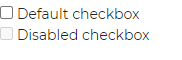
Default Checkbox
To create a bootstrap 5 checkbox we wrap the input elements in a div whose class is custom-check, the input element with a type of checkbox can receive a disabled prop to disable the input element.
<div class="custom-check">  <input class="custom-check-input" type="checkbox" value="" id="defaultCheck1" />  <label class="custom-check-label" for="defaultCheck1">    Default checkbox  </label></div>
<div class="custom-check">  <input class="custom-check-input" type="checkbox" value="" id="defaultCheck2" disabled />  <label class="custom-check-label" for="defaultCheck2">    Disabled checkbox  </label></div>
Inline Checkbox
The Bootstrap 5 inline checkbox is the kind of checkbox that arranges its options side-to-side, to achieve this we use a class name of form-check-inline in the div wrapping the input elements. This is however only available to PRO users.
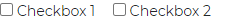
<div class="custom-check form-check-inline">  <input class="custom-check-input" type="checkbox" value="" id="Checkbox1" />  <label class="custom-check-label" for="Checkbox1">    Checkbox 1  </label></div>
<div class="custom-check form-check-inline">  <input class="custom-check-input" type="checkbox" value="" id="Checkbox2" />  <label class="custom-check-label" for="Checkbox2">    Checkbox 2  </label></div>
Checkbox with different styling.
With the Contrast Bootstrap PRO package you can have access to more than just the default styling for the checkbox, you can also define the stylings for the checkbox in the class prop of the input element.
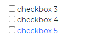
<div class="custom-check">  <input    class="custom-check-input text-primary bg-warning"    type="checkbox"    value=""    id="Checkbox3"  />  <label class="custom-check-label" for="Checkbox3">    checkbox 3  </label></div>
<div class="custom-check">  <input class="custom-check-input" type="checkbox" value="" id="Checkbox4" />  <label class="custom-check-label" for="Checkbox4">    checkbox 4  </label></div>
<div class="custom-check">  <input    class="custom-check-input border-primary text-primary"    type="checkbox"    value=""    id="Checkbox5"  />  <label class="custom-check-label text-primary" for="Checkbox5">    checkbox 5  </label></div>
How to Customize Bootstrap 5 Checkboxes
Customizing checkboxes in Bootstrap 5 involves using built-in classes and custom CSS to enhance their appearance. Here’s a step-by-step guide:
Include Bootstrap CSS
Ensure that Bootstrap 5 CSS is included in your project. You can add it via CDN or install it using npm.
<link href="https://maxcdn.bootstrapcdn.com/bootstrap/5.3.0/css/bootstrap.min.css" rel="stylesheet">Basic Checkbox Markup
Start with the basic HTML structure for a checkbox using Bootstrap classes.
<div class="form-check"> <input class="form-check-input" type="checkbox" value="" id="defaultCheck1"> <label class="form-check-label" for="defaultCheck1"> Default checkbox </label></div>Customizing Checkboxes
Use the form-check-input class to style the checkbox input and form-check-label to style the label. You can also add custom styles using CSS.
<style>  .form-check-input:checked {    background-color: #0d6efd;    border-color: #0d6efd;  }</style>
<div class="form-check">  <input class="form-check-input" type="checkbox" value="" id="customCheck1">  <label class="form-check-label" for="customCheck1">    Custom checkbox  </label></div>
How to Use Radio Buttons in Bootstrap 5
Similar to the Contrast Bootsrap 5 Checkboxes, we have two types of radio available, these include :
- Single Radio button
- Radio button Group with colors
Single Radio Button
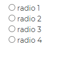
To create Bootstrap 5 radio buttons with Contrast we use input elements with its type values set to radio, next we wrap these input elements ( depending on how many radio buttons we want in our project ) in a div with its class property set to custom-radio.

<div class="custom-radio"> <input type="radio" id="customRadio1" name="customRadio" class="custom-radio-input" /> <label class="custom-control-label" for="customRadio1">radio1</label></div><div class="custom-radio"> <input type="radio" id="customRadio2" name="customRadio" class="custom-radio-input" /> <label class="custom-control-label" for="customRadio2">radio2</label></div><div class="custom-radio"> <input type="radio" id="customRadio3" name="customRadio" class="custom-radio-input" /> <label class="custom-control-label" for="customRadio3">radio3</label></div><div class="custom-radio"> <input type="radio" id="customRadio4" name="customRadio" class="custom-radio-input" /> <label class="custom-control-label" for="customRadio4">radio4</label></div>>Radio Button Group with Colors
A bootstrap 5 radio button group is a group of radio buttons that usually share the same styles. For example, if you were looking to create four different radio buttons, it would be stressful to create them individually and that is the problem bootstrap 5 is looking to solve.
<div> <div class="custom-radio"> <input type="radio" id="customRadio5" name="customRadio2" class="custom-radio-input text-info" /> <label class="custom-control-label" for="customRadio5"></label> </div> <div class="custom-radio"> <input type="radio" id="customRadio6" name="customRadio3" class="custom-radio-input text-danger" /> <label class="custom-control-label" for="customRadio6"></label> </div> <div class="custom-radio"> <input type="radio" id="customRadio7" name="customRadi4" class="custom-radio-input text-primary" /> <label class="custom-control-label" for="customRadio7"></label> </div> <div class="custom-radio"> <input type="radio" id="customRadio8" name="customRadi5" class="custom-radio-input text-dark" /> <label class="custom-control-label" for="customRadio8"></label> </div></div>Conclusion
Creating beautiful Bootstrap 5 checkboxes and radio buttons is straightforward with the help of Bootstrap’s utility classes and CDBReact. By following the steps outlined above, you can customize and enhance these form controls to match the design of your web application. Whether you are a new or experienced developer, this guide provides the necessary knowledge and practical steps to implement stunning checkboxes and radio buttons using Bootstrap 5.
Resources
You may also find the following resources useful:
- Link to Github Repo
- Contrast Bootstrap Checkbox Documentation
- Contrast Bootstrap Radio Documentation
- Get Contrast PRO
Build modern projects using Bootstrap 5 and Contrast
Trying to create components and pages for a web app or website from
scratch while maintaining a modern User interface can be very tedious.
This is why we created Contrast, to help drastically reduce the amount of time we spend doing that.
so we can focus on building some other aspects of the project.
Contrast Bootstrap PRO consists of a Premium UI Kit Library featuring over 10000+ component variants.
Which even comes bundled together with its own admin template comprising of 5 admin dashboards and 23+ additional admin and multipurpose pages for
building almost any type of website or web app.
See a demo and learn more about Contrast Bootstrap Pro by clicking here.

Related Posts