How to build Tailwind css timepicker with Tailwind elements

By Emmanuel Chinonso
Web Developer
Table of content
- Introduction
- Prerequisite
- What is Tailwind Element ?
- How to use Tailwind Element
- Setting Up our project
- Building Tailwind Timepicker using Tailwind Elements
- Conclusion
Introduction
Tailwind CSS is a popular utility-first CSS framework that allows developers to quickly build responsive and customizable user interfaces. In this blog post, we will explore how to build a timepicker component using Tailwind Elements, a free and open-source library of Tailwind CSS components.
Prerequisite
- Node installation
What is Tailwind Element
Tailwind Element is a plugin for Tailwind CSS that provides additional components for your projects. This plugin was built by people in MDBoootstrap. MDBootstrap is a top quality open source UI kits that helps developers build beautiful customizable UI fast and efficiently.
With these tools, we will create a functional timepicker that you can customize to fit your project's needs.
How to use the Tailwind elements plugin on our project
The Tailwind Elements timepicker component allows users to enter a time either through text input or by choosing a time from the clock. It can be embedded into dialogs on mobile devices and is fully responsive. The timepicker component comes with helper examples for 12-hour and 24-hour timepickers, clock-like UI, min and max time range conditions, and more.
There are two ways we can go about building the application, you can either use the cdn or use the packages to build the tailwindcss timepicker.
In these case, we are going to use vite sever with npm package manager to build out our project.
Setting Up our project
We are going to set up our project by installing some packages and plugins
Before we start, you need to make sure you have node installed in your machine or check your node version by running the follwing command
node -v- install and set up Vite We set up vite by running the following command on our terminal
npm create vite@latest my-projectcd my-projectThis will ask you a few questions, such as the version you want to use. In our case we used venila javascript. It will also ask you to name your project and you can call your project anything you like.
- Install Tailwind css We are going to install tailwind css now by running the following command on our terminal
npm install -D tailwindcss postcss autoprefixernpx tailwindcss init -pAfter initializing Tailwind css, we can go ahead to configure the Tailwind.config.js file
/** @type {import('tailwindcss').Config} */module.exports = { content: ['./index.html', './src/**/*.{js,ts,jsx,tsx}'], theme: { extend: {}, }, plugins: [],};- Go ahead and add the necessary Tailwind directives on the
style.cssfile at the root of the application. The file should look like the file below
/* style.css*/@tailwind base;
@layer base {  html {    @apply text-neutral-800;  }  html.dark {    @apply text-neutral-50;    @apply bg-neutral-800;  }}
@tailwind components;@tailwind utilities;
In the application, you can go ahead and link your style.css file to the index.html file. This will be at the head tag.
<head> <link rel="stylesheet" href="style.css" /></head>- installing the tailwind element plugin to our application. In order to use the Tailwind element plugin on our application, we have to first install. This is done by simply running the following command on our terminal.
npm install tw-elements- Updating the tailwind.config.js file
To run this plugin we must update our tailwind.config.js file by adding file patterns that can load dynamic components classes to the content array and also extend our plugin by adding the Tailwind element.
Our file should look like the following
/** @type {import('tailwindcss').Config} */module.exports = { content: [ './index.html', './src/**/*.{js,ts,jsx,tsx}', './node_modules/tw-elements/dist/js/**/*.js', ], theme: { extend: {}, }, plugins: [require('tw-elements/dist/plugin.cjs')], darkMode: 'class',};we can save our file now.
Building the Tailwind timepicker with Tailwind elements
Now that we are done with our setup the next step will be to build our tailwind timepicker with the installed tailwind element plugin.
In our index.html file we will now add some tags and classes.
<!DOCTYPE html><html lang="en"> <head> <meta charset="UTF-8" /> <link rel="icon" type="image/svg+xml" href="/vite.svg" /> <meta name="viewport" content="width=device-width, initial-scale=1.0" /> <title>Vite App</title> <link rel="stylesheet" href="style.css" /> </head> <body> <div class="flex justify-center mt-10"> <div class="relative" id="timepicker-with-button" data-te-timepicker-init data-te-input-wrapper-init > <input type="text" class="peer block min-h-[auto] w-full rounded border-0 bg-transparent px-3 py-[0.32rem] leading-[1.6] outline-none transition-all duration-200 ease-linear focus:placeholder:opacity-100 peer-focus:text-primary data-[te-input-state-active]:placeholder:opacity-100 motion-reduce:transition-none dark:text-neutral-200 dark:placeholder:text-neutral-200 dark:peer-focus:text-primary [&:not([data-te-input-placeholder-active])]:placeholder:opacity-0" id="form4" /> <label for="form4" class="pointer-events-none absolute left-3 top-0 mb-0 max-w-[90%] origin-[0_0] truncate pt-[0.37rem] leading-[1.6] text-neutral-500 transition-all duration-200 ease-out peer-focus:-translate-y-[0.9rem] peer-focus:scale-[0.8] peer-focus:text-primary peer-data-[te-input-state-active]:-translate-y-[0.9rem] peer-data-[te-input-state-active]:scale-[0.8] motion-reduce:transition-none dark:text-neutral-200 dark:peer-focus:text-primary" >Select a time</label > <button tabindex="0" type="button" class="timepicker-toggle-button absolute right-1.5 top-1/2 ml-auto h-4 w-4 -translate-x-1/2 -translate-y-1/2 cursor-pointer border-none bg-transparent text-neutral-700 outline-none transition-all duration-[300ms] ease-[cubic-bezier(0.25,0.1,0.25,1)] hover:fill-[#3b71ca] focus:text-[#3b71ca] dark:text-white dark:hover:text-[#3b71ca] dark:focus:text-[#3b71ca]" data-te-toggle="timepicker-with-button" data-te-timepicker-toggle-button > <span data-te-timepicker-icon> <svg xmlns="http://www.w3.org/2000/svg" fill="none" viewBox="0 0 24 24" stroke-width="1.5" stroke="currentColor" class="h-5 w-5" ><path stroke-linecap="round" stroke-linejoin="round" d="M4.5 12.75l7.5-7.5 7.5 7.5m-15 6l7.5-7.5 7.5 7.5" /></svg> </span> </button> </div> </div> </body></html>This code creates a text input field with the form-input class and the data-timepicker attribute, which tells Tailwind Elements to apply the timepicker component to this input field.
We can customize the timepicker component by adding additional attributes to the input field.
For example, we can set the time format to 12-hour or 24-hour by adding the data-time-format attribute with the value 12h or 24h, respectively. In this case we used the 12-hour attribute. We also added a clock-like UI to the timepicker component by adding the data-time-clock attribute.
Finally, we can go ahead and create a main.js file and link it to the index.html file. On the file we have the following code.
/*main.js*/
import { Input, Timepicker, initTE } from 'tw-elements';
initTE({ Input, Timepicker });
The code above imported the Input, Timepicker, initTE classes from the tailwind elements plugin and it initialized thr time picker function and the input field and time picker on our html file.
The application should look like the image below.
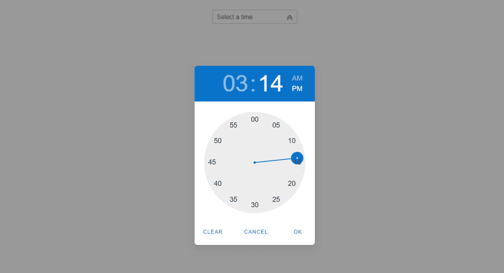
And when you click the icon the image below should display
And that's it! we have built a customizable and responsive timepicker component using Tailwind Elements.
Conclusion
In conclusion, Tailwind CSS and Tailwind Elements provide a powerful and flexible toolkit for building modern and responsive user interfaces. By leveraging the utility-first classes and pre-built components, developers can save time and focus on building great user experiences. You can also check out Tailwind elements docs here.
Build modern projects using Bootstrap 5 and Contrast
Trying to create components and pages for a web app or website from
scratch while maintaining a modern User interface can be very tedious.
This is why we created Contrast, to help drastically reduce the amount of time we spend doing that.
so we can focus on building some other aspects of the project.
Contrast Bootstrap PRO consists of a Premium UI Kit Library featuring over 10000+ component variants.
Which even comes bundled together with its own admin template comprising of 5 admin dashboards and 23+ additional admin and multipurpose pages for
building almost any type of website or web app.
See a demo and learn more about Contrast Bootstrap Pro by clicking here.
Related Posts


