
Full Website Layout

By Emmanuel Chinonso
Web Developer

Website Layout
A website is often divided into headers, menus, content and a footer.

There are tons of different layout designs to choose from. However, the structure above, is one of the most common, and we will take a closer look at it in this tutorial.
Header: A header is usually located at the top of the website (or right below a top navigation menu). It often contains a logo or the website name:
CSS Code:
.header { background-color: #f1f1f1; text-align: center; padding: 20px;}Navigation Bar: A navigation bar contains a list of links to help visitors navigating through your website:
CSS Code:
/* The navbar container */.topnav { overflow: hidden; background-color: #333;}/* Navbar links */.topnav a { float: left; display: block; color: #f2f2f2; text-align: center; padding: 14px 16px; text-decoration: none;}/* Links - change color on hover */.topnav a:hover { background-color: #ddd; color: black;}Content: The layout in this section, often depends on the target users. The most common layout is one (or combining them) of the following:
1-column (often used for mobile browsers)
2-column (often used for tablets and laptops)
3-column layout (only used for desktops).
CSS Code:
/* Create three equal columns that floats next to each other */.column {  float: left;  width: 33.33%;}
/* Clear floats after the columns */.row:after {  content: '';  display: table;  clear: both;}
/* Responsive layout - makes the three columns stack on top of each other instead of next to each other on smaller screens (600px wide or less) */@media screen and (max-width: 600px) {  .column {    width: 100%;  }}
To create a 2-column layout, change the width to 50%. To create a 4-column layout, use 25%, etc.
Unequal Columns: The main content is the biggest and the most important part of your site.It is common with unequal column widths, so that most of the space is reserved for the main content. The side content (if any) is often used as an alternative navigation or to specify information relevant to the main content. Change the widths as you like, only remember that it should add up to 100% in total:
CSS Code:
.column {  float: left;}/* Left and right column */.column.side {  width: 25%;}/* Middle column */.column.middle {  width: 50%;}
/* Responsive layout - makes the three columns stack on top of each other instead of next to each other */@media screen and (max-width: 600px) {  .column.side,  .column.middle {    width: 100%;  }}
Footer: The footer is placed at the bottom of your page. It often contains information like copyright and contact info:
CSS Code:
.footer { background-color: #f1f1f1; text-align: center; padding: 10px;}
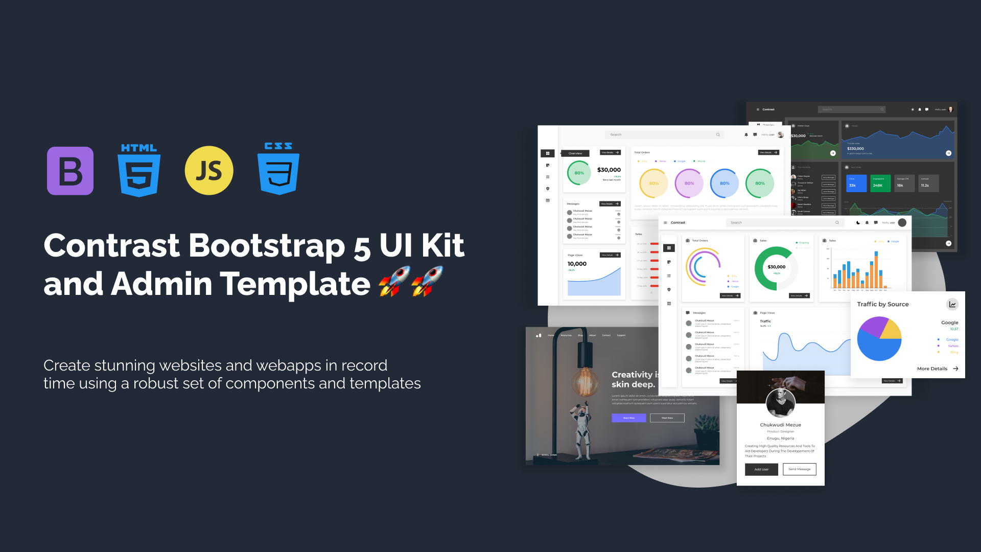
Build modern projects using Bootstrap 5 and Contrast
Trying to create components and pages for a web app or website from
scratch while maintaining a modern User interface can be very tedious.
This is why we created Contrast, to help drastically reduce the amount of time we spend doing that.
so we can focus on building some other aspects of the project.
Contrast Bootstrap PRO consists of a Premium UI Kit Library featuring over 10000+ component variants.
Which even comes bundled together with its own admin template comprising of 5 admin dashboards and 23+ additional admin and multipurpose pages for
building almost any type of website or web app.
See a demo and learn more about Contrast Bootstrap Pro by clicking here.
Related Posts
Comments
...