

Bootstrap Charts: How To Create Bootstrap 5 Charts with Chart.js (Line, Bar, Pie & Doughnut)

By Chimdia Anyiam
Web Developer
What Are Bootstrap Charts?
Bootstrap charts are data visualization components built using a JavaScript charting library (such as Chart.js) styled within a Bootstrap 5 layout. They allow you to display line charts, bar charts, pie charts, doughnut charts, and more inside responsive Bootstrap cards and containers.
A chart is a graphical representation of data that summarizes complex information in a visual, easy-to-understand format. Bootstrap charts combine the responsive grid system and styling of Bootstrap 5 with the rendering power of Chart.js to create beautiful, interactive data visualizations for dashboards, reports, and web applications.
In this tutorial, you will learn how to create Bootstrap 5 charts step by step using Chart.js and Contrast Bootstrap UI Kit, with code examples for each chart type.
Prerequisites
To properly understand this tutorial you must have the following:
- Basic HTML Knowledge
- Basic CSS Knowledge
- Basic Bootstrap knowledge
Bootstrap chart Setup(using chartjs and Contrast)
Bootstrap 5 allows you to create your very own Bootstrap charts, to do this, the first thing you need to do is create a folder that will hold all our files for this tutorial.
In this tutorial, I named my file bootstrap-chart, however, you can choose whatever name of your choice. Next, we create an index.html file. The index.html file will contain a large chunk of our code. Our Bootstrap Chart would be built using Chartjs and Contrast.
CONTRAST
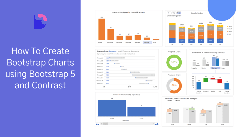
Contrast is an elegant bootstrap 5 UI kit featuring over 2000+ essential components. Contrast can be integrated with any project to build mobile-first, responsive, and elegant websites and web apps. You can read more about the UI Kit here. We will be using some styles from the UI Kit to build our bootstrap chart
Chartjs
Chartjs is a simple, flexible community-managed open-source JavaScript charting library for creating different types of charts in the browser. Chartjs features an extensive collection of charts and configurations to build different functionalities and customizations in your charts.
With Chartjs designers and developers can draw out clean, engaging, and different kinds of charts using the HTML5 canvas element. We opt to use the Chartjs charting JavaScript library because it is easy to learn, easy to use, and extremely customizable with different options for the kinds of charts you are looking to build ( line, bar, radar, polar, etc.)
To use Contrast and chartjs in our project, we have to add the CDN links to <head> section of our HTML code.
After adding the required CDN links, our index.html file should look like this.
<!DOCTYPE html><html lang="en">  <head>    <meta charset="UTF-8" />    <meta name="viewport" content="width=device-width, initial-scale=1.0" />    <meta http-equiv="X-UA-Compatible" content="ie=edge" />
    <link rel="stylesheet" href="https://cdn.jsdelivr.net/npm/cdbootstrap/css/bootstrap.min.css" />    <link rel="stylesheet" href="https://cdn.jsdelivr.net/npm/cdbootstrap/css/cdb.min.css" />    <script src="https://cdn.jsdelivr.net/npm/cdbootstrap/js/cdb.min.js"></script>    <script src="https://cdn.jsdelivr.net/npm/cdbootstrap/js/bootstrap.min.js"></script>    <script src="https://kit.fontawesome.com/9d1d9a82d2.js" crossorigin="anonymous"></script>
    <title>How to create bootstrap charts using bootstrap 5 and Contrast</title>  </head>
  <body></body>
  <script src="https://cdnjs.cloudflare.com/ajax/libs/Chart.js/2.7.2/Chart.js"></script></html>
Now, let’s the go-ahead to create our charts.
Bootstrap 5 chart Examples
Line Chart.
The first type of chart we will be discussing is the line chart. This is the simplest chart that we can use on our website.
A line graph, or line chart is a chart that uses lines to connect individual points. Lines do not have to be straight ( linear ), we could also have curved lines connecting the individual dots. It is usually on a 2-dimensional graph.
To create our Chart, in the body of our HTML page, we use a div element with a class of chart-container this container will house our actual chart which we will create using the HTML5 canvas element, bypassing the element an id with the value of chart.
<div class="card chart-container"> <canvas id="chart"></canvas></div>To style add styling to our charts, we use a style tag in which we define the CSS styling for our chart.
<style> .chart-container { width: 50%; height: 50%; margin: auto; }</style>Now let’s add a script tag where we select the chart canvas and apply the chart settings to it. ...
<script> const ctx = document.getElementById("chart").getContext('2d'); const myChart = new Chart(ctx, { type: 'line', data: { labels: ["Sunday", "Monday", "Tuesday", "Wednesday", "Thursday", "Friday", "Saturday"], datasets: [{ label: 'Last week', backgroundColor: 'rgba(161, 198, 247, 1)', borderColor: 'rgb(47, 128, 237)', data: [3000, 4000, 2000, 5000, 8000, 9000, 2000], }] }, options: { scales: { yAxes: [{ ticks: { beginAtZero: true, } }] } }, });</script>In the code above, the first thing we do is select the chart element. Then, we create a new chart instance using ChartJs and give it the properties we need, such as the type of chart, data we want to use, and other options that will help us customize the chart.
understanding the props
- The
typeproperty indicates what kind of chart we are trying to create. In the block of code above thetypevariable is set to line. - The
labelsproperty indicates the variables on the y-axis (horizontal) side of the chart. - The
labelproperty acts like the chart tag or title. - The
backgroundColorproperty is used to set the background color of the chart. - The
borderColorproperty is used to set the color of the line in the line chart. - The
dataproperty indicates where the points should be located on the vertical axis.
Now our code should look like this.
<!DOCTYPE html><html lang="en">
<head>  <meta charset="UTF-8">  <meta name="viewport"    content="width=device-width, initial-scale=1.0">  <meta http-equiv="X-UA-Compatible" content="ie=edge">
  <link    rel="stylesheet"    href="../contrast-bootstrap-pro/css/bootstrap.min.css" />  <link    rel="stylesheet"    href="../contrast-bootstrap-pro/css/cdb.css" />  <script    src="../contrast-bootstrap-pro/js/cdb.js"></script>  <script    src="../contrast-bootstrap-pro/js/bootstrap.min.js"></script>  <script    src="https://kit.fontawesome.com/9d1d9a82d2.js"    crossorigin="anonymous"></script>
  <title>How to create bootstrap charts using bootstrap 5</title></head><style>  .chart-container {    width: 50%;    height: 50%;    margin: auto;  }</style>
<body>  <div class="card chart-container">    <canvas id="chart"></canvas>  </div>
</body>
<scriptsrc="https://cdnjs.cloudflare.com/ajax/libs/Chart.js/2.7.2/Chart.js"></script><script>      const ctx = document.getElementById("chart").getContext('2d');      const myChart = new Chart(ctx, {        type: 'line',        data: {          labels: ["sunday", "monday", "tuesday",          "wednesday", "thursday", "friday", "saturday"],          datasets: [{            label: 'Last week',            backgroundColor: 'rgba(161, 198, 247, 1)',            borderColor: 'rgb(47, 128, 237)',            data: [3000, 4000, 2000, 5000, 8000, 9000, 2000],          }]        },        options: {          scales: {            yAxes: [{              ticks: {                beginAtZero: true,              }            }]          }        },      });</script>
</html>
With this, we have a chart that looks like it.

Bar Chart.
A bar chart is a type of chart that represents values as vertical or horizontal bars of equal width. They are usually used to compare multiple data or show the distribution of data points.
The code for our bar chart is shown below. Taking a good look, the only things that change are the type of chart option, data, and labels.
<script> const ctx = document.getElementById("chart").getContext('2d'); const myChart = new Chart(ctx, { type: 'bar', data: { labels: ["rice", "yam", "tomato", "potato", "beans", "maize", "oil"], datasets: [{ label: 'food Items', backgroundColor: 'rgba(161, 198, 247, 1)', borderColor: 'rgb(47, 128, 237)', data: [300, 400, 200, 500, 800, 900, 200], }] }, options: { scales: { yAxes: [{ ticks: { beginAtZero: true, } }] } }, });</script>

Pie Chart
A pie chart is a type of chart or graph that represents data or displays data in a circular graph. The circular graph ( circle ) is divided into sectors in which each sector represents a piece of the data or information we are trying to represent.
<script> const ctx = document.getElementById("chart").getContext('2d'); const myChart = new Chart(ctx, { type: 'pie', data: { labels: ["rice", "yam", "tomato", "potato", "beans", "maize", "oil"], datasets: [{ label: 'food Items', backgroundColor: 'rgba(161, 198, 247, 1)', borderColor: 'rgb(47, 128, 237)', data: [30, 40, 20, 50, 80, 90, 20], }] }, });</script>The code above translates to the pie chart in the image below.

Doughnut Chart
This chart is similar to the pie chart except that in the pie chart the data occupies the entire chart ( which is a circle as we have discussed above ) while in the doughnut chart the chart center would be cutout making it resemble a doughnut, hence its name.
The major difference between a pie chart and a doughnut chart is that a doughnut chart can be used to represent 2 different data series while in a pie chart you would have to create two different pie charts to represent two different data series.
<script> const ctx = document.getElementById("chart").getContext('2d'); const myChart = new Chart(ctx, { type: 'doughnut', data: { labels: ["rice", "yam", "tomato", "potato", "beans", "maize", "oil"], datasets: [{ label: 'food Items', data: [30, 40, 20, 50, 80, 90, 20], backgroundColor: ["#0074D9", "#FF4136", "#2ECC40", "#FF851B", "#7FDBFF", "#B10DC9", "#FFDC00", "#001f3f", "#39CCCC", "#01FF70", "#85144b", "#F012BE", "#3D9970", "#111111", "#AAAAAA"] }] }, });</script>In the doughnut chart, we add and change the background color option from a single value to an array of values so that each segment in the doughnut will have its color as shown in the image below.

There are a lot of other variations and options for charts which can not all be covered in this article but you can check them out in the official chartjs documentation. With this, we now know how to create and use charts in our projects.
Frequently Asked Questions
Does Bootstrap have built-in chart components?
No, Bootstrap does not include chart components by default. To create Bootstrap charts, you need a JavaScript charting library like Chart.js, ApexCharts, or Chartist.js. Chart.js is the most popular choice for Bootstrap projects because of its simplicity and extensive chart types.
What is the best charting library to use with Bootstrap 5?
Chart.js is the most commonly used charting library with Bootstrap 5. It is lightweight, easy to learn, supports responsive sizing, and provides line, bar, pie, doughnut, radar, and polar area chart types out of the box.
How do I make Bootstrap charts responsive?
Wrap your <canvas> element in a Bootstrap container or card component. Chart.js automatically resizes charts when the responsive option is set to true (this is the default). The chart will scale to fit its parent container.
Can I create a Bootstrap 5 dashboard with charts?
Yes. Combine Bootstrap 5's grid system (row, col) with Chart.js canvas elements inside Bootstrap cards. Use different col-md-6 or col-lg-4 classes to arrange multiple charts in a responsive dashboard layout.
What types of charts can I create with Chart.js and Bootstrap?
Chart.js supports line charts, bar charts (vertical and horizontal), pie charts, doughnut charts, radar charts, polar area charts, bubble charts, and scatter charts. All of these can be styled within Bootstrap 5 card containers for a clean, responsive look.
Resources
Build modern projects using Bootstrap 5 and Contrast
Trying to create components and pages for a web app or website from
scratch while maintaining a modern User interface can be very tedious.
This is why we created Contrast, to help drastically reduce the amount of time we spend doing that.
so we can focus on building some other aspects of the project.
Contrast Bootstrap PRO consists of a Premium UI Kit Library featuring over 10000+ component variants.
Which even comes bundled together with its own admin template comprising of 5 admin dashboards and 23+ additional admin and multipurpose pages for
building almost any type of website or web app.
See a demo and learn more about Contrast Bootstrap Pro by clicking here.

Related Posts