

Bootstrap 5 navbar-How To Create A Beautiful Navbar Using Bootstrap 5.

By Tobi Osimosu
Frontend Developer
Bootstrap 5 navbar
A navigation bar, or "navbar" is essential for helping visitors navigate a website. It's usually the first thing they look for, so a well-designed navbar improves their experience. On the other hand, a poor navbar can make the website harder to use. This guide will explain how to create a visually appealing and effective navbar using Bootstrap 5 and the Contrast UI kit.
Table of Content
- Understanding Bootstrap 5 and contrast
- How to Set Navigation Bar in Bootstrap 5
- Bootstrap 5 Navbar Examples
- Bootstrap 5 Responsive Navbar
- Conclusion
Understanding Bootstrap 5 and Contrast
Bootstrap is a popular CSS Framework for developing responsive and mobile-first websites. It includes features like SASS variables, a responsive grid system, and JavaScript plugins. Contrast is a Bootstrap 5 UI kit with over 2000 components, allowing for the creation of elegant, responsive websites and web apps. It integrates seamlessly with Bootstrap, enhancing its capabilities.
Avaliable Technologies for Contrast
Contrast, which was created by Devwares is available for the following technologies:
- Vanilla JS: (contrast-bootstrap.)
- React :(cdbreact)
- Angular: (ng-cdbangular)
Devwares also designed a Pro version of Contrast to give you access to more features and improvements.
Click here to check it out.
We will be using the angular version of contrast in this tutorial to create the navbar. Tutorials for other versions can also be found on the docs here.
How to Set Navigation Bar in Bootstrap 5
STEP 1: Install Contrast
Using NPM:
npm install --save ng-cdbangularUsing Yarn:
yarn add ng-cdbangularSTEP 2: Include Bootstrap CSS Add bootstrap CSS to angular.json
"styles": [ "node_modules/bootstrap-css-only/css/bootstrap.min.css"]STEP 3: Import the navbar module in app.module.ts
import { NavbarModule } from 'ng-cdbangular';@NgModule({ imports: [ NavbarModule ]})NB, for our example, we will be needing some other components so our final app.module.ts file will look like this;
import { NavbarModule, CollapseModule, ButtonModule, DropdownModule } from 'ng-cdbangular'; @NgModule({ imports: [ NavbarModule, CollapseModule, ButtonModule, DropdownModule ] })Note: instead of importing one component at a time, the contrast has a module called CDBFreeModule which contains the imports of all the custom components contrast has to offer.
import { CDBFreeModule } from 'ng-cdbangular';@NgModule({ imports: [CDBFreeModule]})Easy right? Now let’s dive right into the view.
HTML VIEW
A basic Contrast navbar looks like this:
<CDBNavbar style="background: black; color: #f4f4f4"> <a href="">link</a></CDBNavbar>The a tag links you to an address specified in the href attribute.

This looks... okay, but I know we can do better. Let’s add the CDBNavBrand component for brand logos and the likes
<CDBNavbar style="background: black; color: #f4f4f4"><CDBNavBrand href="/"><img src="" alt="Brand" class="img-fluid" width="30"></CDBNavBrand></CDBNavbar>Note that the contents of CDBNavBrand can be anything you want eg:
<h4>Brand<h4>

Now, Let’s make the navbar responsive.
<CDBNavbar style="background: black; color: #f4f4f4" [dark]=true expand="lg"><CDBNavBrand href="/"> <img src="" alt="Brand" class="img-fluid" width="30"> </CDBNavBrand> <CDBNavToggle (click)="myNav.toggleCollapse()"> </CDBNavToggle> <CDBCollapse #myNav class="w-100" [navbar]=true expand="lg"> Lorem, ipsum dolor sit amet consectetur adipisicing elit. Aut, minus?</CDBCollapse></CDBNavbar>


This example introduced more custom components. Let’s go through them one step at a time.
- The expand prop was added to the CDBNavbar component.
expand="lg"tells the navbar to collapse when the viewport width is < 992px.
Acceptable breakpoints include:
- sm = collapse when the viewport width is < 576px
- md = collapse when the viewport width is < 768px
- lg = collapse when the viewport width is < 992px
- xl = collapse when the viewport width is < 1200px
[dark]=true was added because the background color is dark. [light]=true should be used when a lighter background is used.
The CDBNavToggle component was added. This is the Contrasts navigation bar toggled. It becomes visible only when the viewport width is lower than the specified breakpoint you put in the “expand” prop.
A click event handler was added to the CDBNavToggle component:
(click)="myNav.toggleCollapse()". CDBNavToggle is accessing the toggleCollapse() function present in CDBCollapse to collapse the navigation bar programmatically through the local referencemyNav.
Note: an image prop can be added to the CDBNavToggle in place on the default toggler eg:
<CDBNavToggle (click) ="myNav.toggleCollapse()" image=""></CDBNavToggle>

Here I’m using a literal hamburger :
The CDBCollapse component was added. This is the actual component that collapses the navigation bar. A local reference of #myNav is added so that the toggler can access its toggleCollapse function. [navbar]=true is used to inform the collapse that this instance is being used as a navigation bar.
expand=”lg”, this is added to tell CDBCollapse when to collapse. Note that the same breakpoint used in the CDBNavbar component must also be used here.
Whew! Alright, now that the navbar is responsive and ready to go, let’s add some flesh to it. We’ll be making use of some other Contrast components. These components are the CDBNavItem, CDBDropDown, CDBBtn.
- The
CDBNavITem, this component creates a nav item in our navigation bar. A nav item represents an item or a navigation link to different pages or sections of a website. - The
CDBDropDown, this Contrast Bootstrap component is used for creating dropdowns in our project. - The
CDBBtncomponent creates new buttons in our project.
<CDBNavbar style="background: black; color: #f4f4f4" [dark]=true expand="lg"> <CDBNavBrand href="/"> <img src="" alt="Brand" class="img-fluid" width="30" /> </CDBNavBrand> <CDBNavToggle (click)="myNav.toggleCollapse()" > </CDBNavToggle> <CDBCollapse #myNav class="w-100" [navbar]=true expand="lg"> <CDBNavbarNav [left]=true class="align-items-center"> <CDBNavItem> <CDBDropDown> <CDBDropDownToggle [caretDropDown]=true style="padding: 0" color="dark" (click)="menu.toggleDropdown($event)"> Categories </CDBDropDownToggle> <CDBDropDownMenu #menu="cdbDropdownMenu" placement="bottom"> Coming soon #pleaseStayUpdated. </CDBDropDownMenu> </CDBDropDown> </CDBNavItem> <CDBNavItem> <CDBBtn [flat]=true color="dark" style="padding: 0"> <CDBNavLink to="/" style="color: #ffffff">Help</CDBNavLink> </CDBBtn> </CDBNavItem> <CDBNavItem> <CDBBtn [flat]=true color="dark" style="padding: 0"> <CDBNavLink to="/" style="color: #ffffff">About</CDBNavLink> </CDBBtn> </CDBNavItem> </CDBNavbarNav> <CDBNavbarNav [right]=true> <CDBNavItem> <CDBBtn [flat]=true color="dark" style="padding: 0"> <CDBNavLink to="/" style="color: #ffffff">EN</CDBNavLink> </CDBBtn> </CDBNavItem> <CDBNavItem> <CDBBtn [flat]=true color="dark" style="padding: 0"> <CDBNavLink to="/" style="color: #ffffff">Login</CDBNavLink> </CDBBtn> </CDBNavItem> <CDBNavItem> <CDBBtn color="white" style="padding: 0"> <CDBNavLink to="/" style="color: #000000;"> Sign Up </CDBNavLink> </CDBBtn> </CDBNavItem> </CDBNavbarNav> </CDBCollapse></CDBNavbar>


That is the final result of what our bootstrap 5 navbar should look like and you can style the components more in any way you wish.
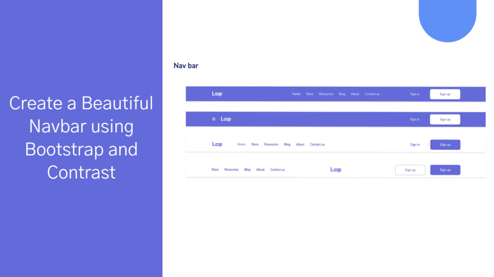
Bootstrap 5 Navbar Examples
Basic Navbar
Here's a simple setup for a Contrast navbar:
<CDBNavbar style="background: black; color: #f4f4f4"> <a href="">Link</a></CDBNavbar>Enhanced Navbar with Branding
Add a brand logo and other elements:
<CDBNavbar style="background: black; color: #f4f4f4"> <CDBNavBrand href="/"> <img src="" alt="Brand" class="img-fluid" width="30"> </CDBNavBrand></CDBNavbar>Bootstrap 5 Responsive Navbar
To make the navbar responsive, add expand properties and a toggle for collapsible content:
<CDBNavbar style="background: black; color: #f4f4f4" [dark]=true expand="lg"> <CDBNavBrand href="/"> <img src="" alt="Brand" class="img-fluid" width="30"> </CDBNavBrand> <CDBNavToggle (click)="myNav.toggleCollapse()"> </CDBNavToggle> <CDBCollapse #myNav class="w-100" [navbar]=true expand="lg"> Your content here </CDBCollapse></CDBNavbar>Conclusion
This guide provides a clear path to creating a functional and visually appealing Bootstrap 5 navbar using the Contrast UI kit. For more detailed component documentation, visit the Contrast documentation.
Build modern projects using Bootstrap 5 and Contrast
Trying to create components and pages for a web app or website from
scratch while maintaining a modern User interface can be very tedious.
This is why we created Contrast, to help drastically reduce the amount of time we spend doing that.
so we can focus on building some other aspects of the project.
Contrast Bootstrap PRO consists of a Premium UI Kit Library featuring over 10000+ component variants.
Which even comes bundled together with its own admin template comprising of 5 admin dashboards and 23+ additional admin and multipurpose pages for
building almost any type of website or web app.
See a demo and learn more about Contrast Bootstrap Pro by clicking here.

Related Posts